Showing posts with label sage francis. Show all posts

Friday, February 09, 2024

Sage Francis 3.0: an always-evolving logo

Artist, record label boss and rapper Sage Francis has just unveiled his new logo, over 20 years since I first fell in love with his records, 18 years since I did the biggest art project of my life on his work, 16 years since I did a piece of art that wasn’t meant to be a logo but became one, 17 years since I did his first proper ‘new logo’, and ten years since I designed him another ‘new logo’. Like the artist himself, this is a logo — and a relationship — that doesn't stay still!
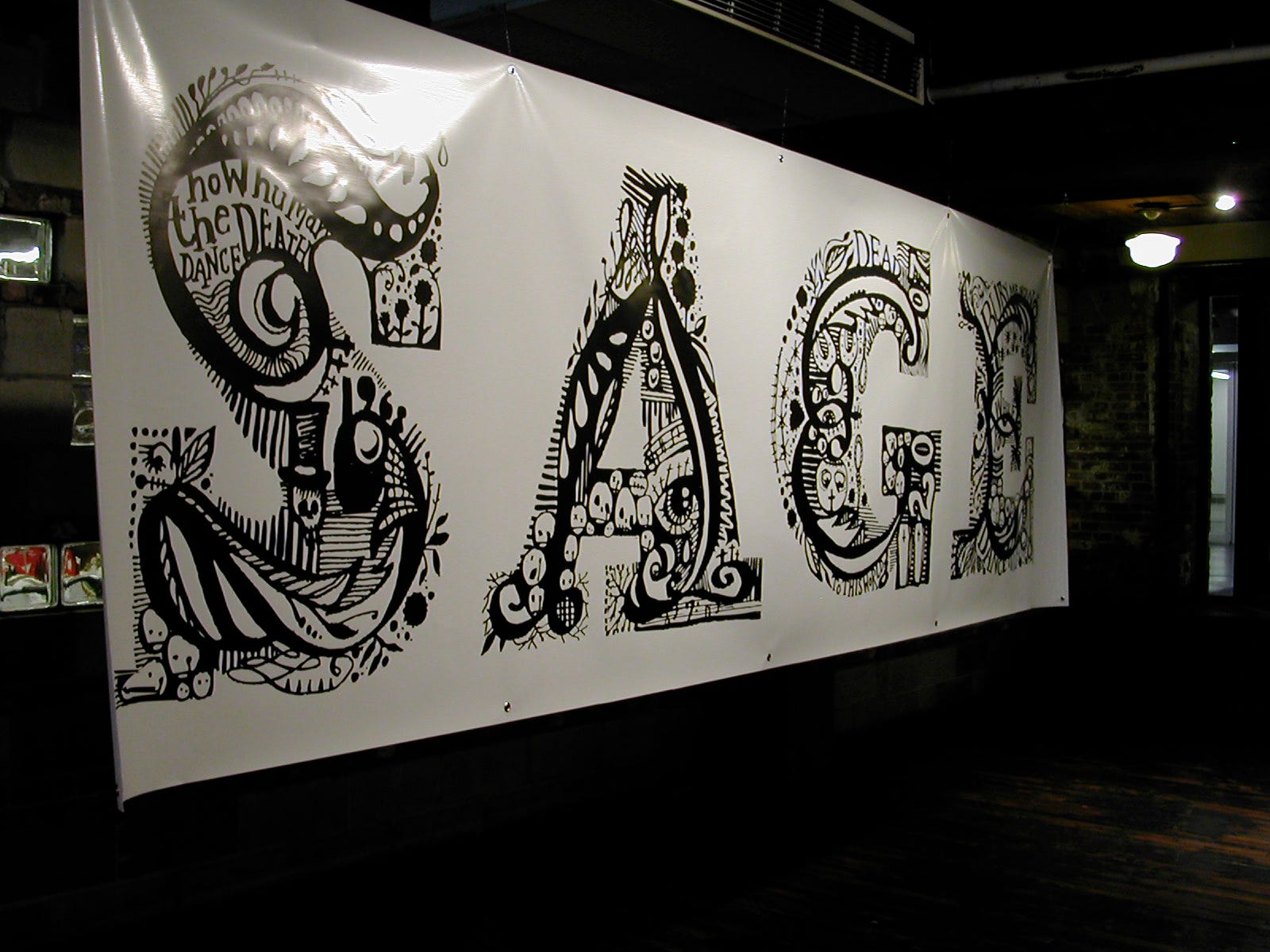
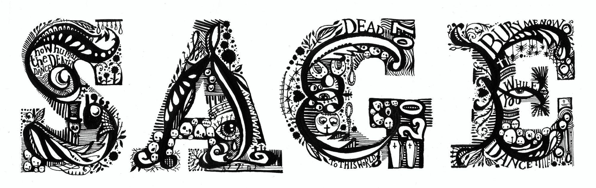
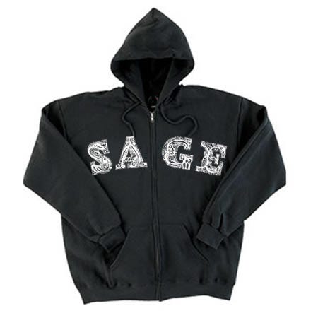
We never sat down to do a logo, to brainstorm or sign an NDA or moodboard or A/B test or anything else. It’s been a fully organic journey. The first one was actually a piece specially created for the 2007 Manhattan outing of our big Sage-inspired show, If A Girl Writes Off The World (a pre-Adobe Dreamweaver-built site will open up. I built it myself and it’s so poignantly 2007). It was picked up and put onto some of the hoodies in Sage’s Strange Famous merch range — best-sellers at that. Detailed and writhing, it was made with a very fine Nikko-G nib and black ink. The original is actually very small, and framed in our hallway.
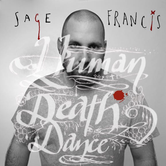
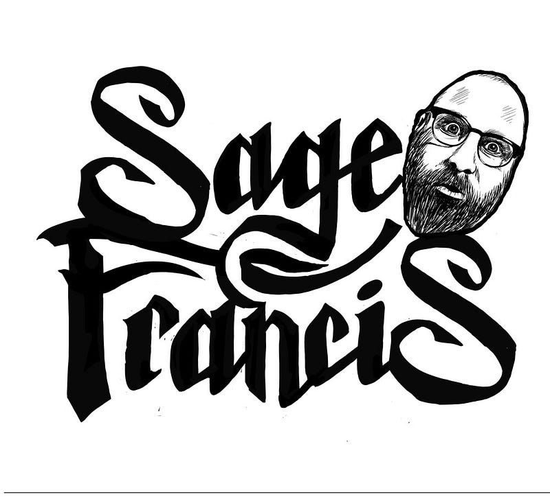
The second was kind of accidental as it was made for the cover of Sage’s 2007 album Human The Death Dance. It just kind of…started to get used on things, posters, ads, posts and merch. In the way that a logo does, I suppose. Made with an inkpen and nib, it featured sad faces and a minimal slope, just designed to peer over the shoulder of the man himself, next to a watermark-like Death. With hindsight, it was flimsy and odd, but then again…unlike a lot of my formal client commisssions, I hadn’t ‘sat down to design a logo’.
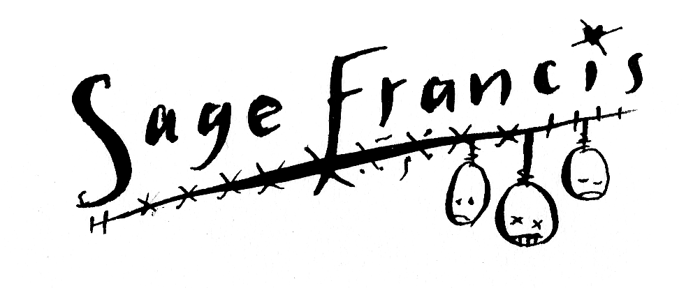
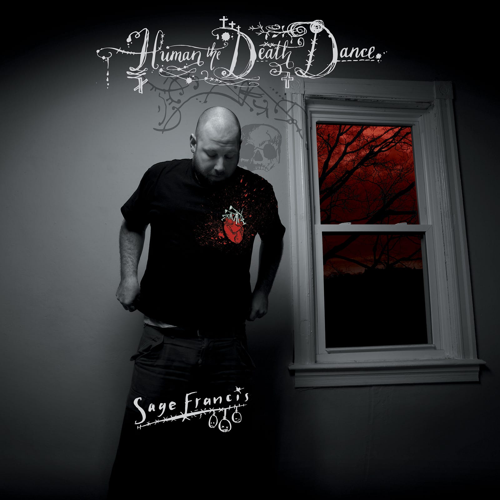
The album cover. Which was almost…
…this one instead.

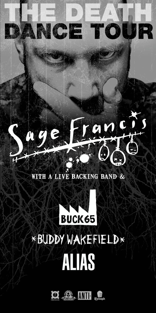
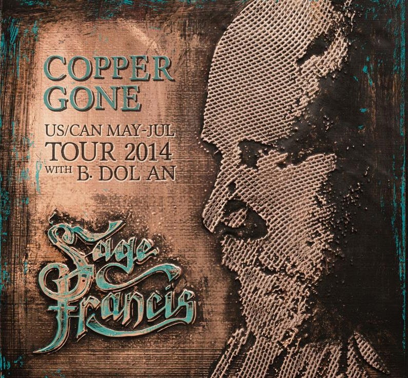
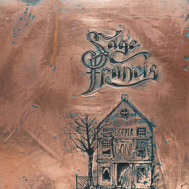
The one that came after that was also for an album, 2014’s Copper Gone. It formed part of a single piece of ink-on-paper art but once again lived a life of its own, and served as Sage’s identity for the ten years prior the current one. I almost can’t believe myself the huge spans of time I’m casually throwing around here, by the way — but those are the dates, and this is the longevity of it all.
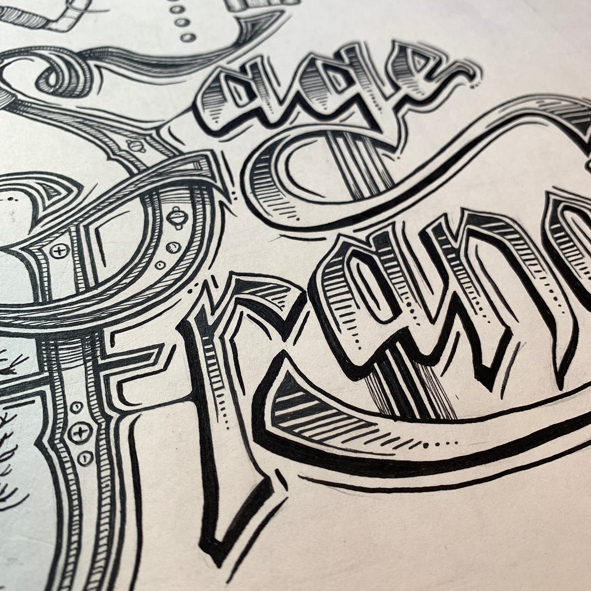
Again if I’d known at the time that this would be deployed in the way it was, there are things I’d have changed — but would it have improved anything? Not sure. Really not sure, but at some point someone filled it in and made it solid — which wasn’t a cool move, and around that time I began thinking, I really need to do that properly, or scrap it and do the whole thing again.

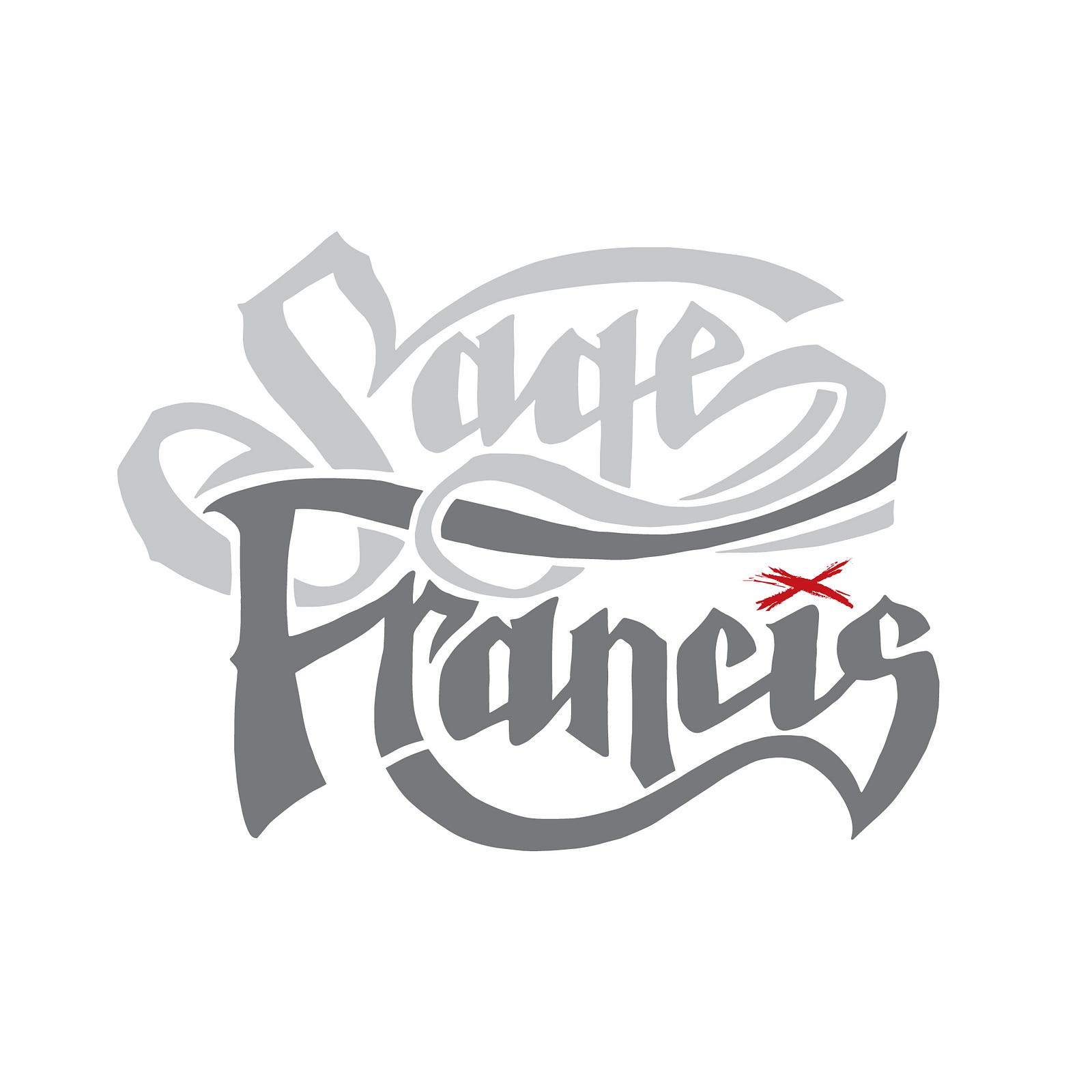
Eventually I did. I can’t remember whether I just did it and sent it to Sage with a note saying ‘this really needed doing’, or whether he asked — it doesn’t matter — but the outcome is this one. This time I *did* sit down to ‘make a logo’ from the roots put down by the Copper Gone iteration, but clean and clear. I faffed and tweaked and moved vector points and smoothed out bezier curves then undid it all, and repeat, eventually creating so many versions I think we actually really should have done some A/B testing. But there it is.

There are still things I’d change, even now, and it may or may not serve for another ten years. But I like the organic and slightly clumsy way all of these were done. They sort of ‘happened’, which is very different from the art-directed, purposeful, accountable way I do my other work.

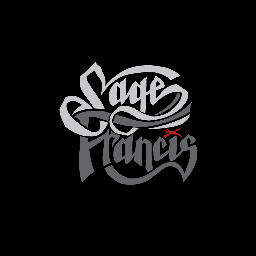
The final. I think. Not sure. I like it. Sage likes it. But do I like one of the other versions more? We can always use one of those…can’t we…I think. We fly in the face of your Logo Rules, sir!

When Sage posted it to the fans, most people just loved it and started slapping money on the counter for the T shirt. Someone said ‘Francis’ reads as a completely different word. Someone else said having seen it they’re now expecting a country album (which I applauded).

I still look at it and see a curve I would change, bits I’d move, and I stare at it till I’m logo-blind. But honestly, I wouldn’t have it any other way.

Thanks Sagey for the wholesomely organic way we do things, every time.

(If you want to read more, there’s a bunch of historic blogs here).

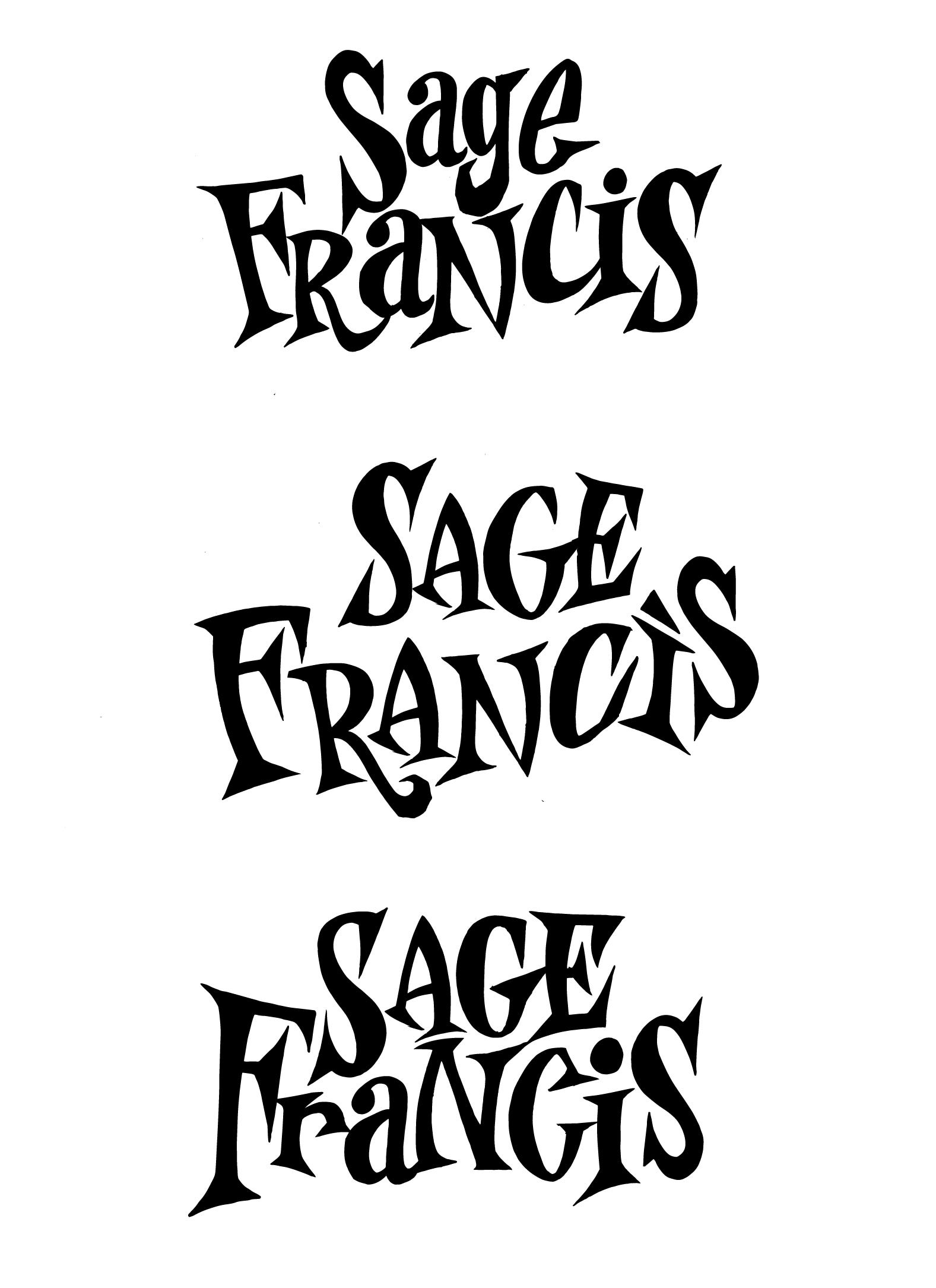
P.S.; this one was a wild card, and Did Not Make It. Nor shall it ever…I think…

Thursday, July 31, 2014

The Copper Mine.

We received this monster stash today from the Strange Famous HQ: all of the things that have been printed for Sage’s tour (halfway through, UK leg commencing October) and copies of the long-awaited album itself. It came in three boxes over three days and each one was scalpelled open with a child-like grin of excitement.


I’m particularly impressed by the sensitivity with which the delicate lines of the illustrations have reproduced on the tiny CD version, and the impact of the SAGE FRANCIS writ large over the t shirts. Careful printing has meant that even on the meaty hoodies, the detail of the little house and things like the riveted album title haven’t suffered - these things mean a lot when you’ve grafted on the minutiae of a thing.


Turn your eyeballs too to the copper and verdigris-coloured vinyl, which changes with each side (no two will be the same). The blue cassette tape is a triumph (one’s gone in our tape-only automobile) and the sparkling, presumably accidental show-through of a little silver on the CD itself makes for real glittery impact. And who DOESN’T wish for a pile of golden round stickers? All brought together in the experienced hands of Irena Mihalinec, Strange Famous’ in-house designer, who brought coherence and consistency to a wide range of difficult-to-design-for objects!

Sage is, to coin an oft-abused phrase, at the 'top of his game’ - lazy shorthand really for someone who’s spent long enough in a business to know how to give value and earn the love - and this is an artillery of connected, considered pieces which demonstrate that: the core product itself, with the extravagant coloured vinyl that ALL buyers deserve, the supporting items for tour sales, the give-aways and the add-ons. All must work together coherently, and the fewest amount of compromises should be made on quality when people are spending their hard-earned, whether after the gig or making a solitary album investment. Watch, and learn!

I’m looking forward to the UK tour, when I get to see all the audio jump to life on stage. Gulp.


Wednesday, June 04, 2014

Copper Gone: Straight from his heart valves into your ears.


In my interview with Sage last week for Altar Ego Radio, I asked him why Buck 65 had made reference to the fact that this was an album by an artist ‘pushing 40’. Sage gave a fulsome and enlightening reply, but I asked the question because Buck 65’s comment had posed all sorts of questions for me.

I’m no longer ‘pushing’ 40, I’m pulling it, and despite the cliché of the attendant dread and self-examination not being an issue in the approach to The Birthday - in fact it was raucously ridiculed by me and my identically-aged friend - it hit afterwards. The most traumatic thing of my life occurred in the first year of my 40s, my last year of the 30s being the one in which I weighed the least, earned the most, ran the furthest, and triumphantly cut off all my hair. I was at my most confident, and I was precisely the reverse exactly one year later.

I thought ‘life’ had done that to teach me a lesson; perhaps I’d been smug, too confident or ambitious, and needed smacking down. But ‘life’ isn’t a force with a will of its own; it’s the thing that you create, and also the thing that, to quote another oft-quoted bloke, ‘happens when you’re busy making other plans’.

I never did understand why John Lennon was so revered, and still don’t really, but it’s a stone cold diamond-hard fact that other people’s words are what trigger some of the most thoughtful and considered responses in me. I can’t just draw things like other people, I have to have a trigger or jump-off - preferably a melancholic or dramatic one - and the over the last decade and a bit, the schoolgirl magnetism of Dickens, the Brontës and Nietzsche has given way to Sage Francis (and Ed Garland, but he’s for discussion later).

Sage will be 40 very soon ("My 40s…I’m not so sure”- Sage). Unlike me, he writes constantly and without needing other people’s material. His entire time on earth provides this. But for the majestic new album released today, even he needed to pull on the recognition this year that he came to a point, as I did, of thinking there ‘was nothing left’ to give. (The album is named for a neighbourhood house stripped over time of its every asset, till someone thought to write on its side ‘copper gone’, to try to prevent further devastation through looting.) His songs have always been unashamedly biographical, that’s well acknowledged. It’s why human beings he’s never met think he’s read their minds, or are his best friend, or look to him as mentor and life coach, counsellor or muse. His words will be engraved on skin by people he’ll never talk to, such is their resonance for individuals. They’ll approach him after gigs and ask, ‘how did you know’?

Well, he knows not because he has magical powers, or had particularly out of the ordinary experiences; he’s just never been afraid to talk about them, with crowbar’d open ribs and surgical word-precision. ‘Personal Journals’ was the album around which I clumsily but determinedly built a show of work which, via a series of events and opportunities I could never have foreseen, brought me to the place I found myself in at 39 - and also to where I am now.  Because of, and irrespective of this, it’s still a deeply moving album for me despite the really, really great albums he’s made since. I still look up to it as an example of what someone with no filter between soul, brain and pen can produce, and as such I still revere it as aspirational. 'Copper Gone’ came to us one track at a time, in the build-up to creating the cover art. Even without the village-burying avalanche effect of hearing all the tunes at once for the first time, which is how anyone buying the album today will experience it, it was immediately apparent that this, just like Personal Journals, was going to need a strong nervous system.

"A massive emotional outpouring” (Alarm Magazine) seems too dramatic a description when set against the voice of the chuckling jovial gentleman of our interview, but that’s just what this is. He’s a DIY artist and writer ("DIY or Die”) who’s built everything from scratch, but the price paid for that weighs on him no differently from that of the habitually all-nighting corporate financier; days, nights, sleep, leisure, friends, health, partnerships, children and opportunities sacrificed for the pursuit of ‘it’ - “he was too caught up in work to sign for the nice deliveries that life brings” (Once Upon A Blood Moon). In that respect, this album is a staggering exposé of the deals we can make without even realising, hoping ‘it’ll all be worth it’, and promising ourselves we’ll reward, relax and be present when we’re done, when it’s enough, when we’re ‘there’.

Something of an alarm call, then, for those of us currently squirming in recognition at that scenario (“we'll burn it at both ends, it's safe to assume what doesn't consume the flame, the flame consumes” - MAINT REQD).

The album is writhing with a thousand quotably poignant or funny lines, and yes some of those will bring fluid to the eyeballs. This is not to suggest however that the music isn’t an equally potent partner to them - even if you didn’t speak a word of Rhode Island, the magnificent beats keep this from being a maudlin sob story. Be careful - it isn’t. (“I talk a lot of shit but I can back it all the fuck up!” - from the satisfyingly bleepy 8-bitty Cheat Code.) I’m not going to break down every track, but some stick around long after the headphones are off.

'MAINT REQ' is a solid, one boot-in-front-of-the-other hip-hop banger that walks you roughly around the reasons This Guy Needs A Break. Reminiscent of the poignant Gunshot swansong ‘The Long Goodbye’, it’s that thing that good’n’proper hip-hop does well - robust singalong hooks, classical jabs to the ribs and monster beats (which are by Kurtis SP.) Sore and tired, it encourages us to ‘push through the pain…have you tried turning me off and back on again?'

‘The Set Up’ was the one that broke me - just as the still-unexplained ‘Bridle’ from Sage’s ‘A Healthy Distrust’ did, and Human The Death Dance’s ‘Black Out On White Night’. I met Alias, who fashioned the elegant softly-spoken tragedy that is the music to this one, at B.Dolan’s wedding, and I struggle to reconcile the memory of this chirpy good-natured bloke with the downright cruelty of those beats. I’m not sure I know (like ‘Bridle’) what this one is ‘about’, but when tracks are so peppered with acute observations and wordplay, and for all the cleverness and obtuseness, does it actually really matter?

I suppose that’s it: although Sage’s creations can, if I invite them to, provide an unconditionally rich seam of ideas and content which I can plunder and exploit visually, they can also, if I choose, simply be the most awesomest hip-hop tracks I’ve ever listened to in that moment - even if I happen to be crying as I shuffle earnestly from hoof to hoof, empty notebook in hand.

Wednesday, May 28, 2014

Sage Francis and Mole Have A Chat.


If you haven’t caught this already, I did an interview with Sage Francis last Friday over the phone, talking about his new album, the process of making it, the stresses of sick kitties and a bewildering range of topics such as you might delve into during the course of a one-hour conversation. There was much laughing!

It was broadcast live on Altar Ego Radio over the weekend, but if you didn’t get to hear it, here it is again!

A lovely man, and such a creative one, who I don’t get to talk to enough. Bring on the UK end of the tour - October, can’t wait.

Interview on Mixcloud.
Feel free to share with any other Sage fans you know.


Friday, April 25, 2014

While we're talking Sage…

My friend Tolaria Sphere Aprihop in the US has been a Mole / Strange Famous Outpost for years, and when he sent me these photographs of this quilt his Mum made him out of his old Strange Famous T Shirts I was well impressed!

Like me, Tollers has a Mum (sorry, a Mom!) in possession of mad skilz on the needles, and here you can see the proper old-fashioned quilting across all of the shirts used in this double quilt. She’s made him a little date tag as well with the remaining scraps of the fabric I had designed and printed for the If A Girl Writes Off The World show in 2006. Excellent!

I think of it keeping Tommie (his real name), his beard and his lass warm at night; Uncle Sage and the extended SFR family keeping the bed bugs and monsters out.

http://www.myspace.com/naysayerz
http://twitter.com/Trinisphere


More Inkymole-Turned-Into-A-Quilt action here.


Wednesday, April 23, 2014

Copper Gone: The Etching

Once the Copper Gone artwork was finished we had to turn it into a real copper etching. Although we weren’t sure at this point whether it was possible or even practical to use a photograph of a real etching on the cover (photographing shiny things is problematic), it had to happen so that we could see how the art looked in its natural, logical material.

A team effort, we ordered dangerous chemicals and donned aprons.


While I broke the artwork into parts so that it could be laser copied (back to front) onto the special blue paper used to make a black ‘resist' on the copper, Graham cleaned the surface of the little copper tests sheets supplied by Art Fabrications.


We then heated the copper sheets one by one on the hotplate of the woodburner and brought it over to the ironing board, put the artwork on its blue paper over the copper, and ironed gently, peeling back to check that the line work was fully transferred. We played with different temperatures and ironing times so that we had a range of test sheets to monitor.


After this, the test sheets were put into a chemical bath of ferric chloride and immersed for four different time periods in a tub outside - again, to check which length of time worked best. We didn’t want the etch to be so deep it created too much shadow or distortion, and neither did we want it to be a mere tickling of the copper’s surface.


Once we were satisfied we had a version we liked, we took the timings from the most successful test and started cleaning up the album-sized copper (well I say ‘we’ - Graham took this one for the team, with wire wool and sore knees) - check this ‘before’n’after':


Artwork was once again flipped and carefully positioned in two parts:


…and ironed on (the Glove Of Doom is because the copper is very hot at this point):


Then the paper’s peeled off to reveal…


After which point, the copper was lowered in its Heath Robinson-esque cradle of string and magnets into a much larger tub of ferric chloride, while the magic happened. This is how it came out:


And the last-but-two process - removing the resist with common nail varnish remover, to reveal glittering copper beneath! (Tip: don’t be tempted to use acetone free nail varnish remover to save your fingers - bike down Asda and get the real cheap nasty shit and put gloves on - it comes off in SECONDS!)


A final polish of the finished etching with lemon juice and salt:

And here is the finished piece:


Interestingly, despite a sealing with a special and expensive protective wax, we think there was another finishing stage to go through, as the piece continued to age and oxidise quite deliciously over the next few days - see how it changes:


Gorgeous eh?


LinkWithin

Related Posts with Thumbnails