Friday, April 27, 2012

Tiny words of joy.

I've never done a bible before. I wasn't sure I would be a suitable candidate for such a task, but then I realised the big fella probably wasn't on the design team. Let's face it, if you've designed and produced something like The Galaxy And Everything In It, you probably don't want to brief anyone, check roughs or give feedback ever again.

This is Hodder & Stoughton's Baby Bible. It is 3" x 4" and is very appealing, replete with silver ribbon and that breathtakingly delicate bible paper they use, which always seems too fragile to be printed on yet holds some of most densely-packed words known to publishing. A joy to do, it is foiled and sparkly.

And that's all there is to say, really!


Grimm.

It's not published until August 27th but I've recently finished the cover for the new collection of Grimm's fairy tales, with illustrations by Quentin Blake, Axel Scheffler, Oliver Jeffers, Helen Oxenbury and Raymond Briggs. The artwork's A2, and I did it twice!

This was an interesting one. If you look at my original artwork next to the final, you'll see the finished version was altered substantially. The printing process (it's all gold and silver foil) wasn't up to capturing all the fine lines, so they've been fattened. That's OK. But you'll notice my animals some of the carriage have been solidified. I don't like what's happened to the skull. My gingerbread boy and girl and owl were removed too, along with my lovely turnips and most of the thorny parts - the darker, more aggressive parts which felt essential to the piece. I'm disappointed, but am in the process of questioning whether I should be - I'm finding that more and more artwork is changed once it's in the hands of the design team, and I'll be honest, it makes me uncomfortable. It might, like other tales elsewhere on this blog about the difficulties sometimes experienced by a working illustrator, become the subject of a blog in its own right, since it is happening more and more.

In the meantime though, if you like lots of leaves, foil and the stories themselves of course, this will be a pretty, sparkly read with beautiful illustrations inside. I can't help wondering whether those are quite the right adjectives for the stories of the Brothers Grimm, though...

Order the book here.

Cover:


Recommissioned.

Our mate Tek gave us this box. Tek has a tendency to have vicious clear-outs in which everything gets chucked unless you make an emergency dash over the Leicestershire/Warwickshire border and save it. He doesn't like clutter, but he's ruthless about his exit strategy: 'take it, or it's going in the bin'.

We rescued this wooden box. It was made by Rank when they were in Leicester but we know not what it contained. When we picked it up it was full of intriguingly (to be later translated as 'frustratingly') un-paired keys and padlocks. I don't know what to do with those yet. A quick Dyson, a polish and some lining paper, and the box now looking after my inks.

(...some of them. I can't fit them all in, and there are more due in the post any minute. But it's a start. Matches the desk too.)


Friday, April 20, 2012

Nervous Records.


Our town used to have a few record shops in it. There was What! Records, on the site which is now a boarded-up (read 'unwanted') McDonalds, and Shooting Star Records, whose staff provided my first ever introduction to the lofty dismissal that was to become de rigeur in British record shops. There was a cheery Woolies, which had a handsome 45s section (all £1.07), and before that, a record shop further up the hill in what was briefly an Adams, now a charity shop. Aside from the many unsupermarkets flogging the odd loss-leading CD, all of our town's music-buying options are long gone.

Apart from one.


In 1978, Gordon Hayes was my next door neighbour's son; long-haired, intellectually bespectacled and clad in a leather jacket. Tall and skinny, he and his blonde and terribly grown-up looking sister (to the little girl living next door) would come and go from number 4, visiting their Dad Eric and waving. Gordon was the man who acquired two terraces next door to each other at the top of town in what was then a busy spot; turning one into his shop, he christened it Nervous Records (it seemed as good a name as any) in January of that year and it became the destination for anyone 'serious' about music.

As a teenager I would pop in there trying my hardest to look all grown up while asking for a Thompson Twins record I probably had to ask my Dad to pay for, which would later have been a Cocteau Twins record I couldn't afford, or a Smiths album I could only look at...while buying my 80s cheese from one of the places down the road to spare my blushes. Wouldn't do to let Gordon know I was as big a fan of Kajagoogoo as I was The Art of Noise.

Almost 35 years later, Gordon can still be found in that shop. Nervous Records watched rock curl up and dye, punk throw a tantrum and slam the door on its way out, mods battle it out with the rockers and New Romantics flounce in and out. It gritted its teeth through the terrible glory of the 80s, humoured Britpop, welcomed Drum'n'Bass and embraced Electronics, all the while providing a steady supply of folk, 60s, 50s, Soul, Disco, Beatles and Indie. If it could be scraped into the surface of a round bit of black plastic, you could get it from Gordon.

What's wonderful about this place is that it hasn't really changed all that much. There is still piles of stuff to look at (though the piles have changed) and something interesting to be found. Even today we walked away with six CDs and a Grace Jones LP. The signs are uniquely hand-written in Gordon's distinctive hand (mostly caps). The music is tidy and organised, and well sectioned. Collectors' gems line the walls.

Anyone who loves the unique pain of fingertips worn sore by rifling dusty plastic sleeves, and the smell of records stacked several feet deep, will enjoy a visit - Gordon will merrily wave off your cash-only purchase with a grin. Having lived through a painful period of seeing so many record shops close across the country, we're proud to have Nervous Records right on our doorstep with Gordon at the helm, and we consider him a stalwart ambassador for considerate music-buyers and the curious alike. We also consider him a friend, and we salute him with our sore fingers and gently-emptied wallets.

16 The Lawns 
Hinckley
Leicestershire
LE10 1DY
01455 612428
Map

gordonhayes@ntlworld.com

And no, there isn't a website.


Thursday, April 19, 2012

Zodiac Timewarp

Spotted this record shop as we drove through South London on Saturday. As we're nearing Record Store Day it has a poignancy to it - that energetic logo (which, should anyone take it over, shouldn't be touched) - and apparently was run by an elderly gentleman who ran out of steam, and the shop had neither a card reader nor even a till - but it DID open on Saturdays. There are rumours of records still being inside it, but only one man knows for sure and that's the chap who ran it - and he doesn't want to talk to anybody about it.

Now...anyone want to donate several thousand quid so we can restore it and put a working till in there?


Record Store Day - Third Man Records

Following on from DJ Food's special coloured-vinyl record package, I felt it only my duty to bring to your attention these vinyl innovations from Third Man Records, Jack White's Label.

Lace-cut sleeves, playable etched 12"s, liquid-filled and 2-coloured records...round things playable with needles are alive and well, and people are having fun with it!


http://www.thirdmanrecords.com/news/view/record-store-day-2012-124


DJ Food's 'The Illectrik Hoax' - multi-coloured vinyl!

Continuing in the generous vein of the launch of his album The Search Engine in January, DJ Food aka Strictly Kev is releasing this tempting package for April 21st, Record Store Day.

It's a remix of his track 'The Illectrik Hoax' by Amorphous Androgynous (aka The Future Sound of London) - the 'Monstrous Psychedelic Bubble Mix'. If you're familiar with Amorphous Androgynous you'll be familiar with the sorts of sweeping soundscapes they make, so imagine this applied to Kev's bouncy jazz spaceship of a tune.

The sleeve is a blisteringly bright skullface in a helmet with his coloured Henry Flint illustrations in the background, and the vinyl is a slab of fabulous meaty-looking marbled vinyl (bit corned-beefy) the likes of which I haven't seen since the 80s (and I DID have a fair bit of coloured vinyl - none with this sort of sound quality though!) What a generous treat. People think 'vinyls' (grrr) are obsolete, but with people like Kev making delicious things like this, and this, and Demdike Stare doing this you'd be barking mad to labour under that illusion for too long.

There are only 1500 copies available, and you can read more about it here on Kev's blog:

http://www.djfood.org/djfood/the-electric-images-in-my-mind-14-2

http://www.djfood.org/djfood/the-electric-images-in-my-mind-8


http://www.djfood.org/djfood/the-electric-images-in-my-mind-14

Thanks Kev!


Stitched Up.

My Mum couldn't find a case for her Kindle that she liked, so she cross-stitched her own. It's based on some fairly traditional inspirations - part illuminated manuscripts, part Arabic motifs and part Elizabethan sampler. I'm not sure if that was precisely her aim creatively speaking, but I approve of the resultant look and the goldwork. After all, this type of embroidery should speak to the digital creative in all of us, since it's exactly the same as working with pixels.

Hmmm...wonder what else she could stitch up. She's already done Sage Francis's portrait, the A-Z of the penis and the sampler to end all samplers (reminders below).


Wednesday, April 04, 2012

Laugh? I nearly bought some chips.


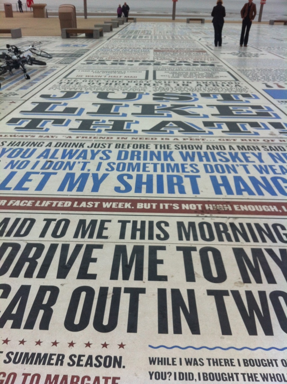
Commissioned by Blackpool Council and created by artist Gordon Young, the Comedy Carpet was something I'd been longing to see. With my youngest sibling a resident of Blackpool, I leapt at the chance to sneak off to the town for an overnight stay on her sofa, from which you can see the glittering tower at all hours of the day and night. With a Saturday afternoon to kill by myself, I finally got the chance to walk around the Carpet, the largest piece of public art ever commissioned.

Why Not Associates designed the 2200 square feet of typography, which uses 160,000 individually cut letters showcasing the words of 850 comedians and writers. All those figures don't mean a lot, though, till you stand in the shadow of the tower at one corner of this massive and lovely artwork, and wander around it. I would like to have been laughing more at the jokes, but I couldn't get past the size and complexity of the piece, thinking about the five years it took to make and the scale of it.

While I was there, people rode their bikes on it, sat on it, ate their chips on it, read it, laughed at the jokes, drank coffee while sitting on it, photographed it - sometimes arranging themselves around the phrases as if they were saying them - or just perched on the surrounding benches, watching the sea from over the cool, smooth stone and concrete. The wind was a bit fresh, and the sky grumbly, but it didn't seems to put off any of these hard Lancastrians and their even more determined visitors.

It is one of the most impressive pieces of art I have ever seen, public or otherwise. Prettiness or scale I enjoy, but because I'm knocked for six by anything which merges art and engineering to spectacular effect, and because this is also a breathtakingly big dose of beautifully-set type, it beats anything I've seen before. Along with my Blackpudlian nephew who's due to fanfare his way into existence any time now, it will be right there for anybody to walk, ride, lie or eat chips on for many decades for come.


http://comedycarpet.co.uk


Inspired by months of research on traditional comedy print, posters and bill matter and their typefaces, along with absorption in the glittery typographic joy of Blackpool itself, each individual slab was designed separately.


The website (or the book you can buy about it from Blackpool) explains in juicy detail how the carpet was made. But in a nutshell, the letters were but individually and typeset just like metal or wooden type - along lines, and carefully set with punctuation and decoration. Then, a specially-formulated mix of bright white and hardwearing concrete was poured around it, then polished and buffed to a supernaturally smooth finish. The process looks completely absorbing (these pictures borrowed from the Comedy Carpet website).


The carpet under construction:

The carpet finished, from the very top of the Tower:


Phew. It's exhausting. Only fat, salt and mustard can possibly aid my recovery...

LinkWithin

Related Posts with Thumbnails