Thursday, April 26, 2018

Dreadful Young Ladies


Dreadful Young Ladies by Kelly Barnhill was published in February to a ripple of curiosity on Twitter - 'who's done this cover?' 'Does anyone know this cover artist?' 'Who DID this?'

I've never experienced this before, and certainly the cover is one of my favourite covers ever, so I'm finally happy to put my name to this gorgeous, murky, witchy collection of stories about women and girls using powers they shouldn't have to do things they shouldn't be doing...or should they? Grief and hope, jealousy, loss, power and love all surge through this ornery family of tales in this, the author's first book for grown-ups.

The characters live in unusual worlds different from, but eerily familiar to, our own. I can only urge you to read it for yourself; I rarely get the time to read an entire manuscript, usually having to work on sections selected for my by the editor, or getting half to two-thirds of the way through it in order to glean clues for the cover. But this one I read cover to cover.

Commissioned by the wonderful, patient Laura Williams of Algonquin Books, Chapel Hill, this hardcover needed a legendary treatment. I had a slightly slow start, aware of the impact this book was going to have for both the well-known writer as her first adult fiction, and the publisher. But once the stories had been consumed, sketches started to flow - from this peep into the mind of the writer - or is it one of her characters? -


to this typographic treatment based on fairy-tale lettering undermined by the bugs, webs, eyeballs and bones of the supernatural element to the stories:


I looked at further type treatments, suggesting we build the macabre feel into the letters themselves, with a rather Gothic and energetic feel:


- before settling on this insect-woman with wings crocheted together from story elements. The human-moth woman's enormous braid was inspired by an earlier illustration from a poetry book for Andrea Gibson which was not included for being potentially controversial - it had a serious political tone, for a seriously political poem. I was working on the two books quite close together, and the rejected braid just fell into place as the centrepiece of this giant (tiny?) insect:


Once this was approved, came the job of inking it in. Check the time-lapse of this happening!


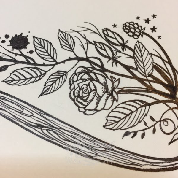
The artwork took a couple of days before being laid over a hand-inked background texture:


and falling stars. Then the inside of the book needed little icons for its chapters, so I created a whole set of numbers and chapter headings, with dark little wing-dings to break up text:


Satisfied with the job, Laura and I sent the whole massive, multi-layered file off to press and  put the book to the back of our minds until publication day.

And then one day in January...it arrived.

I struggle to describe how beautiful the book is - because I didn't expect the other 50% of the cover to be so beautifully complemented by Laura's breathtaking choice of paper and print. A skin-feel stock hugs the black, gold-embossed hardback, and the cover itself shimmers with a layer of pearlescent ink underneath the CMYK:


The pages are artfully studded with my inked decorations, brave chunks of white space adding to the tension:


and check out the shimmering as you turn the cover in the light:


This is one of my favourite covers ever, and I think that's down to a few things combined. The subject matter appealed to me straight away, and was pitched to me enthusiastically by Laura who described me as having precisely the right blend of skills and vibe. Thanks Laura! Second, the artwork is only half the story of this cover - the paper and finishing bring the whole thing to life, creating a curious, slightly unsettling-feeling object which, without even looking at the words, you want to pick and turn around in your hands.

Thank to Laura for commissioning me, and to Kelly for writing the book. She's writing two more, and I can only hope that one of those might make it my way. We know Oprah liked this book, having added it to her to list this year:


And in the meantime, you can fead some reviews of the book here, and if you're in the US buy a copy here, or in the UK, from here.


Tuesday, April 24, 2018

Sleight!


This book by Jennifer Sommersby is published today in the USA by Skyhorse Books and has the honour of having the only one of my covers ever had turned into a cake!

(I've done a cake before as an exhibition piece, but this was something different...)

But before we get to the iced version, here's the inked one. First, the blurb:

"Growing up in the Cinzio Traveling Players Company, Genevieve Flannery is accustomed to a life most teenagers could never imagine: daily workouts of extravagant acrobatics; an extended family of clowns; wild animals for pets; and her mother, Delia, whose mind has always been tortured by visions—but whose love Geni never questions. In a world of performers who astonish and amaze on a daily basis, Delia’s ghostly hallucinations never seemed all that strange . . . until the evening Geni and her mother are performing an aerial routine they’ve done hundreds of times, and Delia falls to her death.

That night, a dark curtain in Geni’s life opens. Everything has changed..."

Now I'm better at drawing animals these days, having got over my early phase of 'everything looks like a poorly gerbil', but this brief came with a request for elephants and lions - so I had some trepidation. The story is a dark one - actually quite a grown-up read, and since it landed in the middle of a lot of middle-grade and YA books, this one required a swerve of brain.

Although the layout came to me immediately, it took some time to get the feel right - colours were too bright, the lettering was too friendly, then too sinister - and the lion originally took centre stage:


- being replaced buy the big magic book that features in the novel:


and once approved, the artwork was inked in a bit at a time, with iPhone shots from the desktop sent to Kate to keep her updated:


As I Art Director Kate Gartner and I worked together we arrived at a satisfying balance of menace and energetic line and colour - with plenty of colour and mood tweaks along the way (I loved this really dark version). The stabby points from the title were removed too:
with the finished version looking like this:

The original art is now in the collection of the author Jennifer herself, who was delighted to receive some real ink-on-paper. I often talk to my authors about whether they'd like to acquire their original art - most do. But they're often surprised to receive paper with ink and pencil on it. My way of working is by no means unusual, but so many covers are handled entirely digitally, I think they appreciate the tangible, hands-on feel of slightly crusty, thick black ink applied with a very sharp nib!

Thank you to Jennifer and Skyhorse Publishing for the opportunity to do this cover.

Here's that cake, baked for Jennifer's Publishing Day Party!
Baked by Jenn's friend Jane in Vancouver.


Tuesday, April 10, 2018

Enchantress From The Stars - my first sci-fi cover!


Published afresh this week, Enchantress From The Stars was written in the 1950s by Sylvia Engdahl, but not published until 1970. A 'young adult' work of science fiction, it was the first in the series set in the Anthropology Service Universe, and was nominated for a prestigious Newbery Award.

The job of creating this cover was given to me by Donna at Bloomsbury New York, and the challenge was to create something very fresh and contemporary while communicating the sci-fi nature of the story:

Elana, the central character shown in ethereal ink on the cover, belongs to a peaceful, technologically advanced, space-faring civilization called the "Federation", which monitors worlds which are still "maturing", allowing them to grow without any sort of contact or intervention. She stows away on a ship in order to accompany her father on a mission to a planet where intervention has been deemed necessary, because a technologically advanced empire has invaded the planet in order to take advantage of its resources. 

In order to lead a young woodcutter (a native of that planet) against them (without exposing him to the truth about either alien civilization) Elana takes on the role of an 'enchantress'. She gives him various tools, leading him to believe that they are magical.

Pre-dating television programmes such as Star Trek, the book explores many of the themes later covered by them, in particular the peaceful exportation of space without intervening in the existence of any other planets. Specifically, the story looks at an emerging concern - the environment, and the plundering of its resources by corporations - here presented as 'a technologically superior empire'.

Having never done a sci-fi book this opportunity pleased me immensely - but could I capture its essence in ink? Initial thoughts went to 70s-style pulp sci-fi covers, but moved quickly into darkened skies which may or not be seen from earth, stars, and a character who although only seen in silhouette is clearly not from our time or place.

Here are the roughs and ideas as they developed. I knew I wanted the texture of some of then 60s and 70s paperback art I'd seen - and collage seemed a good fit, something that could have been created closer to the time Sylvia started writing the book, without digital intervention:


I liked the idea of Elana walking the universe, so put her in front of an inked globe in which the community is seen huddled inside, its lights on and smoke from the chimneys. Her clothes are part-rastafarian-influenced, part 'Rogue One', and part Egyptian Queen:

Variations on a theme used ink-soaked, folded paper dried to a crisp on the range, with bleached-out stars and layers stuck over the top:


(Note numbers for easy client referencing!)


Later ideas explored this mildly disturbing, ink-and-collage portrait of Elana, her eyes like other worlds - I reckon I could have made this one work!
And a hand-drawn lettering style that was meant to sit somewhere between Star Wars, 2010 and Gravity:

In the end the combination of defiant face-on stance for Elana, jewel-like colours for the world she lives in and a strong, hand-drawn title won out. Published today, I hope the book goes on to be consumed by a whole new generation of young readers, all enthralled by this early, female-written and female-told story of life among the worlds we're only just starting to understand!

The book is available to buy here in the UK,
and here in the US.


LinkWithin

Related Posts with Thumbnails