Friday, February 09, 2024

Sage Francis 3.0: an always-evolving logo

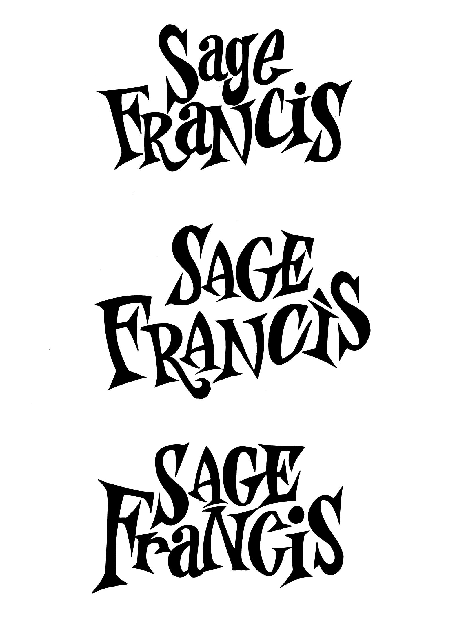
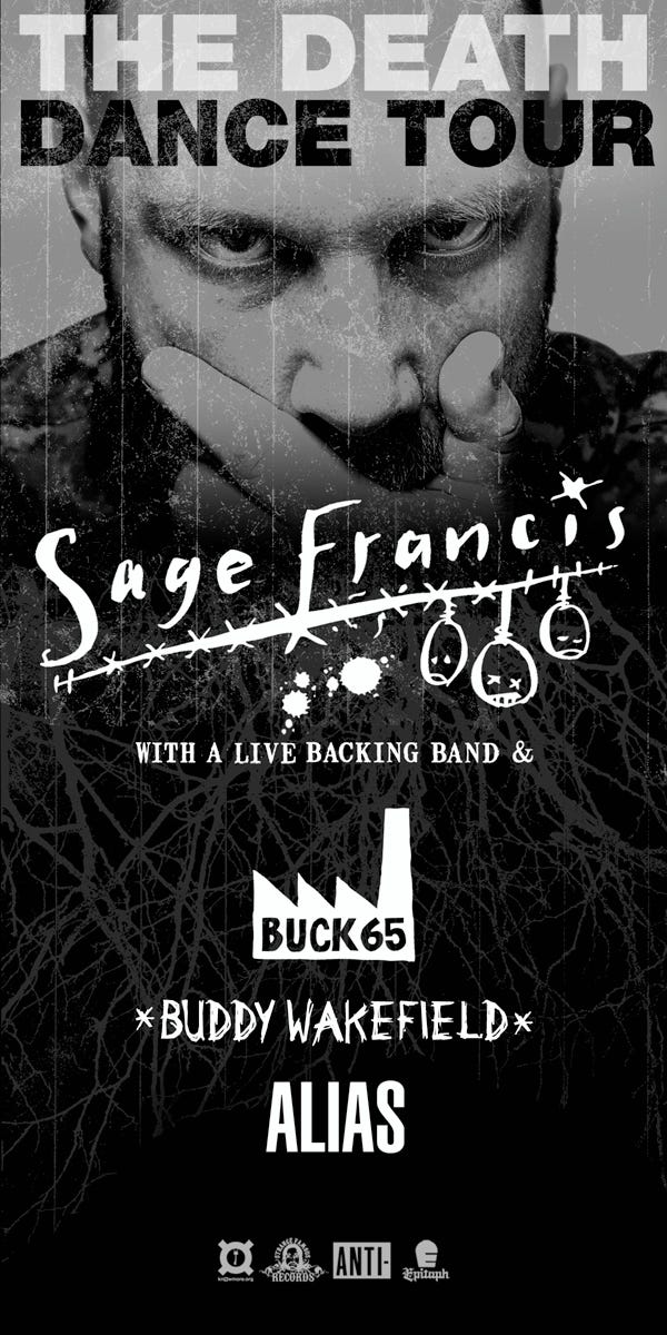
Artist, record label boss and rapper Sage Francis has just unveiled his new logo, over 20 years since I first fell in love with his records, 18 years since I did the biggest art project of my life on his work, 16 years since I did a piece of art that wasn’t meant to be a logo but became one, 17 years since I did his first proper ‘new logo’, and ten years since I designed him another ‘new logo’. Like the artist himself, this is a logo — and a relationship — that doesn't stay still!

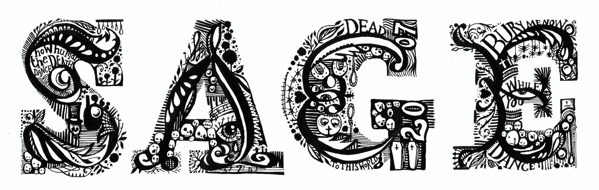
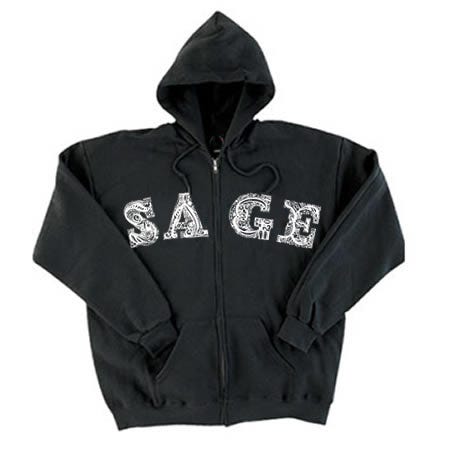
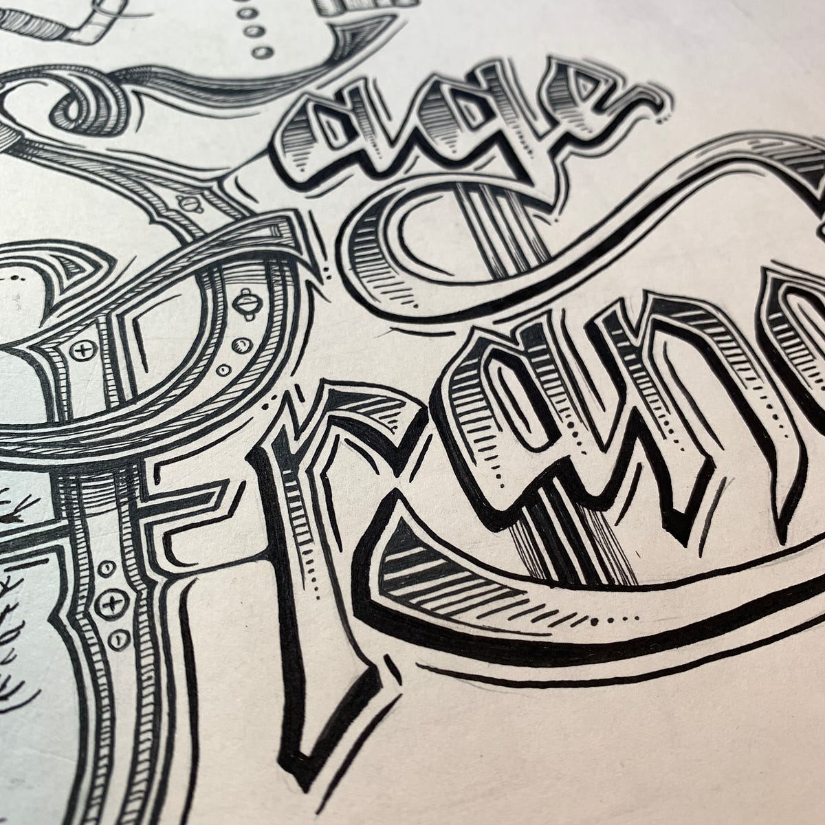
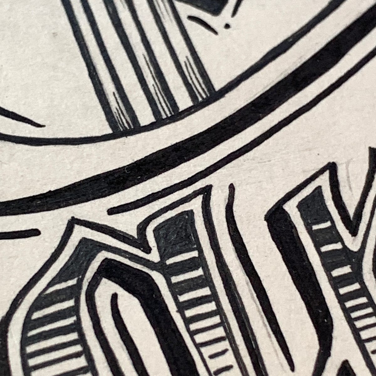
We never sat down to do a logo, to brainstorm or sign an NDA or moodboard or A/B test or anything else. It’s been a fully organic journey. The first one was actually a piece specially created for the 2007 Manhattan outing of our big Sage-inspired show, If A Girl Writes Off The World (a pre-Adobe Dreamweaver-built site will open up. I built it myself and it’s so poignantly 2007). It was picked up and put onto some of the hoodies in Sage’s Strange Famous merch range — best-sellers at that. Detailed and writhing, it was made with a very fine Nikko-G nib and black ink. The original is actually very small, and framed in our hallway.

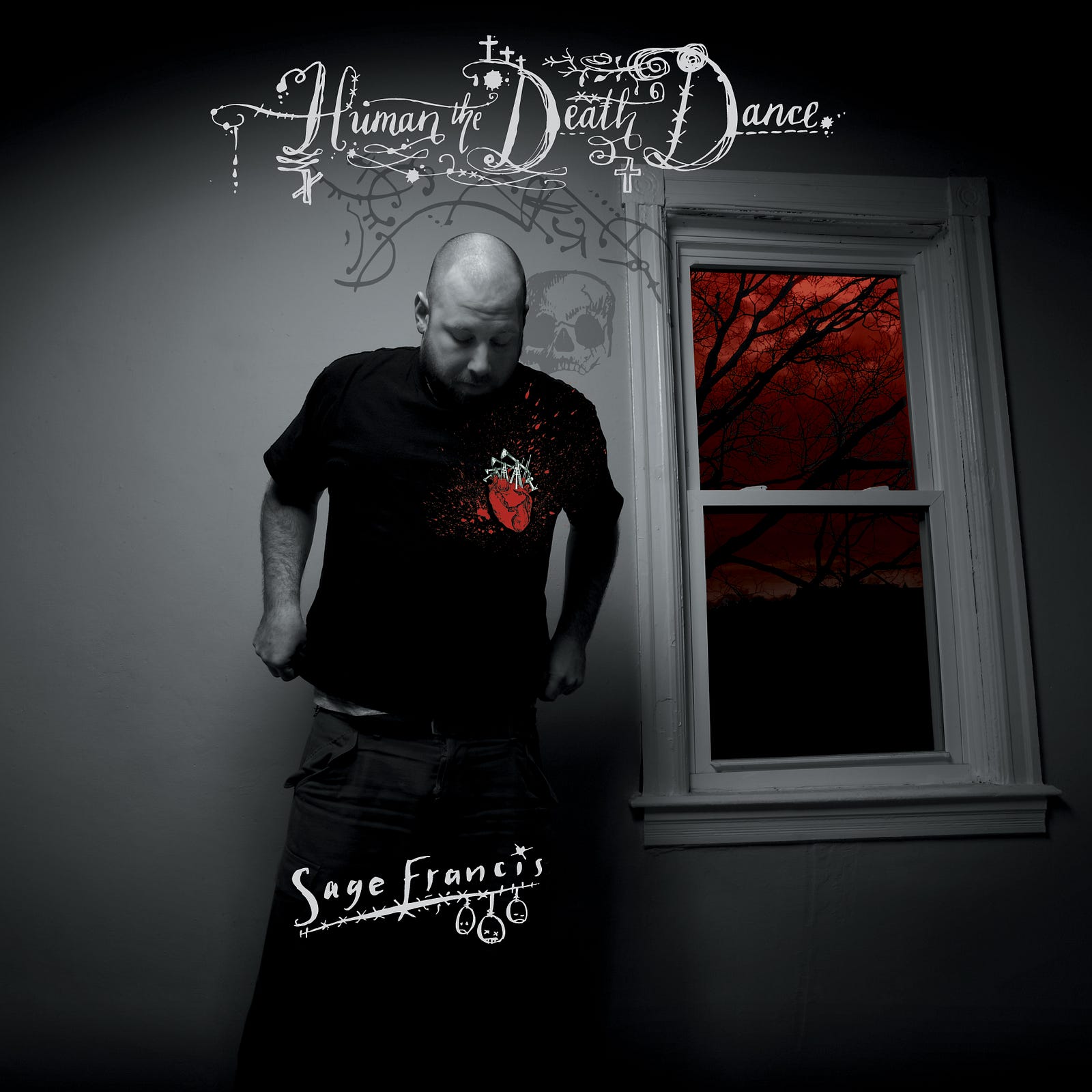
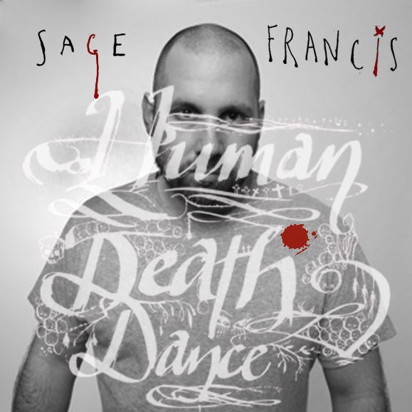
The second was kind of accidental as it was made for the cover of Sage’s 2007 album Human The Death Dance. It just kind of…started to get used on things, posters, ads, posts and merch. In the way that a logo does, I suppose. Made with an inkpen and nib, it featured sad faces and a minimal slope, just designed to peer over the shoulder of the man himself, next to a watermark-like Death. With hindsight, it was flimsy and odd, but then again…unlike a lot of my formal client commisssions, I hadn’t ‘sat down to design a logo’.

The album cover. Which was almost…
…this one instead.

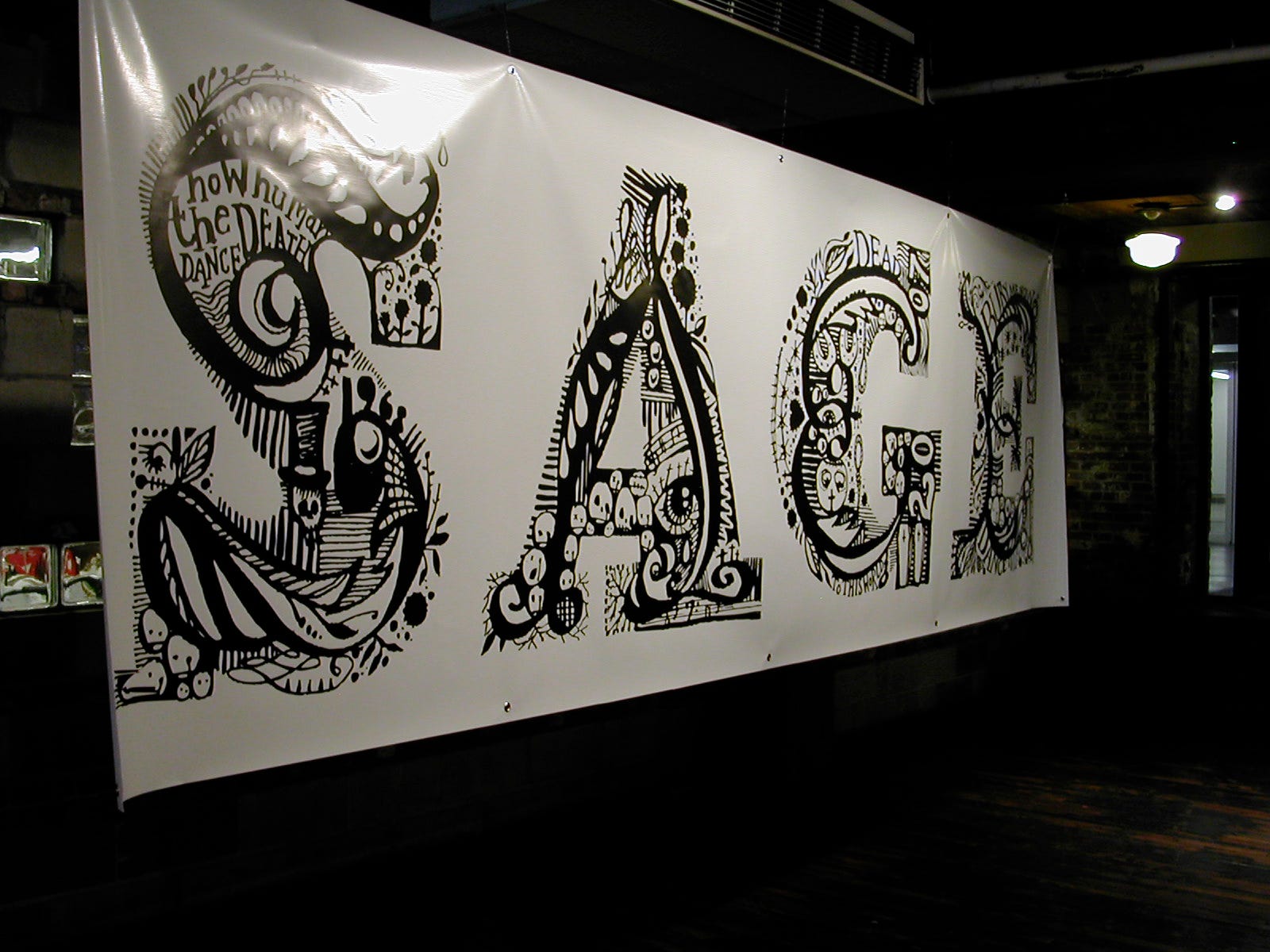
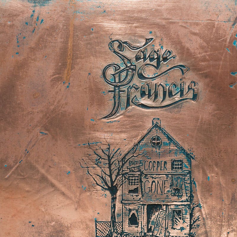
The one that came after that was also for an album, 2014’s Copper Gone. It formed part of a single piece of ink-on-paper art but once again lived a life of its own, and served as Sage’s identity for the ten years prior the current one. I almost can’t believe myself the huge spans of time I’m casually throwing around here, by the way — but those are the dates, and this is the longevity of it all.

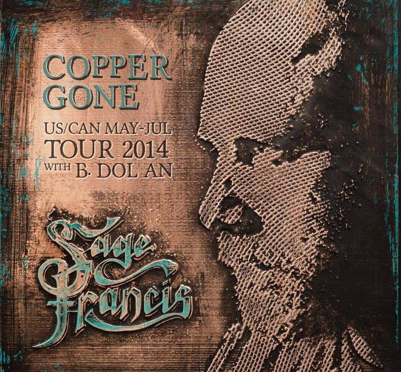
Again if I’d known at the time that this would be deployed in the way it was, there are things I’d have changed — but would it have improved anything? Not sure. Really not sure, but at some point someone filled it in and made it solid — which wasn’t a cool move, and around that time I began thinking, I really need to do that properly, or scrap it and do the whole thing again.

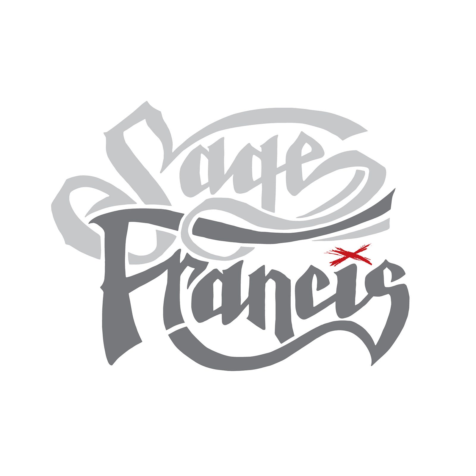
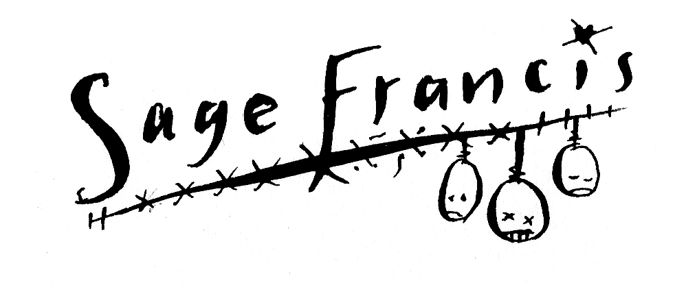
Eventually I did. I can’t remember whether I just did it and sent it to Sage with a note saying ‘this really needed doing’, or whether he asked — it doesn’t matter — but the outcome is this one. This time I *did* sit down to ‘make a logo’ from the roots put down by the Copper Gone iteration, but clean and clear. I faffed and tweaked and moved vector points and smoothed out bezier curves then undid it all, and repeat, eventually creating so many versions I think we actually really should have done some A/B testing. But there it is.

There are still things I’d change, even now, and it may or may not serve for another ten years. But I like the organic and slightly clumsy way all of these were done. They sort of ‘happened’, which is very different from the art-directed, purposeful, accountable way I do my other work.

The final. I think. Not sure. I like it. Sage likes it. But do I like one of the other versions more? We can always use one of those…can’t we…I think. We fly in the face of your Logo Rules, sir!

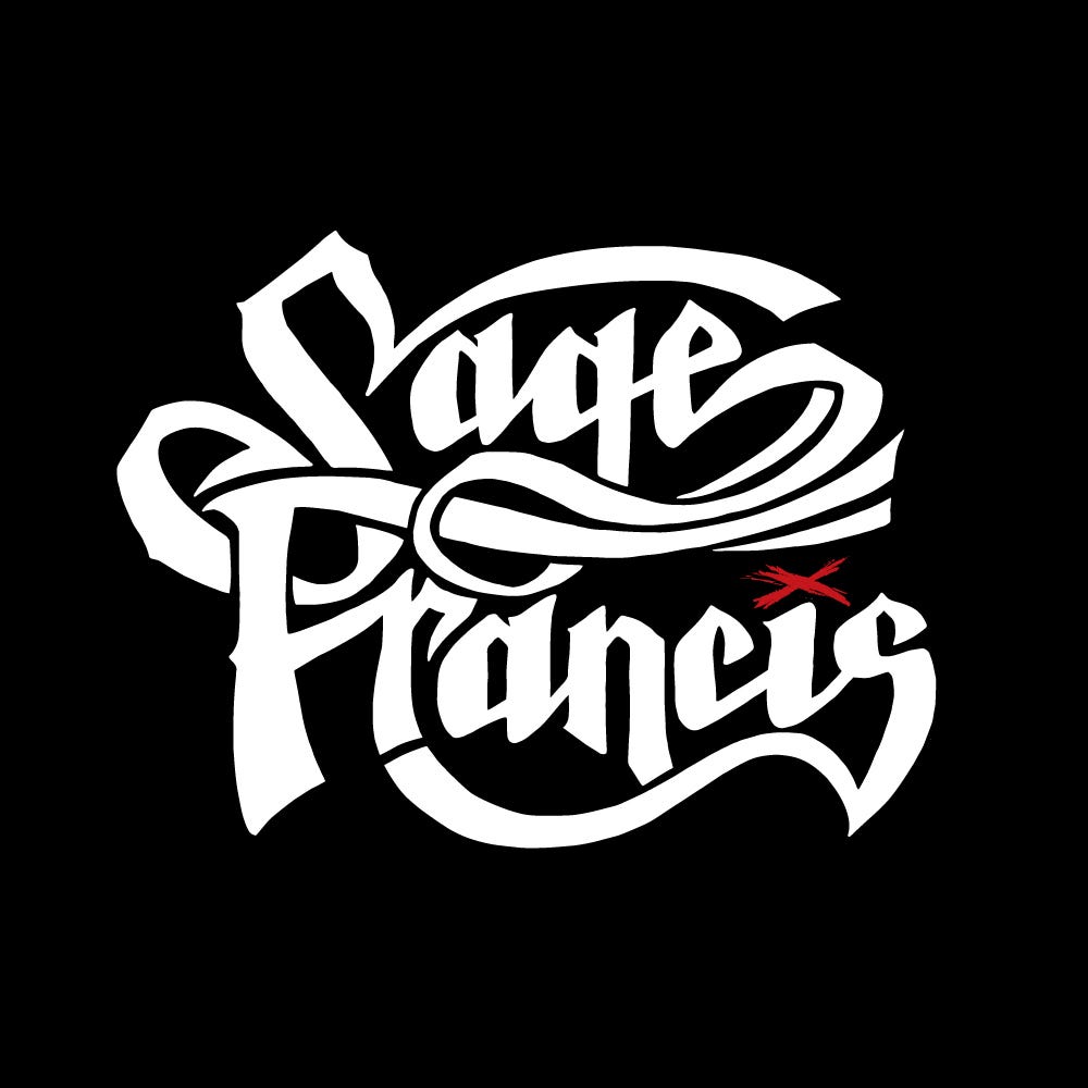
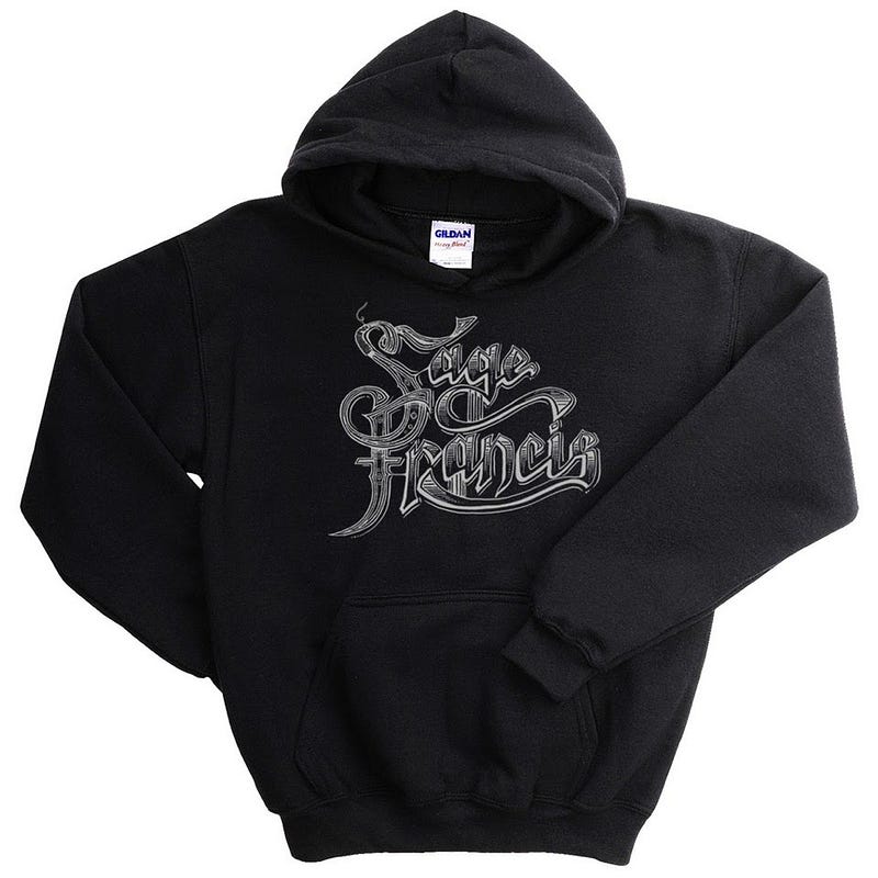
When Sage posted it to the fans, most people just loved it and started slapping money on the counter for the T shirt. Someone said ‘Francis’ reads as a completely different word. Someone else said having seen it they’re now expecting a country album (which I applauded).

I still look at it and see a curve I would change, bits I’d move, and I stare at it till I’m logo-blind. But honestly, I wouldn’t have it any other way.

Thanks Sagey for the wholesomely organic way we do things, every time.

(If you want to read more, there’s a bunch of historic blogs here).

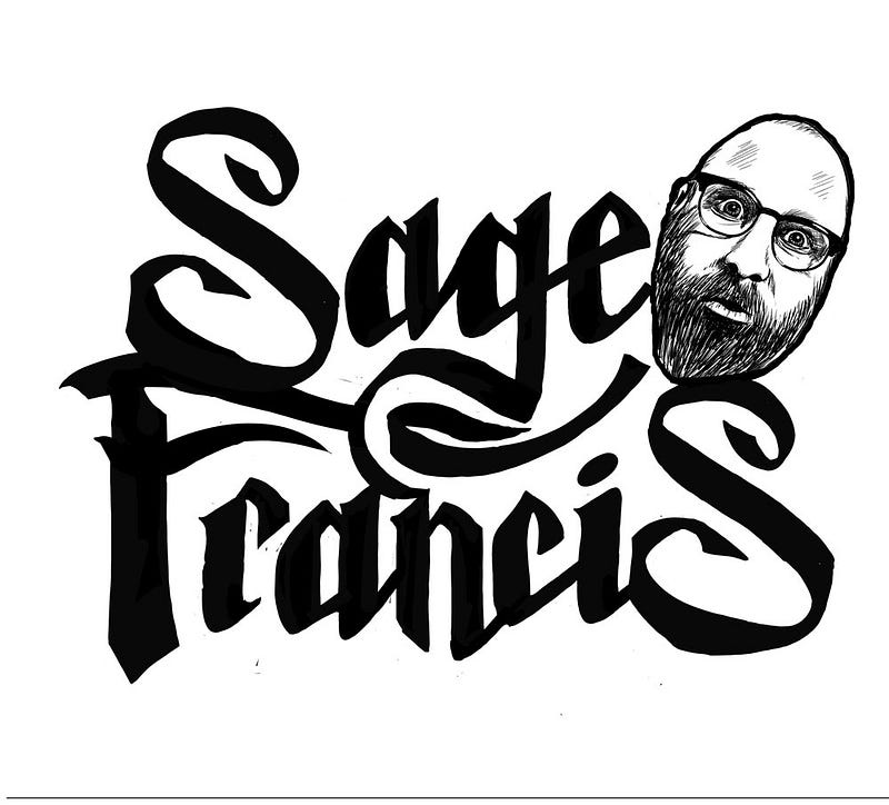
P.S.; this one was a wild card, and Did Not Make It. Nor shall it ever…I think…


Wednesday, February 07, 2024

Writing Their Story

I’ve just posted a new project in my folio, and although I’ve got over 20 years of pharmaceutical work hidden away in a password-protected archive for all manner of legal reasons, this one I was able to share. And I’m glad, because it was both a privilege and a responsibility to work on.

We watched 'Stilllast week, the documentary about Michael J. Fox’s life as a person with Parkinson’s Disease. We were shown the myriad clever, agonisingly secret techniques he developed to hide the effects of the disease for as long as he could. We watched the trembling left hand always given the task of holding something or gesticulating, and the way he exaggerated his already restless manner of moving through the day, in order to fold any twitches or unexpected movement into his famously energetic modus operandi.

It was funny, educational and extremely moving, and the moment we were shown his hands beginning to move I thought of this project.

Commissioned in 2020 by Saatchi Wellness, it was designed to communicate the effect that Parkinson’s Disease has on motor control through the power of handwriting. My job was to develop a set of authentic handwriting styles for a set of fictitious patients, each with unique characteristics, that are shown both subjected to the effects of Parkinson’s, and after treatment by the drug Duopa.

Although it isn’t suggested that the treatment returns the patient to pre-Parkinsons handwriting, their motor control is shown to be sufficiently improved as to render their writing readable once more, communicating a sense of a return to empowerment and confidence. The stories of each individual are based around achieving modest, important tasks such as picking up a grandchild, or dancing with a partner.


From the Duopa project, working with Saatchi Wellness: the patient’s handwriting is challenged. It had to be hard to read, but not difficult, and accurately demonstrate the potential effects of the condition. You can see this image in use on the website.

The conclusion to the story is the patient’s handwriting showing the improvement in his condition; he’s able to hold and read a book.

The two shown here are from a larger set we created, with a complete font developed for use on behind-the-scenes assets. The research and development for this project was extensive and very moving at times, and I cried a few times as I channelled everything I’d learned through my fountain pen into the words of the imaginary, but also very real, patients.


Part of the developmental work for this project.


A small section of the font I created for the Duopa project, including the range of variations that are possible within the scope of the disease’s effect on the patient’s ability to write. This is manifested in the changing ‘T’s, ‘U’s and ‘V’s shown here.
Some of the many. many experimental pieces created for the Duopa project, showing notes and adjustments. Each of these handwriting styles must be thought of as ‘a voice’, rather than simply ‘this is how they write’.

I do a lot of what might be called forensic lettering work — maybe that’s too exacting, perhaps ‘reproduction lettering’? — whereby I’m called on to recreate the handwriting of a famous person, or someone deceased (sometimes both) for advertising or TV, film or books. Some of won’t be seen publicly. I’ve also done a lot of work that involves developing handwriting for fictitious characters — in fact, I’m doing one right now, three different ‘voices’, three different ages and situations, with a different choice of writing implement for each.


An example of the specialist lettering work I do. Here I’m recreating the handwriting of the physicist Paul Dirac, one of the founders of Quantum Theory, for use inside and outside the book, using just handful of the extant references available. The age and style of fountain pen used were of great importance too.

It’s harder than you think to override your own muscle memory and install new clicks and flicks of the wrist, different angles and pressure and descenders, a way to dot ‘i’s and cross Ts that’s someone else’s, and to keep it consistent — while tying in any historical factors too. In fact, it feels more like acting than design or lettering work, and it’s a million notebooks away from calligraphy. Once I’ve got the writing locked down, I can get into that costume and ‘be’ that person for as long as I need, even switching between them day to day. (There is, incidentally, always a voice that isn’t mine that accompanies the words I’m writing.)

But I love the immersion and focus that comes with the task, and the attention to detail. It’s very different from the kind of lettering I might make for an editorial or a logo, where I throw my brush, nib or Apple Pencil across the page with energy and only the loosest idea of outcome.

If you would like to know more about this type of work, please get in touch. In fact — write me a letter; I’m far more likely to respond…and who knows, maybe I’ll do it in your own handwriting.

Images shared with the permission of Saatchi Wellness.

https://www.duopahcp.com

LinkWithin

Related Posts with Thumbnails