Thursday, February 23, 2023

Avon Called!


Cosmetics, jewellery and perfume mail order behemoth Avon asked me to create illustrations that worked with and around the model for their new fragrance range last year, in a campaign which has just gone live.

The 'Eve Become' quartet of fragrances consists of Truth, Privé, Confidence and Eve; each created to reflect a different aspect of the wearer. Taking their cue from womanhood and everything the word can mean, and presented in beautiful, contemporary glass bottles, the scents offer alternative vibes depending on your mood on the day. The company needed a collection of images that spoke to the changeable nature of femininity. 

Working with UK-based One Production, I went to London on the day that the PM resigned - definitely the topic of the day while we had our introductions - to be present at the campaign's photo shoot. Peering 'behind the curtain' of the hours-long process was a thrilling treat - I've been on site for all sorts of ad and photography-based things, but not a shoot quite like this. After a coffee or two I got to work sketching live on my iPad as the models went through their day, having makeup applied, hair tweaked and clothing pulled into place around them (with two very appealing dogs to entertain us in between takes - see below). Those girls were impressively professional - young, skilled and infinitely patient!

Surrounded by a team that included photographer, stylist, lighting team, director, photo editor and a catering and logistics squad, I wove my way in and out of the action Procreating spontaneous sketches. Not intended to form part of the final ads, these were made to capture a vibe that would inform the work later, back in the studio:


(Her name was Margeaux, and she was enormous!)


Back in the office week or so later, the selected photos were sent over to me and the work began. We'd already explored some ideas - two sets of suggested looks, one digital and one ink-made - so we had an array of looks to base the final pieces on. Here are some of the analogue tests:


And here's a handful of the digital pieces. These ones I absolutely loved, because they're very much in the realm of the kind of work I'm really into at the moment - free, energetic, and with a delightful amount of spontaneity!


One of the things I'd offered to do as part of this job - in fact, something I offer all my clients now - is capture the process of making the work. This is a brilliant thing to do for two reasons; first, the client gets to see the process, which can not only help to shape the final outcome but can be really useful for communicating how long something might take, and what's involved in adjustments, and second, small snippets of film can add incredible value when it comes to social media and passing those 'peeks behind the curtain' into the client's audience and customers. So the pieces for this campaign were captured at almost every stage, in closeup, for integration into the final ads:


The process of developing final pieces was a delightful sequence of back and forth between myself, art director Rich Gent and the Avon creative team, wrestling with the edges of ink, line quality, and just how organic the art should be. In the end, the final pieces were a mix of real sloppy ink on paper and digital work - maybe you can see which is which, maybe you can't!


This little gif was a tidy example of how the team blended my
live capture with video and stills from the shoot.


Thanks to Rich, Lottie, Lesley and Melanie for involving me, and to my agents at CIA through whom the job arrived. It's become one of my favourite jobs ever!


Wednesday, January 18, 2023

"I can't imagine a life without music."

Gordon Hayes, owner of Nervous Records, the longest-serving record shop in Hinckley, died on Monday, and a town is in mourning.

Gordon was our friend, and was thought of as a friend by most of our small Midlands town, it seems. With sparkling blue eyes behind spectacles gently channelling those of his idol John Lennon, he wielded the exuberance and sparkle of someone much younger than his date of birth might suggest; sharp of wit, firm in his beliefs, he was unfiltered in his kindness and generosity.

So far this sounds like the kind of write-up that would have him cringing, batting it away with a checked shirt sleeve while offering you a cup of tea. I can hear this distinctive voice tutting and laughing as I'm sitting here grappling for phrases that don't succumb to cliché. You can hear that gentle voice in this interview.


I grew up next door to Gordon's Dad, Eric, who lived at No. 4 Hays Lane. It was decades before I was corrected in my belief that the lane was named after Eric; it wasn't, as Gordon pointed out one day, because his 'Hayes' has an 'E' in it. Gordon would arrive at No. 4 in a rocker's jacket with long hair, cool specs, looking grown-up and dramatic, and I would watch as this elongated, slim 'youth' wandered up the drive. That's Gordon, my Mum and Dad would say.

He opened his shop in the 70s, and its history is the subject of this documentary. And although the shop's breathtaking longevity is impressive in itself, surviving recessions, streaming, online shopping and pandemics, this blog is about the man who ran it.


He bought our records, we bought his; he ordered in the rare things for us. We sold him records, he sold our 45rpm adapters during the years that we made them. He bought our vegan solid chocolate eggs and we drank tea. There were all the conversations in the Co-op; the joy over their vegan doughnuts, when such things were still a distant fantasy for us. His horror when it closed down - how far was he going to have to walk now! I still refer to brussels sprouts the same way as him, my fellow sprout-lover— ‘little cabbages’.  I even designed him a new shop logo once; I think he used it on paper, but it never made it to the shopfront (why would it, when his hand-rendered type stands as bold and clear today as the day it went up?)

And he was our biggest cheerleader when we released a 12" with Sage Francis:


Gordon came to our gallery events and surprised me with his never-diminishing interest in my work. I worried I was boring him if I went off on a work chat, but he was always curious. Maybe I was still the art-school teenager in his eyes; the one that would have walked into his shop asking for awkward records when I could easily have sought them from the 'other' record shop - the one I didn't like to go in, because the staff could be aloof and they never had what I wanted.


Speaking of work, his DIY ethic was front and centre, and a significant contributor to our own modus operandi. Of particular charm were Gordon's hand-drawn shop signs. Long ago established as a way to save cash, his beautiful, almost casually-calligraphic letters were called upon to write every sale board and every poster. He somehow managed to master kerning and justification without resort to digital means - no small achievement. The little stars too; check out the little stars!


I was emailing him a week or so ago, as he'd sent me his annual home-produced birthday card - always funny. His last words to me were "Again, just the one at the back!" - I chuckled, but it wouldn't be funny here even if I tried to explain it. Gordon's desire to argue his point was strong and informed, but he was also a listener. His lapel badges and posters were a neat non-verbal heads-up to his stance on a way of life - which you could choose to engage with or not - and wherever you stood on the spectrum of those issues, he'd talk with you about them all. His influence was such that, having had to give up dairy in 1997 as an already non-meat eater, I was inspired to cut the remaining animal-based foods and products from my life, like Gordon. We continue to live that way today, and in further examples, we're able to reflect back on our music-buying and identify the things that came to us through the Nervous sphere of influence.


In the hours after the news of his death was made public, Gordon’s many customers began deploying the word 'legend' - and when I looked it up, I realised it wasn't a lazy superlative; it actually fitted like the proverbial Smiths' Hand In Glove:


His legendary status came from his humility, his wealth of knowledge, his ethical stance, his humour and warm welcome. There’s more, but they’re all quality traits in a human. His existence on earth spanned seven decades, so not only did he possess a musical knowledge that was empirical and encyclopaedic, he had a customer base that was multi-generational: people all over the area knew him, but so did their Grandpas, their Mums, Aunties, siblings - and then their children. The poet Buddy Wakefield, seen with Gordon in the photograph above, said "truly humble people don't use the word humble"; Gordon's humility first and foremost seemed to shape everything else he did and was.

He's gone. But someone on Facebook said that they thought Gordon "was just always going to be there" - and in all the ways that truly matter, he will be.


~ The growing collection of tributes outside Gordon's shop today, 18th January 2023. ~


Photos: First (Will Johnston/Leicester Mercury) and last photo of Gordon borrowed from The Hinckley Times where I briefly worked as a typesetter of obituaries for a while. All other photographs are my own.


The Annual Fist Fight.

I've just seen someone talking about a website called My Future Self where you write to yourself privately and check back in later - either much later, or just a few months. The potential for encouraging, moving, sorrowful or grateful readings years later is all there, and it seized my imagination in the moment. What a novel idea, I thought.

But then I remembered I've been writing myself a letter every single year for the past 16, 17, 18 years - I can't remember how long, as I don't always keep the letters. I do it once a year, and I always do it as I'm taking the Christmas tree down, filing the letter in a sealed envelope deep in the decorations box. Then, when it's time for the decs to be put out once again, the letter is there, and I'm able to review where I was - and see where I am, in comparison.

Every single time I forget a letter's going to be in there, then I laugh at my own surprise, and then I see it and I put off reading it because I'm a sombre little sod with a leaning to the saturnine, especially at the turning of the year when Christmas is over and I've a whole year yawning out before me. No-one reads this letter, and I wholeheartedly don't want them to; I can't bear the idea. It's addressed to Moley, because that's what Leigh calls me and it's what I feel is most purely and entirely Me. And usually, in that moment, I'm feeling a bit small and mammalian with trouble seeing into the distance.

Moley's usually a bit sad, and the letter's always long and a bit rushed, because I write it between dusting and wrapping up decorations. I never thought I did journaling - I react to the word with the cynical lip-curl of a teenager who thinks All That Stuff Is Bollocks (which is a cringingly obvious sign I probably should be doing some of it) - but I realise this is what this is, albeit with entries a year apart.

What do learn when I read these letters? 

Well, I learn that I love to moan it all out onto the paper. All the things I can't say to anyone. I am very cross with myself, often. I definitely swear a lot and I stay angry about things. not exactly grudges, but if I spot something that seems to be afflicting me fro one year to the next, I can see that I get really f*cking angry about it. I like to take it all out on myself. I like to take it out on others, too. I like to choose a different sparkling fountain pen ink to do it with, the glitter gel pens of the same eye-rolling teenager much in evidence. And I also see that the struggle is real when it comes to giving gratitude: these letters have shown me year on year that I can only see the things that aren't sorted, that weren't done, and that still need work.

Work itself, actually, isn't mentioned that much - a significant book publication or project might get a nod, but that's not what this is about; I have Instagram (for now) to show me chronology of professional high points. When it comes down to it, my assessment of the success of the year hinges on three things, and is seen through the prism of those: my relationships, my health, my mind, and the stuff I didn't do.

I still have a lip-curling teen reaction to the idea of journaling, of brag documents; I'm not comfortable with end of year round-ups of my achievements on social media (though we do that privately, making coffee and going over the previous year's wall planner before we put it away) but I wonder if I need to rethink my approach. Because left to my own devices, left to my own blank page, I only fill it with ire. And the amount of stuff to be grateful for, and celebrate, is actually overwhelming.

"Beating yourself up is never a fair fight" - Andrea Gibson
 

Thursday, January 05, 2023

In Spite Of It All, Life Is Beautiful.


For 2022's Christmas project I decided, in a break from 20+ years of massive annual mailings, that I wouldn't post anything - Autumn's Royal Mail overwhelm, the cost of postage, workload and the strikes led me to that decision. Instead, I decided to make an animation instead, and make a very small print run for only those people I could physically hand a card to.

As you may know if you've already seen my posts in December, I chose to illustrate this excellent line by the band Idles; it comes toward the end of their track 'The End', from their album Crawler. The end of the year, with its political, social, economic and emotional landscape almost begging to be served a reminder of this line's sentiment, was the opportunity to deploy the words we've loved since hearing them hurled out from singer Joe Talbot's passionate jaws for the first time.

They were printed in a single colour using one of my tiny Japanese Gocco printers, which use a system that's halfway between a screen print and a rubber stamp. The Gocco can be notoriously difficult to get a good outcome from, but this one came out right first time and was the perfect printing machine for this style of work.

I've been using Goccos for almost 20 years now, and have made myriad projects with them.

A relative of the Riso (it's actually made by Riso) the Gocco is a 1980s toy made for children, also used by adults and now something of a cult item, and is a gnarly, unpredictable and joyful little beast which uses small screens that are exposed with old-fashioned flash bulbs, similar to the kind you'd get with a separate flash unit on a 35mm camera. Battery-operated, the flash bulbs are single-use, as are the screws, so this is robustly not a great environmental choice - but it is obsolete, with consumables hard to find (I collect them!) that would otherwise simply be landfilled - but I've already got an alternative screen solution lined up for when that day comes.

A to-size original is printed by laser printer into white paper, which has to have a nice and deep, even toner application - this can alternatively be created to-scale using the carbon-based Gocco pens you can still find from time to time. A new screen slid into the holder, then placed under the plastic window where pressure is applied to the lid - this houses the batteries - and the popping flash bulbs expose the screen. 

The ink's then applied to the screen one colour at a time and built up once each colour dries.

Those are the basics, anyway. There's quite a bit more to it than that, but I'm going to save the detail for a video I'm making to accompany the still-sealed Gocco I have coming up for sale, if anyone is interested! I already have four...five is getting carried away...

I Gocco'd some envelopes too, and realised with horror that about 10 of our best chums were too far away to deliver by hand (I obviously didn't think it through all the way!) so did post a handful using these brilliant google-eyed fruit and veg stamps I'd saved for a rainy day - they must be 15 years old at least! But not the 1000 or so I would have posted in previous (aka 'pre-Covid') years.

I loved how these turned out, and although I adore Christmas and every speck of glitter associated with it, I sent them to people with myriad religious views and attitudes to the season of Santa, so I made them gently non-Christmassy. For that reason I also printed a heap of extras, to put in the shop, as they carry a simple message of affirmation, without the tyranny of the toxic positivity trotted out from so many memes and home decorations. You can find them at shop.inkymole.com while stocks last.


Monday, November 21, 2022

Payment for freelancers: it needs to evolve. It really, really does.

I got quite upset the other day when I got the call to collect a repaired car. 

It was my sister’s; I’d organised the repair in her absence, and I told the garage she’d settle the bill when she was back from her holiday. But of course, the garage, quite correctly, reminded me it couldn’t release the car without payment. So I paid.

Then it hit me. In that moment, as I settled the bill, I wondered why is it that I am expected to release ready-to-use artwork and then wait weeks or months for payment, often long after the work’s actually been deployed by the client?

I was staggered to grasp in that moment that in almost 30 years of working as a full time freelance illustrator running a limited company, the payment system hasn’t evolved. Every time I ask for a deposit, I’m looked at askance. Historically, too, suggesting it to an agent has them running scared — fearing that if their agency charges a deposit and the next one doesn’t, the client will simply go to that next one instead. There’s been the occasional downpayment, but in hundreds and hundreds of jobs, I can probably count those on my fingers.

It takes boldness to bring about change and I’ve felt like a lone voice for years, but I was overwhelmed that day by how different my financial machinations could look if work was paid for on delivery of artwork.

I can’t believe I’m still having this discussion, actually.

There’s hope. One client recently offered what they called their ‘new-style’ contract, nervous I wouldn’t like it — but it offered a third on signing the contract, a third on delivery of artwork, and the final third when the work was published. Now THAT sounded…evolved. Still not perfect, but thoughtful. And I couldn’t sign quick enough.

I’ve three decades of managing a business with a traditionally difficult and unpredictable cashflow; I’m good at it. But I’d rather not have had to get good at managing a wildly fluctuating income, based not on a variable stream of work but on the unknowable due date of the payment for that work. I spend a lot of business hours managing money, and always have — hours that could be spent doing other things. And seriously; in all that time, despite the increases in speed at which work can be generated and sent, the immediacy of modern bank transfers, the myriad options for quick online payments, technological marvels and invoice management, the system for ‘talent-makes-work > bills client > client uses work > sits on payment’ hasn’t changed.

And it really, really needs to.


Thursday, October 20, 2022

Thank you Marcia Willett: all those books, and all those titles.

I might do all sorts of fancy stuff as part of this job, but I've always done simple lettering for book covers - hundreds of them, many of which I never post.

I love doing them though, especially this ongoing series for Marcia Willett's books, playing my small part in these massively bestselling books.

Today, on the day her most recent book is published - Christmas At The Keep - I learn that she has died. She was amazingly prolific and adored by her readers, and I truly will miss working on her titles.


Wednesday, October 05, 2022

You’re too expensive, Sarah.

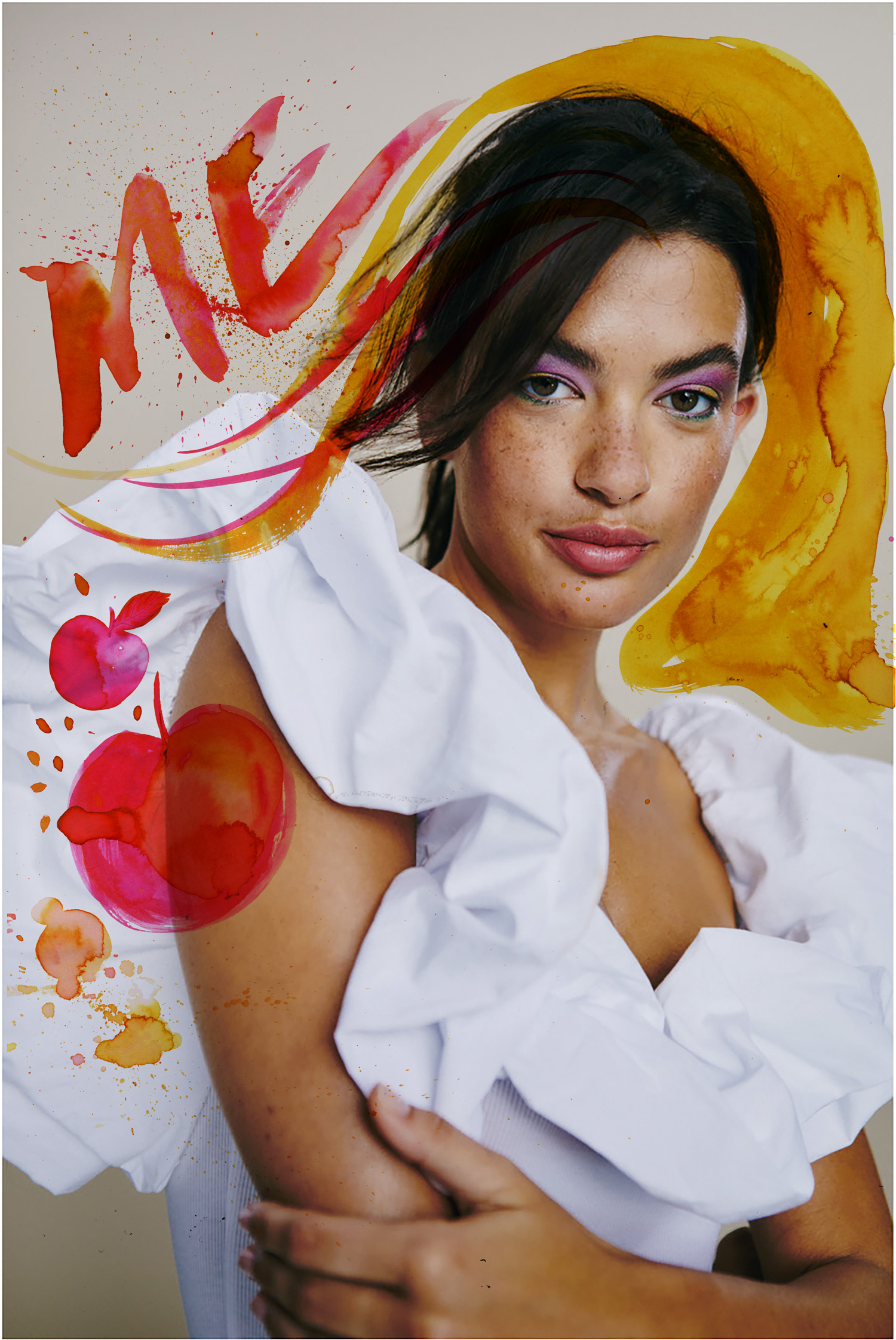
I've done LOADS of book covers - here are a few!

Here’s how a conversation went last week about a new book cover. I’m posting it because it’s not the first of its type, and its tone bothered me.

It’s a neat encapsulation of the kind of conversation I’m having more and more, but I wonder if you, as reader, also see the client’s emphasis on me charging too much, rather than the client offering too little.

Friendly and professional, it’s message beneath the words that I’m concerned about.

— — — — — — — — — — — — — — — — — — — — — — — — — — — — — — — — —

I was taught from the very beginning that the client approaches the illustrator (or photographer, or designer), outlines what they would like doing, and asks for a quote or estimate. The artist then generates a proposed figure, often with a scope of work and terms, which the client may accept, reject, or negotiate on.

I don’t remember me ever telling my builder what he should charge for the job I’ve asked him to do, told my accountancy firm they should actually halve their bill, nor listened to an estimate from my car mechanic and told him that no, actually £200 is all I’ve got, so.

But almost thirty years into this industry, am I out of date with this line of thinking?

In this climate is it a case of ‘take anything going’ and I should be grateful?

Are the days of determining your own fees gone, or am I right to adhere to a career-long policy of curating my own fee structure?

Could an AI system make this cover for zero pence instead, and should I therefore just be happy I was approached?

I want to know what you think!

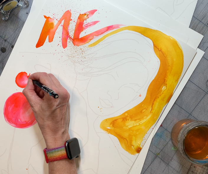
The conversation is lightly edited for anonymity and brevity (and none of the books in the picture above are related to this conversation, to be clear).

— — — — — — — — — — — — — — — — — — — — — — — — — — — — — — — — —

Client:
We’d like you to do this book cover. You’ve already worked on some covers for this author.
We will have a think about what the cover art should include but perhaps this brief summary already gives you some ideas. As the book is publishing in June we’d like to send you the art brief in early December and have the artwork for January 2023: you can let us know what is possible on your end. We can offer a fee of £500.
I look forward to hearing from you and hope that we will have the opportunity to work together.

Note that there’s no mention of whether that £500 is expected to cover a buy-out, any particular set of usages or geographical applications— so it can’t be assessed as appropriate or not by the artist.

— — — — — — — — — — — — — — — — — — — — — — — — — — — — — — — — —

Me:
Thanks very much for emailing. Nice to hear from you! I apologise for the delay as I was travelling for much of Wednesday and all day yesterday.
The book sounds wonderful and it would be great to keep the continuity by working on the cover for this author. I really enjoyed illustrating their previous books.
My fees for book covers however are much higher than the one you propose, particularly for a wraparound. Industry standard rates have admittedly not kept pace with inflation terribly well, but still sit around the £1000-£2000 mark and for the US, in the region of $2000-$4500.
Let me know if your fee is a suggested ‘starter for ten’ on which we can negotiate, or whether that is all you have available for this. I would love to do it!
All the best, Sarah.

Sounds positive and flexible — doesn’t it? Hm, maybe not!

— — — — — — — — — — — — — — — — — — — — — — — — — — — — — — — — —

         Client:

We appreciate that you charge a higher rate and we are sorry but we cannot match this.
Thanks for getting back to me so swiftly and again, thank you for creating fantastic covers for [publisher’s name].

I charge a higher rate than — than what? Their other artists? Than what they’re used to paying? Higher than the amount they think is fair? 
OK; a little context might be required.

— — — — — — — — — — — — — — — — — — — — — — — — — — — — — — — — —

Me:
Thanks for the reply!
Just to give context for my email, [publisher] paid $3000 for their cover for [title of book by the same author] in 2018, and the bill for title modifications to the cover for [another book by the same author] was £100 in 2019. It was the same for similar title modifications to turn the cover of [book] into [different edition].
So £500 for a full wraparound cover is not an appropriate fee, and although I’m fully aware that someone else (perhaps, but not necessarily, a less experienced illustrator) might eagerly take this on, I’m almost thirty years into the industry and know how long a good wraparound cover takes, and I also know the experience and expertise I bring to my covers.
I do understand that you are a smaller-sized publisher, and I’m sorry it didn’t work out on this one, as I feel quite strongly about cover continuity for author series and presumably this one will look completely different.
But I feel more strongly about fees being structured properly, and I always take the trouble to expand upon a fee if it is ever rejected, so my clients know I’m coming from a place of careful consideration and experience, not greed or arbitrary figures.
Thank you for reading!

With this reply I realised I’d leapt into defending my perfectly fair and appropriate fees (which I don’t need to) while also being rather firm in my stance. (The urge to defend or explain one’s fees is often something that needs to be kept in check!)

— — — — — — — — — — — — — — — — — — — — — — — — — — — — — — — — —

Client:
[. . . . . .]

And that’s where it ended. Fair enough, as there’s not a lot more for the client to say.

— — — — — — — — — — — — — — — — — — — — — — — — — — — — — — — — —

But I’m interested to know what you think. This upcoming 30-year anniversary has had me reviewing a LOT of practises and habits, and there are more articles about these coming up.

Because if I’m to spend another decade or two at the coalface, there are things that need reviewing, dismantling and, as a result, rebuilding, revamping or rejecting. And those things, along with the unavoidable creative review and reflection, will shape what the next chapter of this long and busy career looks like.

LinkWithin

Related Posts with Thumbnails