Showing posts with label diamine inks. Show all posts

Thursday, February 23, 2023

Avon Called!


Cosmetics, jewellery and perfume mail order behemoth Avon asked me to create illustrations that worked with and around the model for their new fragrance range last year, in a campaign which has just gone live.

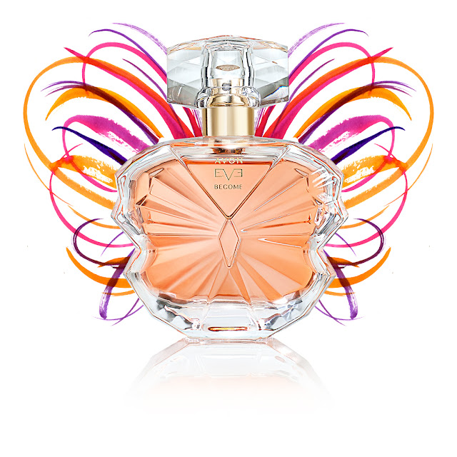
The 'Eve Become' quartet of fragrances consists of Truth, Privé, Confidence and Eve; each created to reflect a different aspect of the wearer. Taking their cue from womanhood and everything the word can mean, and presented in beautiful, contemporary glass bottles, the scents offer alternative vibes depending on your mood on the day. The company needed a collection of images that spoke to the changeable nature of femininity. 

Working with UK-based One Production, I went to London on the day that the PM resigned - definitely the topic of the day while we had our introductions - to be present at the campaign's photo shoot. Peering 'behind the curtain' of the hours-long process was a thrilling treat - I've been on site for all sorts of ad and photography-based things, but not a shoot quite like this. After a coffee or two I got to work sketching live on my iPad as the models went through their day, having makeup applied, hair tweaked and clothing pulled into place around them (with two very appealing dogs to entertain us in between takes - see below). Those girls were impressively professional - young, skilled and infinitely patient!

Surrounded by a team that included photographer, stylist, lighting team, director, photo editor and a catering and logistics squad, I wove my way in and out of the action Procreating spontaneous sketches. Not intended to form part of the final ads, these were made to capture a vibe that would inform the work later, back in the studio:


(Her name was Margeaux, and she was enormous!)


Back in the office week or so later, the selected photos were sent over to me and the work began. We'd already explored some ideas - two sets of suggested looks, one digital and one ink-made - so we had an array of looks to base the final pieces on. Here are some of the analogue tests:


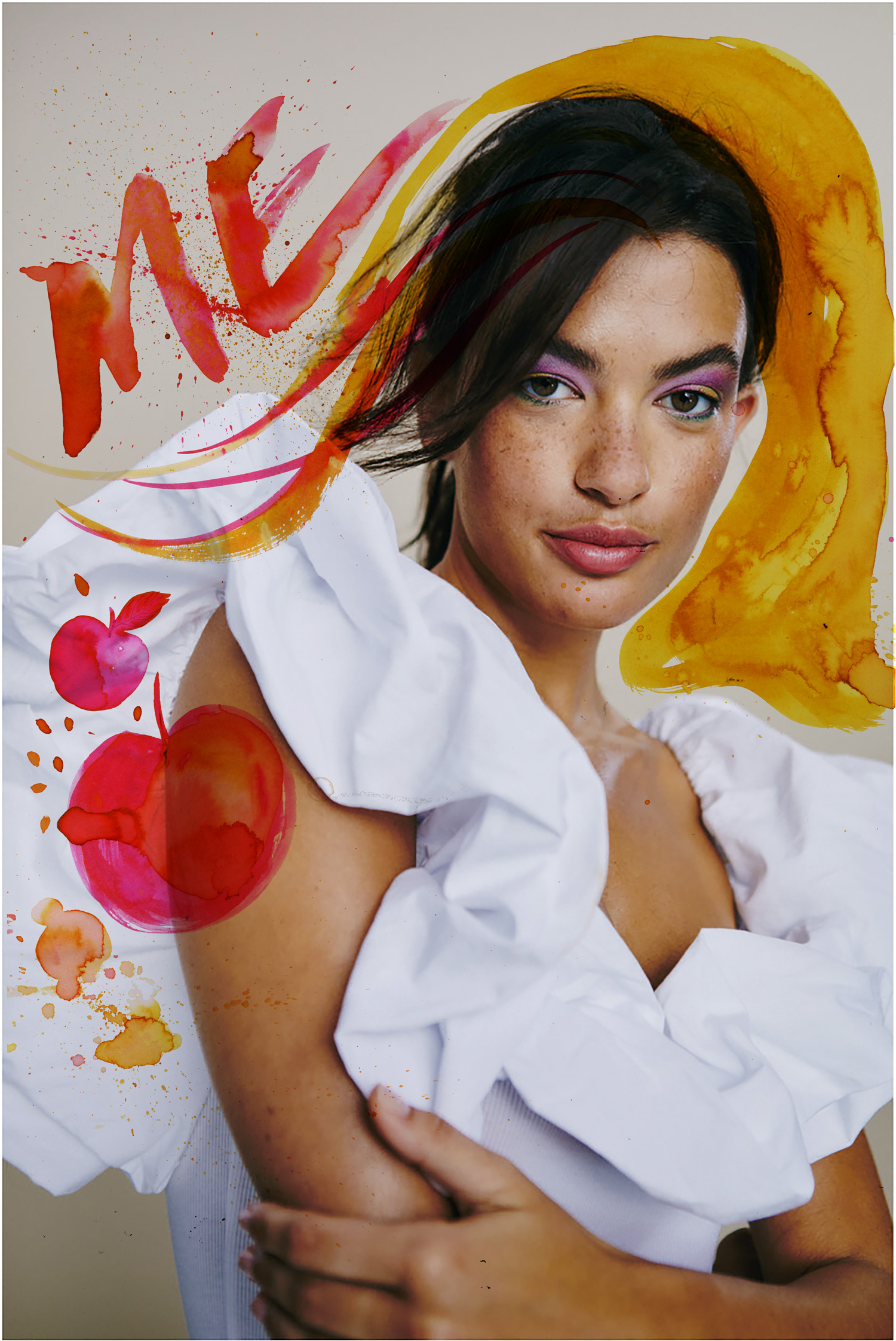
And here's a handful of the digital pieces. These ones I absolutely loved, because they're very much in the realm of the kind of work I'm really into at the moment - free, energetic, and with a delightful amount of spontaneity!


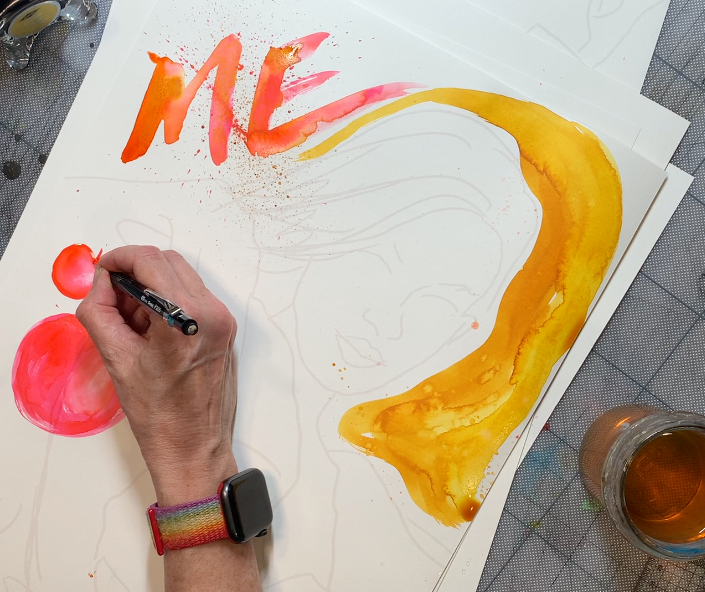
One of the things I'd offered to do as part of this job - in fact, something I offer all my clients now - is capture the process of making the work. This is a brilliant thing to do for two reasons; first, the client gets to see the process, which can not only help to shape the final outcome but can be really useful for communicating how long something might take, and what's involved in adjustments, and second, small snippets of film can add incredible value when it comes to social media and passing those 'peeks behind the curtain' into the client's audience and customers. So the pieces for this campaign were captured at almost every stage, in closeup, for integration into the final ads:


The process of developing final pieces was a delightful sequence of back and forth between myself, art director Rich Gent and the Avon creative team, wrestling with the edges of ink, line quality, and just how organic the art should be. In the end, the final pieces were a mix of real sloppy ink on paper and digital work - maybe you can see which is which, maybe you can't!


This little gif was a tidy example of how the team blended my
live capture with video and stills from the shoot.


Thanks to Rich, Lottie, Lesley and Melanie for involving me, and to my agents at CIA through whom the job arrived. It's become one of my favourite jobs ever!


Monday, January 18, 2016

‘For The Exposure'.


I see people being quite snarky about doing work for free, and with no expectation of anything in return, but I do this quite a lot. I’ve got no blanket rule about it - every request is assessed on its own merits, for there may be something I like about the job, I might like the people, the product, the brief - or all three. And, I might just fancy doing it!

Every year I get many such requests and I’d say I maybe accept one in four, something like that. If only this, such things are a chance to play with some materials off the clock, where it doesn’t matter if it’s a bit wonky or, ahem ‘experimental’, as there’s no client breathing down your neck fretting about how their crayon dollars are being spent. Which they do QUITE understandably, but from time to time, it’s quite freeing not to have that! I don’t need exposure (well, I do, but it’s part of my job to choose where and how that’s achieved) and no, I certainly can’t pay my lipstick bill with it, but it’s not all about that, and it’s certainly never my sole consideration.

This was a nice little one that came in when I was MEGA busy, but I really wanted to do it, so the poor lad had to wait, but I think he was pleased with the result.


Scrawlrbox is a nice idea - a modest monthly subscription which brings a surprise package of new art materials to your letterbox each month - and to kick it off, Chris the founder, Crowdfunded it with decorated boxes (the ones they send the art materials in) auctioned off to raise funds. Simple enough!

I agreed to do it (putting in my disclaimer about not being able to commit to a deadline), and the ‘Inkymole’ box was bought by Greg at Infringe Films, who make fictional films, documentaries and other productions for a wide variety of quite impressive clients.

Having recently completed our own film, Stupid Enough, I wanted to make a comment about how tricky it is, and how surprisingly easy at the same time. I knew I’d heard a quote somewhere about film-making being just ‘groping around in the dark’ so I did my homework, tracked it down and unearthed some more great quotes about film-making.

Here’s what the box looked like in the end - I did the inside too of course, and got to use all my pens and glittery things in a completely relaxed no-stress way! And yes, that IS a set of B&M neon and glitter gel pens, alongside the posh inks and limited edition nibs.


Monday, January 19, 2015

150 Years Of Ink.


Diamine is a British ink company whose inks I discovered relatively recently (about four years ago) and they not only have a bewildering range of colours, they make their inks right here in the UK - Liverpool - and have done so for the last 150 years. I have a big box full and if any of my projects have used colour in the last four years or so, it’ll be Diamine inks you’lll have seen.


The company is headed by a Christine, a formidably organised and ambitious woman who always makes time for a chat while overseeing her modest but hard-working team of ink makers and packers. The inks are created by family member Phil, who invents new types of inks and new colours.

Having had a really nice working relationship for a while, they asked me to design a 150-year anniversary edition box which reflected the company's longevity and the diversifying users of their inks.


The bottles themselves were a special edition, made in Italy like all their bottles, in the shape of triangles which have to be snugly fitted into an easily-stackable rectangular box. (At first I misunderstood their brief and designed a triangular box then a pizza-style box to fit all the colours in as a set…I think I was quietly re-writing it!)

Looking across the years, it only made sense to reach back for the detailed flourish-adorned turn-of-the-century advertising style with one hand while grabbing a handful of my own vivid blobby ink-splats with the other:


I also suggested the inclusion of some good old-fashioned ‘Happy Birthdays’ and party balloons!


But finally this was the outcome, complete with a hand-drawn version of the company logo:


- and a panel left on the front of each box for the inclusion of the relevant colour sticker. Here are the boxes piled up in a delicious splendid colour pile:


The bottle itself had a matching sticker and, as you can see from this example, my bottles of the new colours have already been thoroughly waded into by my brushes.
Hurrah!


Thank you Christine and Phil for letting me design this most significant of birthday outfits. Here’s to more collaborations to come!

Now…if they would just let me get their hands on that website…


 Christine has now been united with the original art - better on her office wall than in my archive!

LinkWithin

Related Posts with Thumbnails