I've just seen someone talking about a website called My Future Self where you write to yourself privately and check back in later - either much later, or just a few months. The potential for encouraging, moving, sorrowful or grateful readings years later is all there, and it seized my imagination in the moment. What a novel idea, I thought.
But then I remembered I've been writing myself a letter every single year for the past 16, 17, 18 years - I can't remember how long, as I don't always keep the letters. I do it once a year, and I always do it as I'm taking the Christmas tree down, filing the letter in a sealed envelope deep in the decorations box. Then, when it's time for the decs to be put out once again, the letter is there, and I'm able to review where I was - and see where I am, in comparison.
Every single time I forget a letter's going to be in there, then I laugh at my own surprise, and then I see it and I put off reading it because I'm a sombre little sod with a leaning to the saturnine, especially at the turning of the year when Christmas is over and I've a whole year yawning out before me. No-one reads this letter, and I wholeheartedly don't want them to; I can't bear the idea. It's addressed to Moley, because that's what Leigh calls me and it's what I feel is most purely and entirely Me. And usually, in that moment, I'm feeling a bitsmall and mammalianwith trouble seeing into the distance.
Moley's usually a bit sad, and the letter's always long and a bit rushed, because I write it between dusting and wrapping up decorations. I never thought I did journaling - I react to the word with the cynical lip-curl of a teenager who thinks All That Stuff Is Bollocks (which is a cringingly obvious sign I probably should be doing some of it) - but I realise this is what this is, albeit with entries a year apart.
What do learn when I read these letters?
Well, I learn that I love to moan it all out onto the paper. All the things I can't say to anyone. I am very cross with myself, often. I definitely swear a lot and I stay angry about things. not exactly grudges, but if I spot something that seems to be afflicting me fro one year to the next, I can see that I get really f*cking angry about it. I like to take it all out on myself. I like to take it out on others, too. I like to choose a different sparkling fountain pen ink to do it with, the glitter gel pens of the same eye-rolling teenager much in evidence. And I also see that the struggle is real when it comes to giving gratitude: these letters have shown me year on year that I can only see the things that aren't sorted, that weren't done, and that still need work.
Work itself, actually, isn't mentioned that much - a significant book publication or project might get a nod, but that's not what this is about; I have Instagram (for now) to show me chronology of professional high points. When it comes down to it, my assessment of the success of the year hinges on three things, and is seen through the prism of those: my relationships, my health, my mind, and the stuff I didn't do.
I still have a lip-curling teen reaction to the idea of journaling, of brag documents; I'm not comfortable with end of year round-ups of my achievements on social media (though we do that privately, making coffee and going over the previous year's wall planner before we put it away) but I wonder if I need to rethink my approach. Because left to my own devices, left to my own blank page, I only fill it with ire. And the amount of stuff to be grateful for, and celebrate, is actually overwhelming.
"Beating yourself up is never a fair fight" - Andrea Gibson
Our friend and long-term Inkymole collaborator Ed Garland is finally on Instagram, after moving away years ago and becoming Dr. Ed. This is good news.
After meeting up with him for a weekend recently, I’ve been thinking of all the projects we worked on together. Obviously I hope there will be more now that his gruelling study schedule has eased off, but I wanted to share a few as they emerged at a time when social media was still new, and were therefore only seen by the people who received a copy, attended an exhibition, or were part of the project.
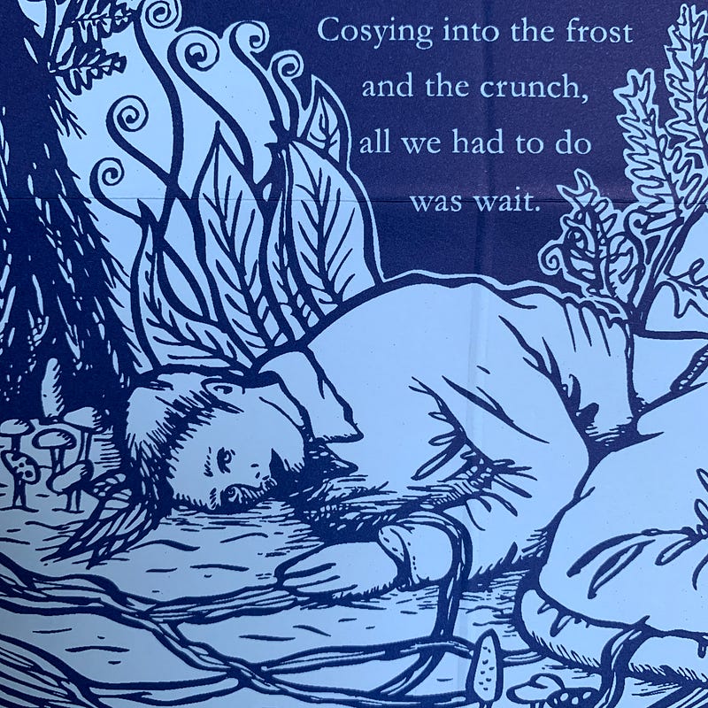
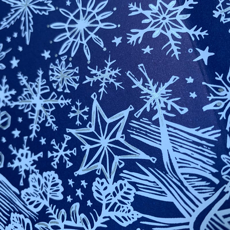
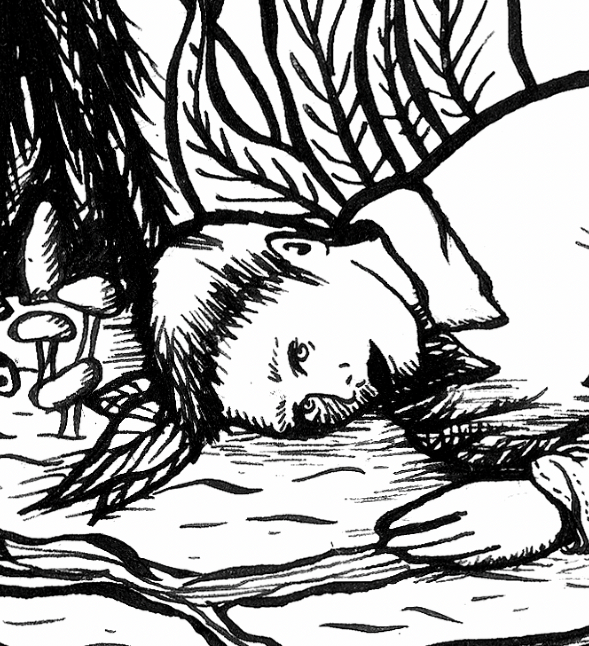
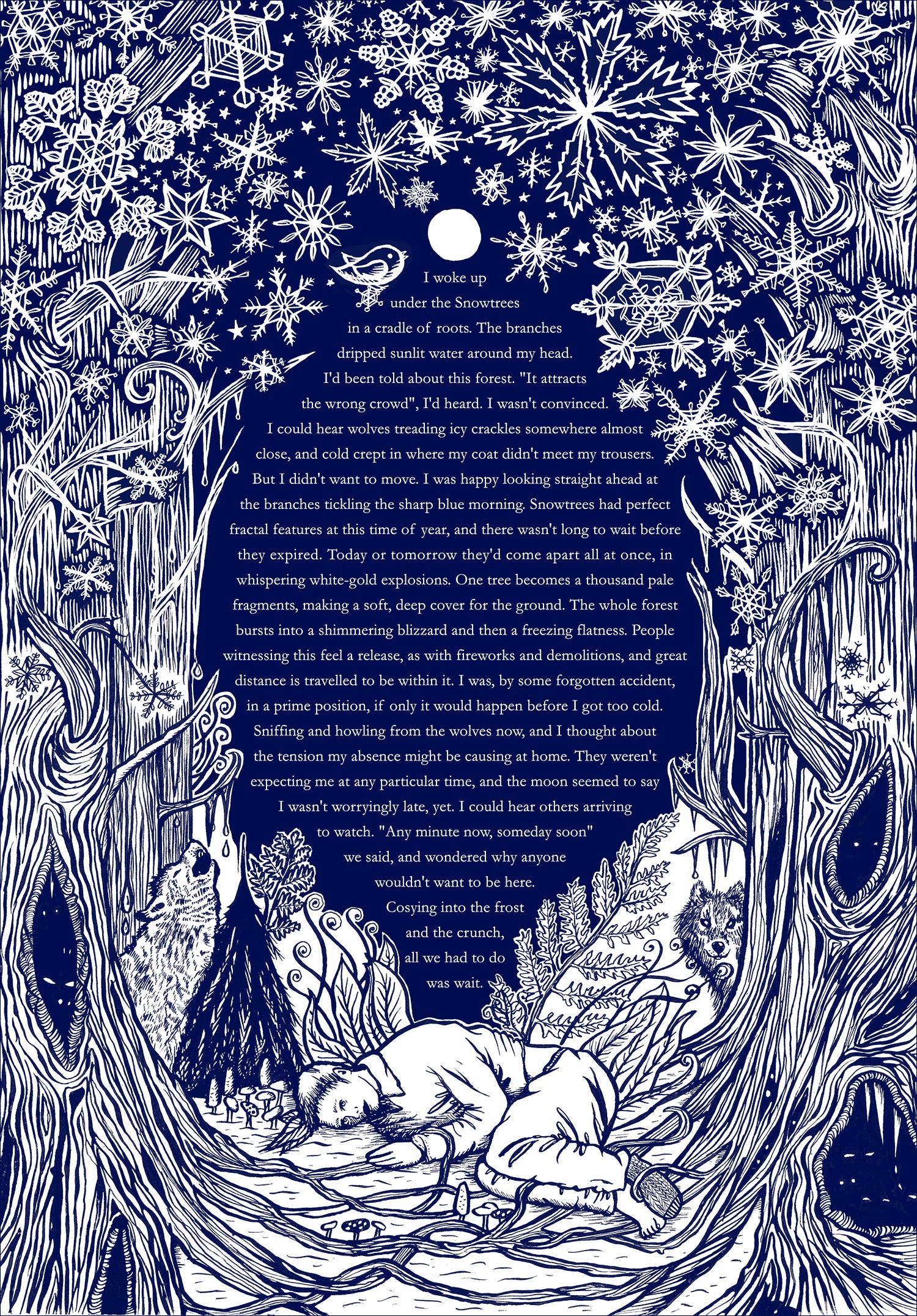
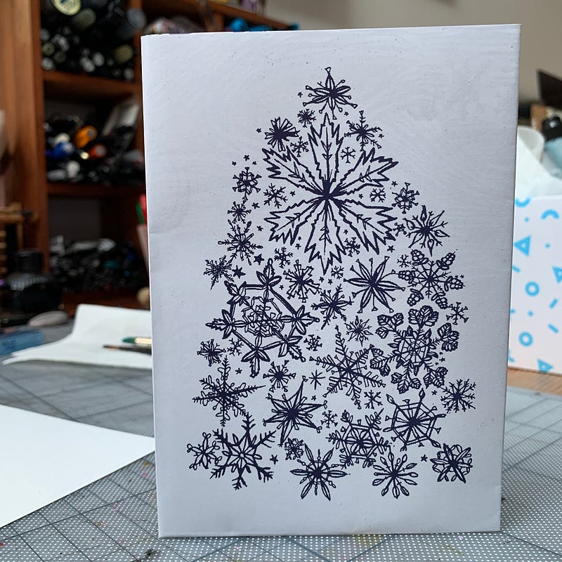
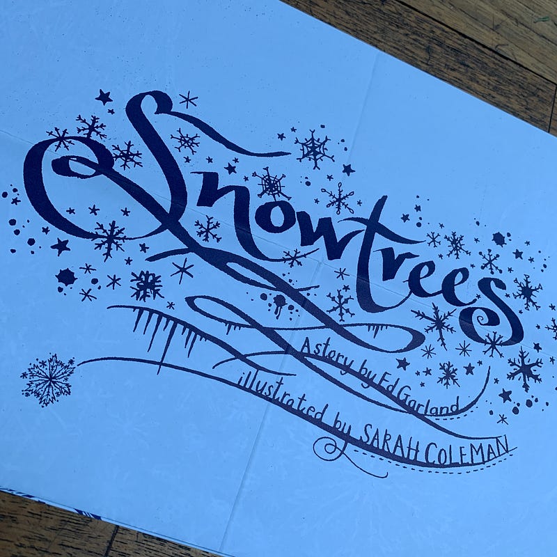
This is Snowtrees. We had just put up a big installation called ‘The Witches’ in the repurposed church building of our regular clients TBWA\Manchester, for which Ed had written the words, and we were in the van on the M6 driving home, knackered and full of chips. I checked my email. It was mid-October and, thinking ahead, I’d asked Ed to write a piece for our annual Christmas mailing, which would take a different form every year. I would illustrate whatever he wrote. His story was in, and I read it; crying, because it was so beautiful and it was exactly what I’d hoped for. Even a little more than that, in fact.
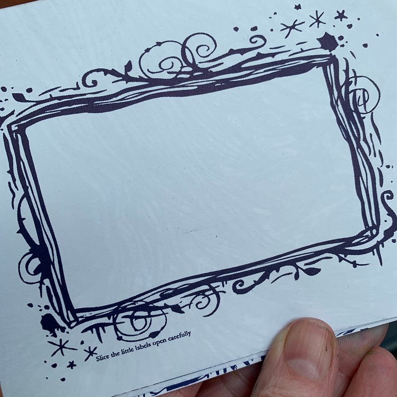
I made a black and white ink illustration to go with it, indulging my longing for eerie stories to illustrate and my love of all things creepy and atmospheric. (Whenever the opportunity arose for some personal or promotional work, this is often the direction it would take). We had a 1000 copies printed to A3 in navy blue ink, foldable to A6 (sorry Kelly, who did all the folding). They were addressed individually and sealed with a tiny label, and it stood like a Christmas card with a snowflake-tree on one side, inspired by a duotone 1950s fold-out birthday card we’d had on the studio wall for years.
And there it was. Ed will probably do the thing people often do when confronted with old work — shrugging off my praise, pointing out all the things that are ‘wrong’ with it, maybe even cringing a little— but I love this piece of writing, and more importantly, I love the creative response it triggered in me. Although I too can see things I would do differently now, I love the outcome.
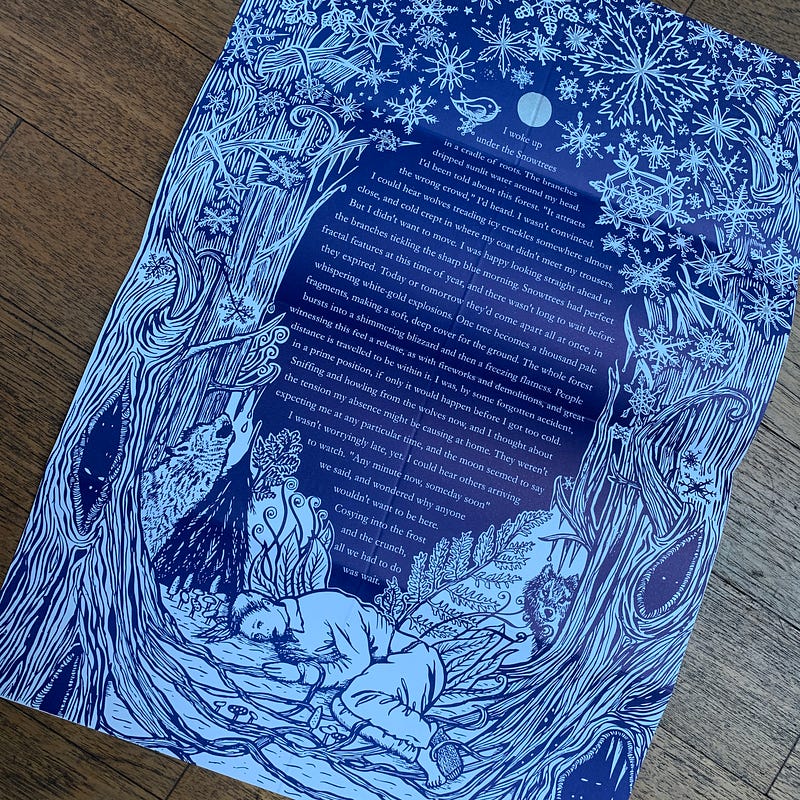
I woke up under the Snowtrees in a cradle of roots. The branches dripped sunlit water around my head. I’d been told about this forest. “It attracts the wrong crowd”, I’d heard. I wasn’t convinced. I could hear wolves treading icy crackles somewhere almost close, and cold crept in where my coat didn’t meet my trousers. But I didn’t want to move. I was happy looking straight ahead at the branches tickling the sharp blue morning. Snowtrees had perfect fractal features at this time of year, and there wasn’t long to wait before they expired. Today or tomorrow they’d come apart all at once, in whispering white-gold explosions.
One tree becomes a thousand pale fragments, making a soft, deep cover for the ground. The whole forest bursts into a shimmering blizzard and then a freezing flatness. People witnessing this feel a release, as with fireworks and demolitions, and great distance is travelled to be within it. I was, by some forgotten accident, in a prime position, if only it would happen before I got too cold. Sniffing and howling from the wolves now, and I thought about the tension my absence might be causing at home. They weren’t expecting me at any particular time, and the sun seemed to say I wasn’t worryingly late, yet. I could hear others arriving to watch.
“Any minute now, someday soon” we said, and wondered why anyone wouldn’t want to be here.
Amy Shane is a book reviewer and special events editor for the Independent Voice Newspaper in Missouri, USA, and first came to my attention on Instagram when she recreated one of my book covers...on her own body!
I'm used to seeing my artwork pop up on people's skin via the tattooist's gun - always an unexpected thrill which fills me with admiration and curiosity for the brave human who's done it - but this was different. This was a full-on, body-paint recreation of the cover in all its detail, on a difficult and unusual surface. Amy's recreated more of my covers since, and as someone will happily talk in public or in front of an audience but doesn't exactly embrace selfie culture let alone photographing anything from the neck down, I wanted to ask her about what she does and why. This blog's normally about what I'm doing, so I thought I would probe someone else about their strange and fascinating hobby! We, of course have the common ground of the printed book, so I think Amy and I will be in touch for a long time to come. She can be found on Instagram as amy_fortheloveofbooks
Please explain what your ‘real-life’ job is, and how you came to be the amazing Amy Who Paints On Her Legs?
My “real-life” job is also book related and why I ended up with an Instagram account in the first place. I am a Professional Book Reviewer, and have a newspaper column called 'For the Love of Books'. I'm nearing on eight years now, so I guess you could say I am always surrounded by books. I started on Instagram because the publishers wanted to see an online presence; honestly, I went in kicking and screaming, afraid I would never figure how it all works.
After about eight months and totally lost on how to find my own presence, I started thinking about what books really meant to me - when you read an amazing book it’s as if you become part of it, you fall into the story, and well that’s where the idea began. I then thought about making myself part of the story and started researching paints. To be honest, I have never painted before or have taken an art class. I just doodle when I am bored. So, I bought some body paints and started playing, and the rest is history.
My ‘Forest Queen’ was one of the first ‘leg’ paintings that you posted on Instagram. The legs seem an odd choice at first but they’re the natural resting place for a book when reading. Have you painted anywhere else? With or without success?
I originally started on my arm and hand, then my chest. I enjoyed painting on my chest (and matching lipstick to the paint colors) however, I have to paint completely backwards, which at times can be a bit complicated, especially when dealing with words. It took me awhile to realize I could just paint on my legs. My legs also give me space to get in more detail and aren’t a flat surface, which is easier for me to paint on. I still can’t paint on canvas or flat paper, it doesn’t make sense to me either, lol.
Some technicals:
What do you paint with? Do you use both hands?
I only use Mehron Paradise AQ body paints. After a lot of research, I really value the company and the ingredients they use in their paints. They include: aloe, cocoa butter, avocado oil, lemon grass, cucumber extract, and vitamin E so they smell and feel wonderful.
They have also been around for over 90 years, so they have to be doing something right! I also use NYX brand spray primer (Just to get a smooth surface and prep the skin) and matte sealer just as an added protection when I am done.I just paint with one hand. When it’s nice outside I love painting on my back porch, overlooking the cornfields (where I take pictures for my stories). My neighbors must truly think I am nuts!
How long do they take you - from x hours to…?
An average paint takes anywhere from 2 ½ hours to 4 hours, depending on how much detail there is, or how particular I get with myself.And yes, if any of you are wondering: I have gotten so frustrated that I have scraped the whole paint and washed it of before I changed my mind.
How do you wash it off?
Just plain water. The whole paint washes off in about 10 seconds. Which is why I have to be super careful, and why I add the sealing spray. And yes, I have spilt water on my legs and lost the whole paint.
What’s the criteria for choosing a book cover to reproduce?
The cover art is really the first thing I look at, and if it is it something I can attempt to replicate. I can’t do photos, or people. Parts of faces yes, whole people – no way lol. I will also choose a book if I read the book and loved it, or by the author or publisher reaching out. Sometimes I go in themes. Really there is no rhyme or reason to my brain - lol!
Is there one you haven’t done yet that you really want to do?
There are so many that I want to do, my list grows everyday. One older title I would love to do is 'Splintered' by AG Howard. I loved the series and the cover art.
Do you have aspirations to create covers yourself? You’re clearly creative, with dexterous skills!
I honestly never thought about it.
And how many books do you have lined up to paint at the moment?
At the present moment I have a list of 13that are lined up with upcoming release dates, and 3 already painted ready to be posted.
~ Thanks to Amy for answering my mildly predictable but nosy questions! ~
You have to be honest, but keep your professional veneer; you can’t show off, but it’s important to talk about your achievements, since you’re being asked about them. I’m often surprised at the things I say in interviews, as I find myself being more candid than I expected to be. And sometimes, when you read them back, it can be like reading about someone else!
But whatever the outcome, it’s always my hope that there’s something useful in it for those who take the time to read it.
Thank you for taking the time to talk to us about your creative practice, recent work and future projects.
Please could you tell us about how you started your creative career?
It started very young, as soon as I could hold a pencil! But, in a nutshell, I did a degree in Illustration where I was a bit hermit-y, in the with cleaners at 7am and out with the security guards at 10pm. I won an award for my lettering and started working for clients before I graduated (I did a book cover for Carrie Fisher and a couple of other small pieces) before going on to work full time…there’s quite a lot I also did in between, but your readers may keel over asleep if I list them all!
We are very proud to be featuring your work in Ascenders Volume.1, Leaders In Contemporary Illustrationout in December. Could you tell us about some of the pieces you will be featuring in your printed portfolio?
Thank you. I’m excited to be part of a new publication, and one based in in a country that’s not the one I live in! I’ve included some recent chalk work I did for a French client, as I love to work in different languages. I’ve also chosen a nice collection of book covers, as they’re great for demonstrating the breadth and diversity of the lettering work I do. And I do do a LOT of books!
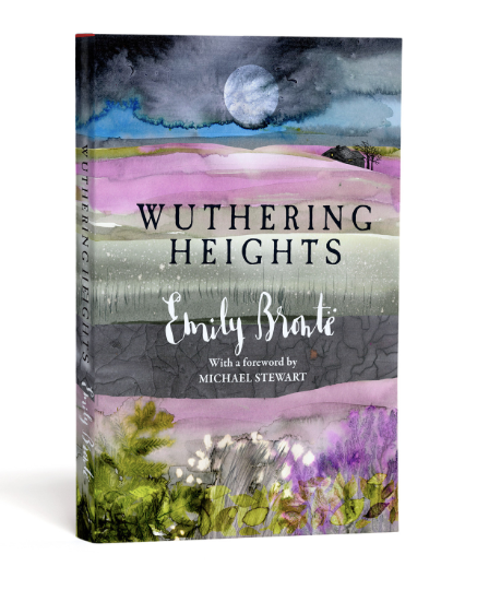
One of your most recent projects is illustrating the 200th anniversary edition of Wuthering Heights to coincide with the 200th birthday of Emily Brontë. The book is available now and your cover looks incredible, we’re excited to see all the illustrations within.
I understand that this was a story very close to your heart from a young age, and you’ve even exhibited at the Brontë Parsonage Museum. How did it feel to be asked to commemorate such a landmark edition and as a long-time reader, did you always have an idea of how you wanted to represent the characters and settings? Did the final result finish up to how you originally envisaged?
I felt a great sense of responsibility but also big excitement. I had to talk myself down from the ledge of thinking ‘this has to be the best work you’ve EVER done’ to a much more relaxed state of ‘let’s just let the ink flow, and see what happens organically’. I know the book so well, in the end all I needed to do was tune into it. The end result was better than I had hoped, but I could never have predicted that particular outcome! I like those jobs the best.
We understand you’ve recently celebrated some career milestones, with over 450 books illustrated (covers, interiors and both) as well as reaching over 25 years in illustration. You’ve certainly come a long way since winning ‘Best Handwriting in school’.
What would your advice be to your younger self?
Yes it’s flown. Seriously, 25 years have gone by in what feels like 5, and I know I still think like a new illustrator — anxious to promote, always feeling the competitiveness of the industry, never comfortable with resting and always thinking about what’s coming next.
My advice to my 23 year old self would be to try to make sure there’s always time for mucking about. I work so fast and furious for clients, particularly on work I get through my agent, that I sometimes forget that I’m not a machine I need time and space to develop. Often, development and experimentation happens ‘on the job’ — which is a good way of making it happen, but risky, and quite pressured. Investment in self is absolutely vital, and I feel the areas where it’s lacking of it as I get older; I know other illustrators feel the same. But I would let my 22-year-old self know that she was right to join the gym as soon as she left college!
(By the way I doubt my handwriting would win a prize now — it’s like The Picture of Dorian Grey; the more I’ve worked publicly as a lettering artist, the more my ‘real’ writing has deteriorated!)
Next year sees the release of activist Malala Yousafzai’s third book, which you’ve created the front cover for. You’ve previously worked with her on ‘Malala’s Magic Pencil’. That is amazing! How does it feel, knowing that the work you have created with a Nobel Prize laureate will be seen by millions of people around the world?
It feels nice, and although I treat it like a another job while I’m actually working on it — simply to make sure the same level of objectivity and efficiency is applied — I receive the finished books and get a warm glow across my face!
They could have chosen any lettering artist in the world, yet they chose me, so I feel very privileged. She is truly an excellent role model, and not just for women and girls.
You’ve illustrated world renowned philosopher and spiritual teacher Ram Dass’s new book — ‘Walking Each Other Home’ which is out now.Could you share a quote from him that particularly resonates with you?
As it happens my copies arrived this morning! And this quote popped out of the page at me as I was flicking through (it has a LOT of pages!):
“You are not dead yet. It’s not too late to open your depths by plunging into them, and drink in the life that reveals itself quietly there.”Good huh?
2019 is an exciting year for you with a top secret project released, involving a very famous film coming into book form for the first time!
How did you get involved with the project, and when will we know more information?
It came from a publisher I’ve worked with a lot in the past, but an art director I’d only done one book for previously. I think my combination of inky, layered textures, the darker stuff I naturally lean towards and the ability to create strong type centrepieces pointed flow-chart-style to me! I haven’t got a final publication date, but I think it’s early summer. I believe it’s hardback, and special finishes are currently being discussed!
You have built up a diverse and successful business, working across everything from a record label, to advertising, film production and of course, illustration.
Could you share some advice for young creatives looking to establish themselves commercially?
Gosh that is quite difficult. The landscape I graduated into was very different from the one I enjoy working in now. But I think there are commonalities.
It won’t happen overnight, building a career takes investment and you need to be brave, taking risks, having a stab at things.
It will always be hard work. Especially just as you think it might start to chill a bit — that’s when you need to sink your teeth in!
Talk to people, a lot — in person, and pick up the phone. ‘Business’ is just another word for relationships, with money thrown in!
Authenticity is key. You are only you; you can never be ‘them’, and their successis notyour failure.
Do not take social media at face value — massive pinches of salt and a humorous dose of cynicism will keep you from thinking everything and everyone else is unattainably perfect! It can be your best friend and your worst enemy, so treat it accordingly.
Look after your body and your mind. Start now. How you handle both will directly shape your 30, 50, 70 year old working self. There is no business without you.
Finally, could we ask about your pseudonym, Inkymole, how did that come about?
Rather undramatically! My surname is Coleman, and because I was short sighted at school with pretty thick bins*, that got turned into Colemole, which got shortened to Mole. The inky but came as a result of a lifetime spent with ink and paint on my fingers and just started to sort of get slung in front of it. Clients were calling me Inky on the phone, and when sarahcoleman.comwas already taken when it came to buying my first domain, inkymole.comwas free — so I bought that! Et voilà. Inkymole!
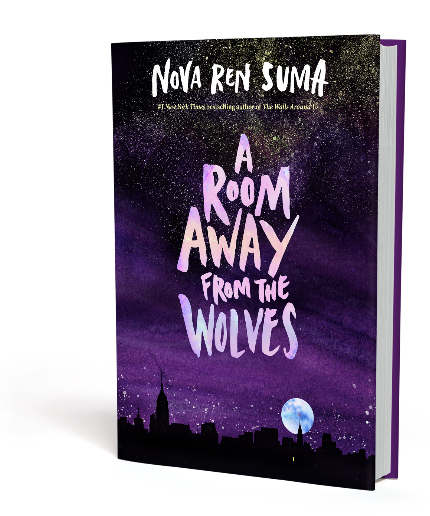
Nova: a transient astronomical event that causes the sudden appearance of a bright, apparently 'new' star, that slowly fades over several weeks or many months. When I heard Nova Ren Suma's name, I thought it had to be a fabulous, eerie pseudonym, with its syllabic simplicity and its space-age middle name. I didn't even know the gender, at first, of this new author whose cover I would be working on - but I knew right away a) they weren't about to fade away! and b) I was fascinated. The appearance of Nova's new book 'A Room Away From The Wolves' is far from sudden - it took her a long time to write - but it has proved a sparkling new addition to the richly-layered teen fiction landscape. Without giving too much away, this is a ghost story with, as the cliché goes, a mighty twist, but set far away from any Burtonesque, Disney or period environment; the characters existing, instead, in modern-day downtown Manhattan. With references to a key character's former life in the 90s, this is a story that both a young reader and a 'grown'-up' can identify with chronologically as well as emotionally, with its themes of belonging, friendship, abandoned dreams, broken relationships and accepting who, and ultimately what, you are - and what you never will be. I read the book first as a manuscript, which is always interesting because at this stage of the process, the author is still making notes and fine-tuning. The finished copy which I read many months later did indeed differ from the original draft, and that's part of the reason I love doing books so much; getting that early peer into the writer's machine, watching the head-scratching, the changes of tense, notes to the Editor, syntax tweaks, even chicanes of storyline as the author changers her mind completely. Thus, although a strong and simple story - one which I might add is crying OUT to become a film - this was a tough cover to crack. It could not be too overtly ghosty; such an approach is easy to make 'silly'. It couldn't be too literal; there are a lot of ethereal concepts to ponder, and a suspension of disbelief is required for the key events to make sense, but at the same time, the sense of place was important. Bina, the protagonist, couldn't be portrayed too specifically, as one person's vision of a central character is always different from the next - and Bina is, interestingly, somehow described both thoroughly, and ambiguously enough to toggle-switch-on the reader's own pencil of the imagination. So what to do? Well, the art director, who I'd worked with on Dreadful Young Ladies And Other Stories, wanted another book that was beautiful. We knew this was going to enjoy special finishes. The book had to be very strong on a book shelf; Nova's previous novel The Walls Around Us had set a precedent there. The location gave me the initial starting point for the cover, along with the foggy cool of an early winter evening in New York:
But it was an omnipresent dark opal that gave us our central motif, and allowed the next round of roughs to emerge: I created a pile of opals in ink, and some big pages of hand-lettered titles, and used them to generate not-too-directed ideas in fast succession:
These also gave us our colour cues - the purple! Throughout, as is my usual process, I was adding title after title in different inked letters - avoiding the 'goth' and the 'romantic' traps, neither of which were right for this novel.
Then we needed to consider the geography. If you've ever been to Manhattan, you'll know how big the sky is, since you're always looking up at the skyscrapers. But if you can get across the water from Manhattan Island for some perspective, and look back out towards it from say Brooklyn or New Jersey - the sky is vast, and the city glows and hums. It positively sparkles - stars, buildings thrusting upwards, the occasional firework, with flashes of blue light for emergencies. This is where our opal needed to...explode into life. And so we tried a few iterations:
In these versions, our opal shards were to be finished in some kind of iridescent or metallic varnish; maybe even a holographic look, to truly make the cover twinkle. But then, Art Director Laura saw what we had been missing in the many roughs we were discussing - the central lettering, the mesmeric skyline against the moon, the purple glowering of the all-ink sky - and the window light. I'd added a single, tiny one in the lower buildings (for reasons you'll learn upon reading!) - and suddenly, there it all was.
With a little fine tuning here and a bit of preening there, the cover was before us. And this is the one it went to press with, on flesh-feel, pearlescent stock, which allows the lettering and the moon to glimmer through:
The back has a hand-written 'blurb' (no hand-lettering style fonts here - this is the real deal):
Watch the iridescence as the book moves in the light! (shady iPhone vid):
I am as delighted with this cover as it's possible to be, and I know that Nova is too. You can enjoy Nova's lively, conversational promotion of the book by following her on Instagram, Twitter and Facebook - and to get a copy of the book, go here.
And if you're in the US, you can catch her one one of her book tour dates:
Thank you Nova, and Laura Williams, ever-patient art director!


