Showing posts with label handlettering. Show all posts

Wednesday, May 04, 2022

“…but how long did it take you get your STYLE’?”

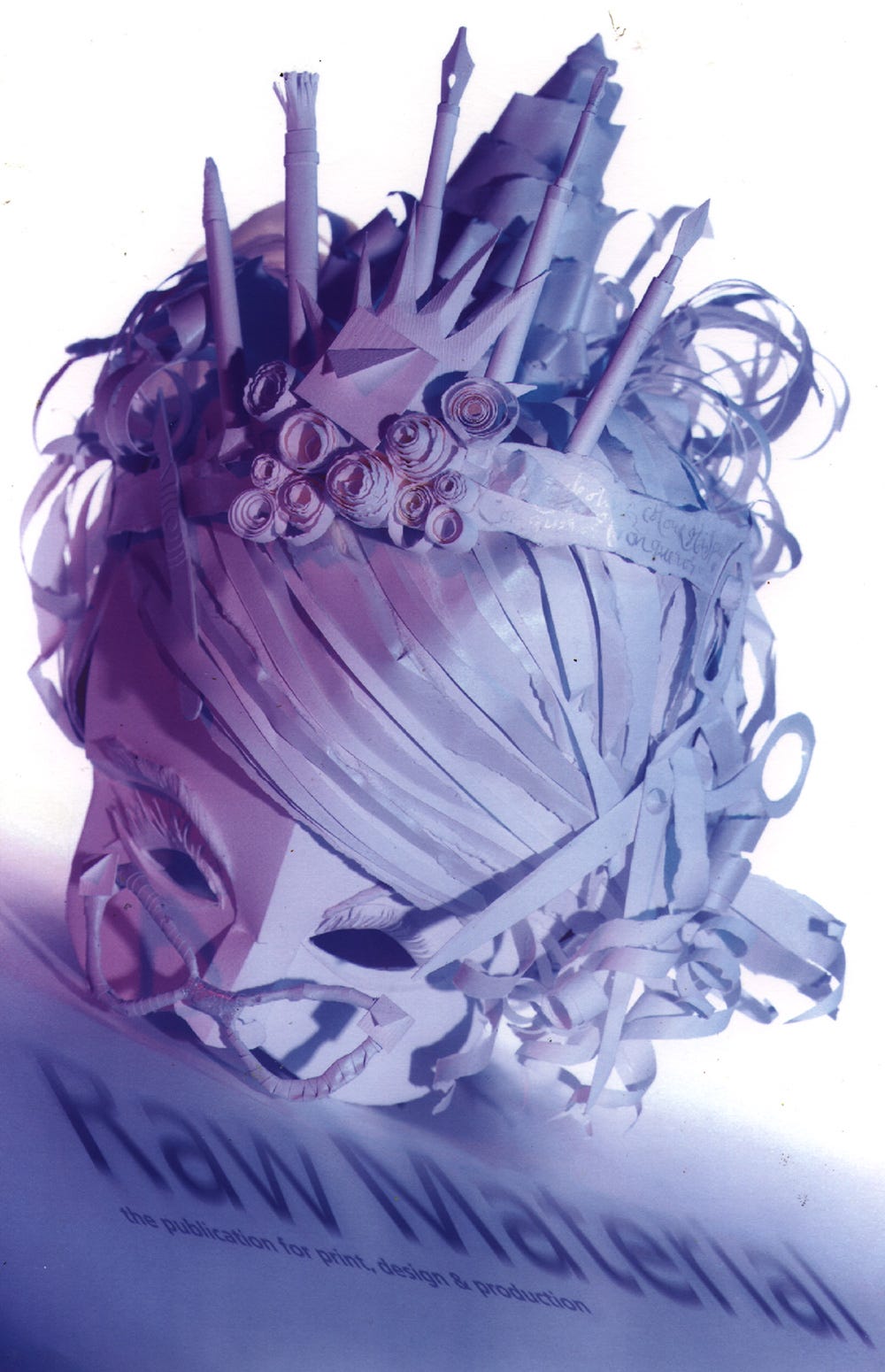
Created in paper and polystyrene for Arjo Wiggins Fine Papers, about 1997/8.

I do a lot of talks and seminars for schools and colleges, and one of the questions I get asked the most is “how important is it to have a ‘style’?” — followed by “how long did it take you to get your own style”?

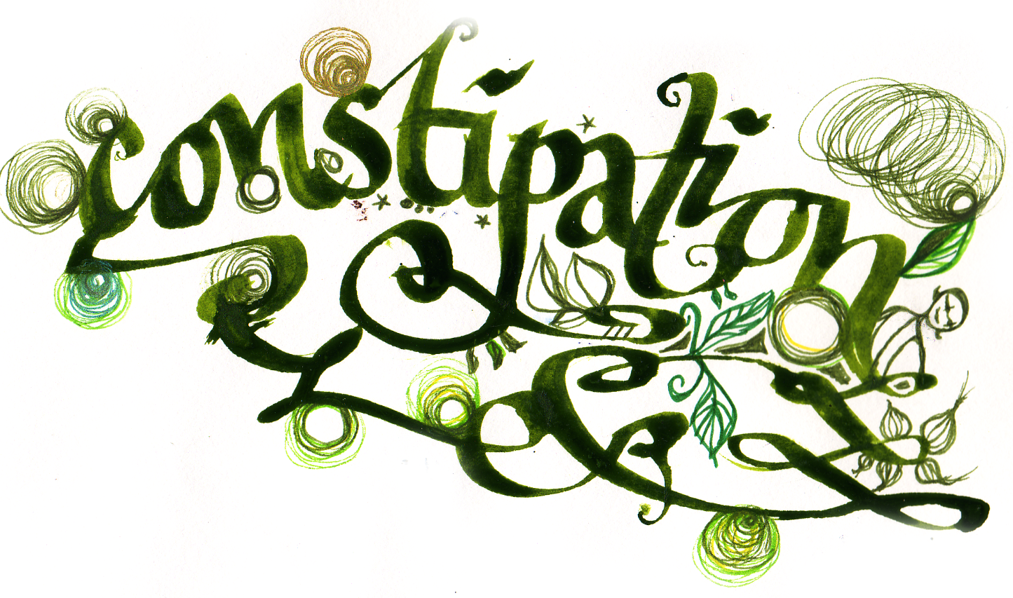
My answer to this is not straightforward. Have a quick scan down the sample images in this post — they’re all from the same period of about 7 years, from graduation onward. You can see what was going on; I’d graduated with a portfolio of wildly ambitious 3D work, built pieces for the stage, costumes and models as well as poster designs and storyboards and illustrations full of lettering and ink. I basically wanted to do Everything — and, I would pretty much go on to do that, but for a young illustrator starting out the resultant folio was what clients described as ‘exciting but confusing’.

How would I get this (pre-internet) 3D work to them? It would all need photographing — would the client pay me for that? If they give me a brief, how do they know what they’ll get back — will it look like this, or this?
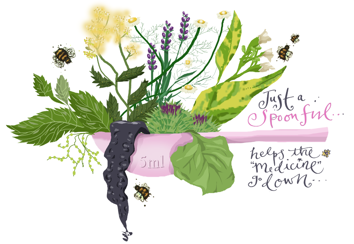
A magazine editorial from about 1998/9. This one actually got me a LOT of work.

I liked to build stuff, I loved to work on a large scale with pastel pencils (you can see an A0 example of that in the slides) AND with my inks, and I loved lettering (I won awards for it and was one of the earliest to posit hand lettering as a ‘thing’ you could commission in its own right — more on that in a separate blog) but I was also fascinated by digital; check out the work I did for the panto dames!
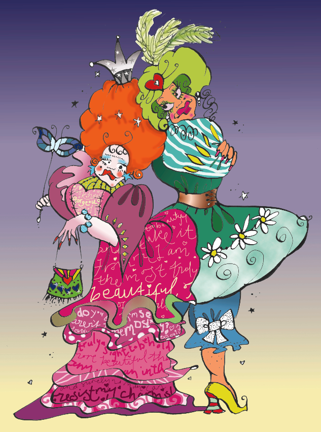
The Panto Dames! I did not know how to use layers properly.

Clumsy but wildly energetic, I was quite literally laughing as I drew them; they were real panto dames. What made people like this image is the energy and the humour — those things eclipsed the lack of sophistication (and lack of Wacom tablet) in the rendering. I only had a mouse then, so you can see that the work here was created with an ink drawing which was then digitally coloured.
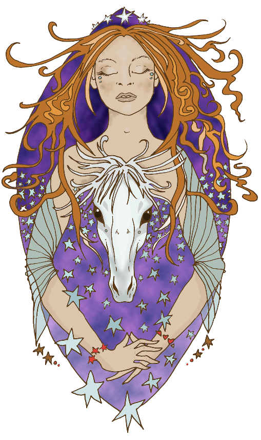
I don’t get horses, at all, but at one point found myself doing a monthly slot for Your Horse magazine. Woah there.
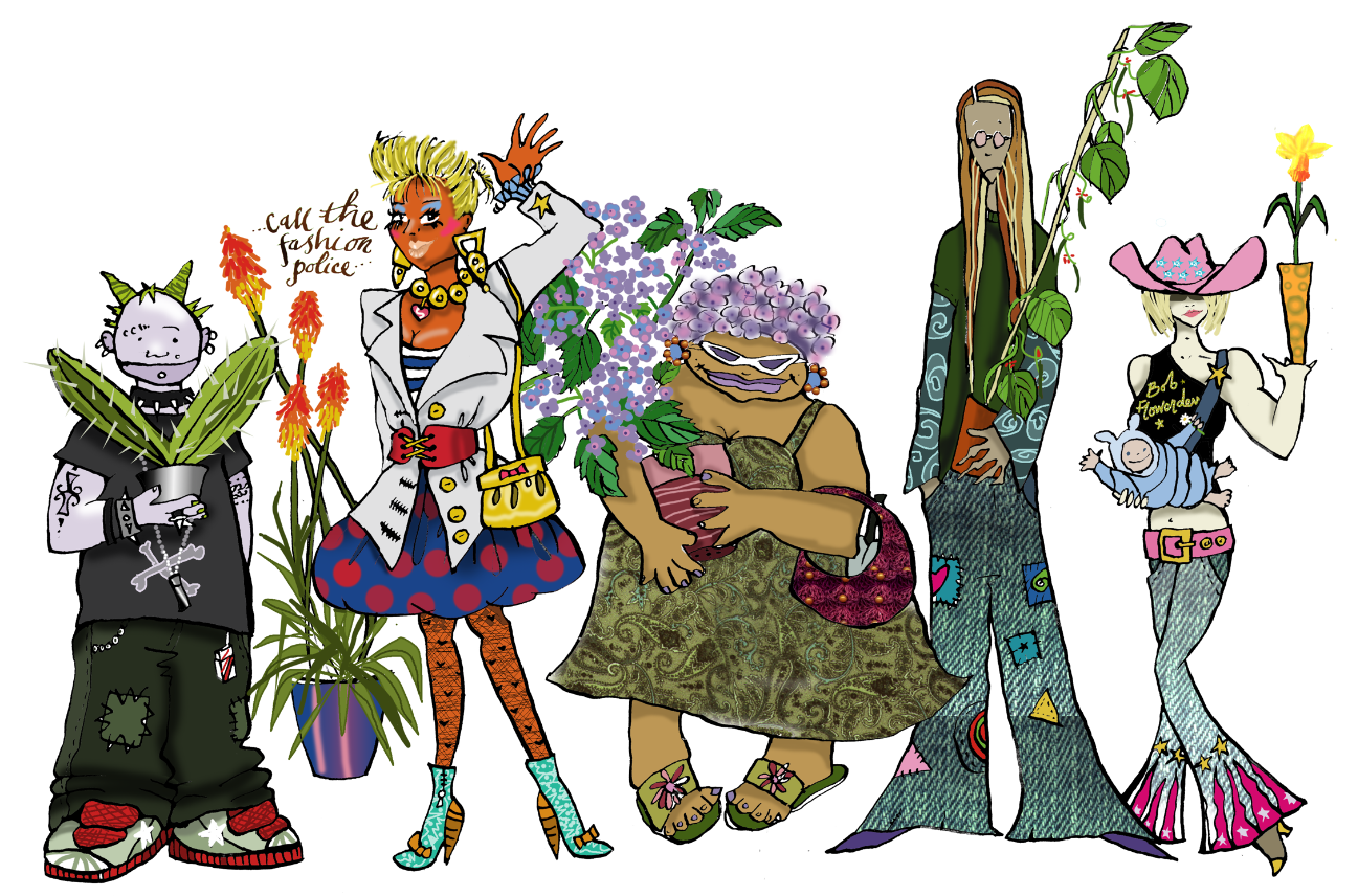
And this was one of a series for a bestselling gardening magazine. I had about a week to do each one, and regular income was very welcome at that time! They looked the same as the flyers I was simultaneously creating for the pirate radio station I was working on.

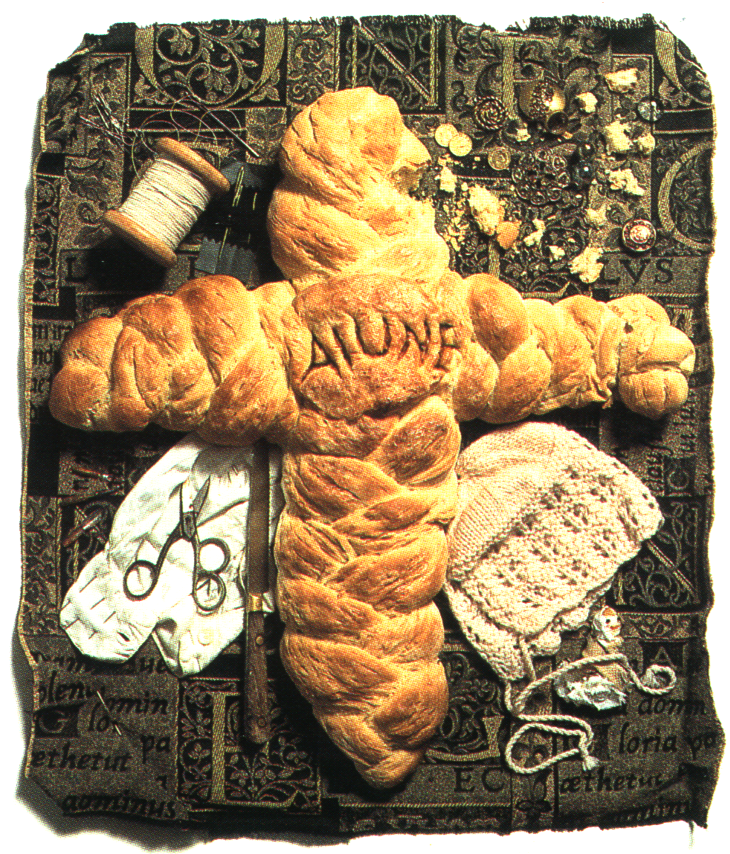
I went on to have multiple magazine series in that style, so I suppose it could be argued that was ‘a style’ for a while — but running simultaneously, I also illustrated a magazine column once a month with built, almost set-like pieces which were photographed, like this (yes, this one involved baking real bread; real baby clothes and a real self-made poppet doll. I ate none of them afterwards, and the illusatration actually lasted for years).
All of these images are very ‘me’, but it isn’t one style and it’s definitely not one medium.

In fact, I’ve always viewed this multi-medium thing as a blessing, not a curse. It means I’ve been able to turn my hand to a vast array of opportunities that, had I favoured one style, medium or way of working at the exclusion of all others, I would not have been willing or able to tackle. It’s made me flexible, adaptable and, in a lot of cases, bold — the ‘sure, I can do that!’ approach (say yes now, worry about it later). A 15m mural in paint? Check. A 3D piece to illustrate a spoken word poem? Check. Detailed pen and ink drawings for a ghost story? Check. Fast digital pieces for an urgent editorial? Check. A set of animated GIFS? Check.

You get the idea.

Some people use pseudonyms to identify their different styles — an example is Toby Leigh who also works as Tobatron, or Tim McDonagh who also works as Avril15. Those identities exist to make sure you know which of their worlds you’re in, and that’s definitely something I’ve thought about over and over again — I even have the names worked out. But I’ve never actually done it…maybe I still will, though, and it could work for you, too, with careful consideration and enough work to hang under each banner — this is important, as clients will need to see that you’re well-versed and a ‘safe pair of hands’ in all of the styles or identities you put forward.
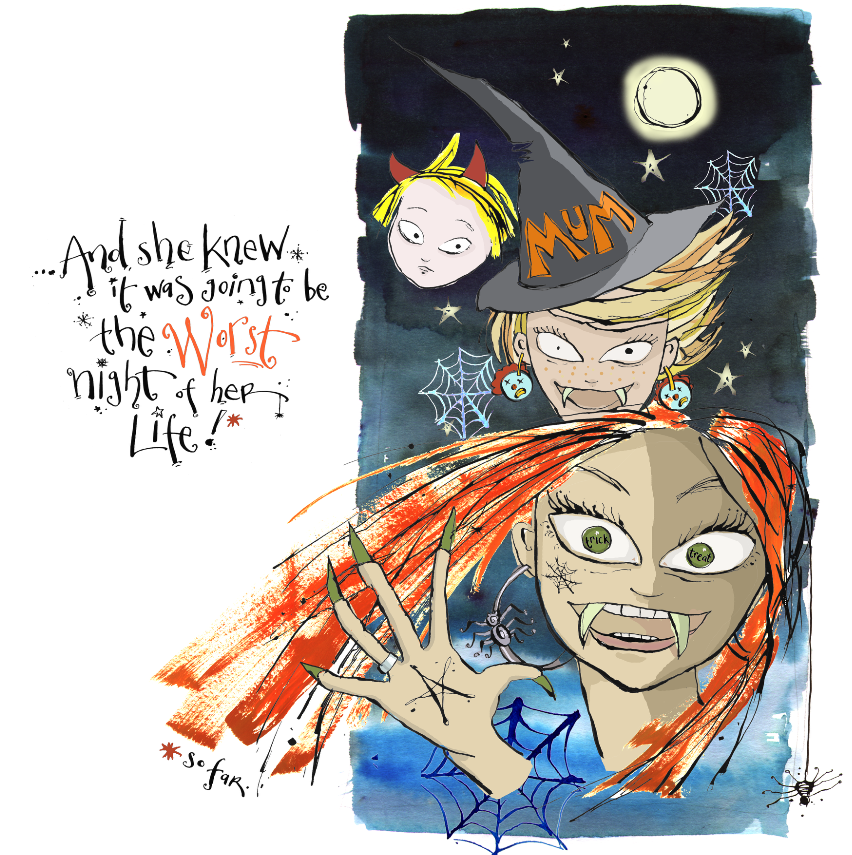
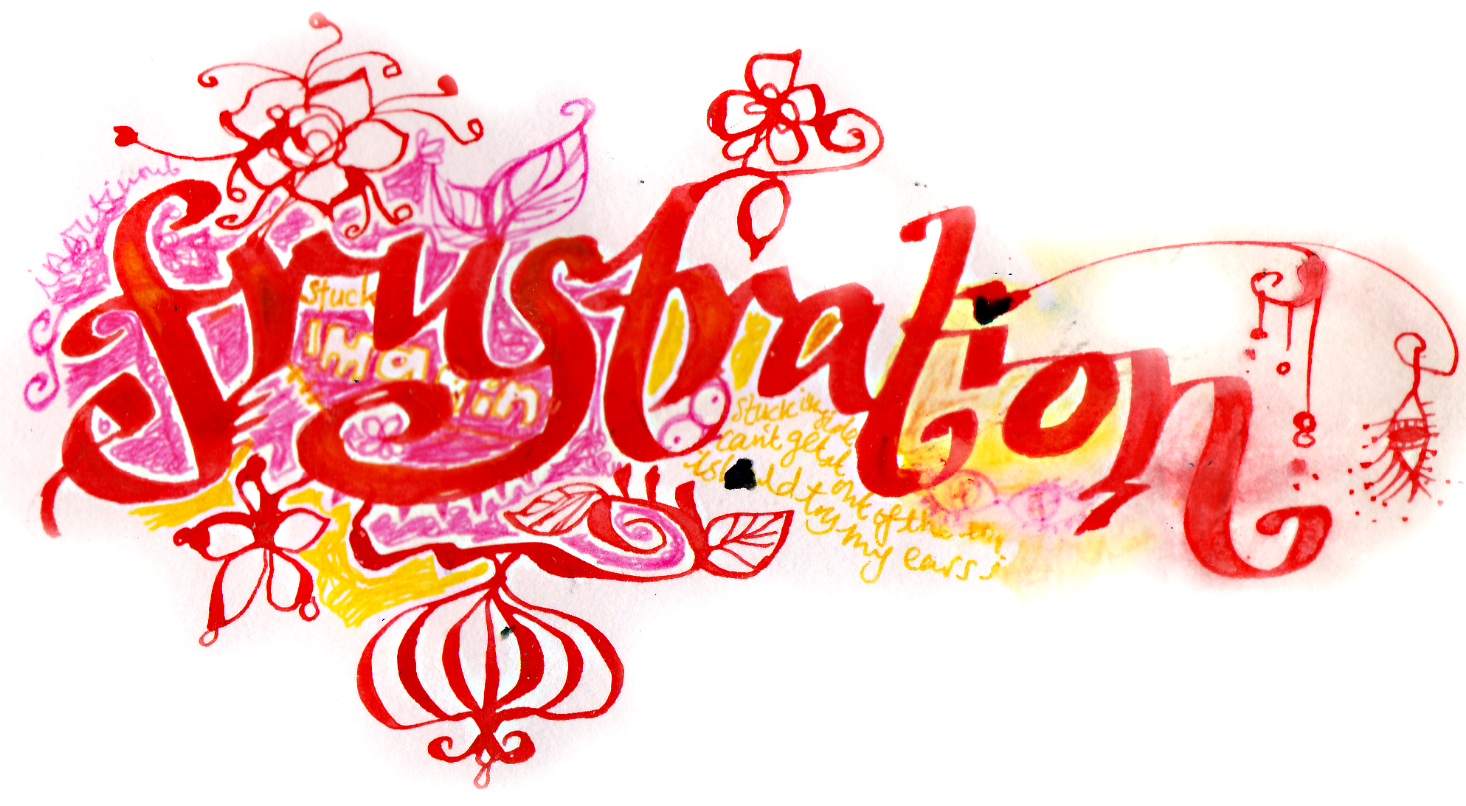
Personal work from a book project that I shelved. I might un-shelve it — though the artwork would look very different today! (the toddler in the picture is now a post-grad).
These two lettering pieces were created in an Edinburgh hotel room, in the middle of what felt like a little breakdown. I was creatively stuck, feeling at a dead end, and really upset, but was away for the week teaching degree students about illustration — so feeling like a massive fraud. My partner suggested combining some of the lettering I’d been doing for years with flowers and plants, and some of the darker stuff I liked to draw. Thank god he did; the work that nervously emerged that week saved me, and set me on the path for the next decade.

Over time, my ways of working all combined to create a body of work that utilises several different media, but hangs together as a look which is definitely ‘mine’. And the ‘mine’ comes via the movement, the energy, the content and the vibe, rather than the equipment I used to make it.

So I say, DO NOT worry about ‘style’ — if you see someone who looks to have a really strong visual language or colour scheme or way of working, they’ve likely had a long time to develop that. Maybe they don’t actually HAVE other ways of working — maybe they can’t! — or maybe they just don’t feel comfortable offering more than one look. And what you probably won’t see are the mountains of work that led to what you see in front of you.

Monday, November 02, 2020

Comfort & Joy - 'a journey'


It's definitely not too early to post this Christmassy book by Kristin Hannah - after the weekend we've had and the weeks we're about to have, I thought we needed an unashamedly seasonal bit of work!

I started this book cover in February this year, before the 'first' lockdown when Christmas seemed a lovely recent memory rather than an imminent but uncertain event. Such is the nature of Christmas-related projects - I can be working on those eighteen months ahead sometimes - but when I was making this cover I had NO idea, of course, that we'd all be anxiously waiting to see what shape Christmas would be this year.

This one's also a good example of a cover that went through a great many versions before the final was approved. In fact, the project was finally finished in May, while we were deep but freakishly sunny mid-lockdown, the talk was still of banana bread and clapping, and I was still running to the local graveyard to do my workout!

Art director Derek was keen for a brand new look for Kristin's books, which are mega-bestsellers. The author had seen a cover of mine that she'd liked ('Nightbird' by Alice Hoffman) so we started there - a rich surround of wintery foliage revealing a cosy-looking house in the centre. 


The work was done as pencil sketches on A2 paper - my plan was to really ink these in in quite some detail:


To this I added some colour, with a hand-made ink sky (captured on camera):


Now, this was pretty much exactly what the author wanted. It's actually quite unusual for an author to have so much say in a book - but I think because of her status as a high-seller, with a strong reader profile, this writer was allowed to have more input. However this sketch was quickly set aside for a more toned-down foliage-based approach - no flowers (which had all been chosen for their geographical and seasonal relevance), just foliage. So we tried that approach instead.

And the house? Less grand, please! So we tested out how that might look, in a quick all-green rough:


This wasn't the right look either - so Derek and I discussed some branch-only approaches. Just green, and just the branches of a pine tree - a few branches:


A few more branches - painstakingly drawn one needle at a time in Procreate - and in the blazing sunshine!


And then Full Branch Action. Note how the house has changed from the first one, too:


After drawing gazillions of individual pine branches, I learned that the author still wasn't keen. I don't think she was being ornery deliberately; she just knew what she liked - but only when she saw it! And...she hadn't seen it yet.

So we tried a more graphic approach, reducing the branches to mere silhouettes, more like a framing device. Pine cones are Works In Progress here!


This one I loved - although only loosely indicated here, it was easy too picture a holographic foil on the tips of these frozen branch tips, and a spot varnish for the moon:


But. These still weren't right. And I can't remember exactly HOW we got to the final version, but all went quite for a couple of weeks, before 'Overwhelmingly Patient Art Director Derek' sent me another piece of my previous work, and told me the author rather liked this one now, instead (my work for Bareminerals' Christmas make-up range):


And off we went again! Again using Procreate to sketch and do final, with the art then brought into Illustrator for careful vectorising, we got to an outcome Kristin liked. My little house survived for one rough more, but my lettering didn't:


And by the time we got to 'Final-Final-Final', the house had gone too. And my blue-ink sky was made red, with the simple magic of Photoshop, of course!


I can't wait to see this in the flesh as I understand there's gold foil action, and that's going to look extremely Christmassy. It's one of those jobs where the roughs took me hours and hours, with all the pine needles (all those 'bastard pine needles' as they were being called at the time) with the final art taking me a morning to complete - but that's how it works sometimes. My record for rejected roughs remains at 47 - forty-seven different, individual cover ideas for a single book, NONE of them used in the end (they used a stock photo) - and this was nowhere near that, so that record is safe...for now.

And it was all worth it (it almost always is) because Kristin says on her Instagram account that ‘for the first time, she really loves the cover’ on this novella. My work here is done!

I’ve saved every sketch, original bit of art and rough because you ever know — they might not have been Kristin’s cup of egg nog, but they could be someone else’s. Recycling, you know!


'Comfort & Joy' is published by Ballantyne, part of Penguin Randomhouse, and you can buy a copy here.


Monday, March 09, 2020

Harley In The Sky


This golden, shining cover is wrapped around Akemi Dawn Bowman's latest work of fiction, following on from the bestselling 'Starfish' and 'Summer Bird Blue', both multi-accolade-winning novels in the Young Adult Fiction world.

I already knew about Akemi's books as their covers are the sort that seem to have existed forever in my line of sight; popping up on 'best book' and 'great read' lists and on the myriad publishing news emails I sign up to. So when I realised THAT'S whose book I was about to illustrate, I knew it had to be...

...well, different from those. This was a different story, not linked; new characters and settings. 
And by a different illustrator!

I started where I usually start, by reading the manuscript. Always feeling like a giant skive - reading books during the work day? Someone's going to grass me up any minute - this is the single most important thing I can do before starting a cover. 

And I was gripped.

~ † ~


It's a risky strategy, reading the book rather than opting for a neat summary with key points provided by the editor. You might not actually like the book, in which case you can approach the book more objectively and pick out the key elements that could inform your cover in a rather workmanlike way. You might like the story but not the main characters (let's be honest, just like in real life, you can't like EVERYONE you meet), in which scenario your job is to focus on the environment, the landscape it's set in, and pivotal objects or moments. (If the art director's asked you to focus ON the character, well. Then you just suck it up and crack on.)

The third risk is one I encountered umpteeen years ago, close to the start of my YA illustration career. You don't just like the book. You LOVE the book. LOVE it. So much that you cart the manuscript around with you to the MOT station, to bed, to the waiting room, the bathroom; you laugh (or cry or tremble) out loud in public places and feel The Sad when it's over, even though it's not a proper book yet because you haven't even drawed the front of it so it can't be a book yet.

You might think these books are the easiest to draw for, because you gel with them. And maybe it is for some - but it isn't the case with me.

When I'm this situation I want to get the cover so right it can be paralysing. I want the cover to tell the entire story in one image (which a cover cannot, and should not, ever do). I want the character to look precisely the way I visualise them. I want it to be perfect - and oftentimes, objectivity flies off out the window along with sound judgement and the necessary sense of detachment that's needed to make a cover.

After all, a cover needs to not only hint at the story and mood, and be nice and legible, it needs to be attractive and distinctive on shelves. It needs to leave enough ambiguity for the next reader - after you, you who got to read it first - to pull it down from Waterstones' shelf and go, 'OOH'. Essentially, it needs to SELL, and that little spot just there where a cover artist's personal desires Venn-Diagram their way into the Marketing Team's Monday meeting can be a hotbed of angst, difference of opinion and disappointment.

Which is why objectivity and detachment can be king when tackling a cover.


'Harley In The Sky' fell into this last category. To be really honest, a great many of the manuscripts I read DO fall into this category. I'm a reader, and I love books and escaping, and regularly fail to believe my good fortune that I'm asked to draw covers for such immersive, narratively energetic books. There's only ever been one manuscript I didn't like, and it was because it was written in a certain why that I found hard to read. As it happens, this had a surprising effect: I had to try much harder with the cover, and the end result was one of my all time faves (and I shall never tell which one it was!)

Tackling Harley therefore yielded, as often happens in this situation, a great many initial ideas. Because how on earth was one going to do the job on its own?

I started by visualising a very pretty, very ornate cover, inspired by Japanese paintings, Klimt and botanical art. Set against a pitch-black background, I wanted Harley Milano and her hoop swinging into the middle of it all; strings of jewels and ivy, trails of exotic flowers and ropes as her backdrop. The circus would be communicated through some hand-drawn lettering drawn straight from turn of the century circus posters (suggested by the cheesy placeholder font here).


In an alternative version, she's the focus of attention, her face staring purposefully out from a writhing assembly of rococo flourishes, cherry blossoms, ribbons and fellow aerial performers, her piled-high hair crowned with a mini-Big Top:


And in the third initial suggestion, she's divided by the cover; rebellious Harley who runs away to join the rival circus on the front, the Maison de Mystére, and the 'good' Harley who should stay with her family's own circus, the Teatro della Notte (even though her parents are against it):


The second batch of ideas suggested the world of Harley's imagination as a full side profile, looking skyward into her trapeze-based aspirations - of these, only the circus at the bottom was to stay, but I LOVED everything about these two. I consider these all-ink options 'The Ones That Truly Got Away':


Harley's 'stars' being added


After this, another round of ink-based approaches using dramatic shapes and silhouettes. If Harley was to be featured, she could be seen the way she might be seen from far away on the ground in the Big Top - a sharp silhouette, rolling down her aerial silks.

The background this time IS the Big Top, swirling upward into blackness, acrobatic lettering in the foreground.
(Crikey I loved that Y and REALLY wanted it to stay!)
And here's where the idea of show lighting came in - these sulphurous spots surrounding the performance:


The final cover we settled on looked like this; a combination of the more organic looking lettering, Harley as silhouette, and that big top with the lighting, the circus illustration taking centre stage not the back:
And this is how it was made!

I wanted lots of texture in this cover, so the Big Top was created with a sheet of A3 cartridge paper inked over with mono printing ink and a roller. This gave the points their aged, gnarly texture.

Cut from the centre into radial points with a scalpel, but keeping the piece of paper attached in the centre, I arranged the sheet on a scanner.


A deepening orange background was painted with layers of ink, to sit behind the 'Big Top' and create that sense of peering into the darkness. And the circus was drawn entirely with fineliners!


And the finished cover was appropriately treated to a gold under print, making it absolutely sparkle at the edges. It's a satisfyingly fat hardback, so is lovely to hold in the hands. Check the gold below in the video - and delightful surprise of the gold foil on the back spine beneath!


I insisted Akemi sign her copy for me! The 13-year-old in me is fainting.

Thank you to Heather Palisi for the careful and enthusiastic art direction, and tor asking me to do it.

"Harley In The Sky' is published by Simon & Schuster on 10th March, 2020, 
and you can buy a copy here in the US, or here in the UK.


LinkWithin

Related Posts with Thumbnails