Reproduced here from an interview by Michelle at Capsules Books: https://capsulesbook.com/blog/sarahjcoleman
Interviews are funny things.
You have to be honest, but keep your professional veneer; you can’t show off, but it’s important to talk about your achievements, since you’re being asked about them. I’m often surprised at the things I say in interviews, as I find myself being more candid than I expected to be. And sometimes, when you read them back, it can be like reading about someone else!
But whatever the outcome, it’s always my hope that there’s something useful in it for those who take the time to read it.
Hello Sarah!
Thank you for taking the time to talk to us about your creative practice, recent work and future projects.
Please could you tell us about how you started your creative career?
It started very young, as soon as I could hold a pencil! But, in a nutshell, I did a degree in Illustration where I was a bit hermit-y, in the with cleaners at 7am and out with the security guards at 10pm. I won an award for my lettering and started working for clients before I graduated (I did a book cover for Carrie Fisher and a couple of other small pieces) before going on to work full time…there’s quite a lot I also did in between, but your readers may keel over asleep if I list them all!
We are very proud to be featuring your work in Ascenders Volume.1, Leaders In Contemporary Illustrationout in December. Could you tell us about some of the pieces you will be featuring in your printed portfolio?
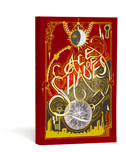
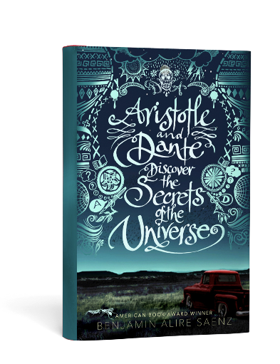
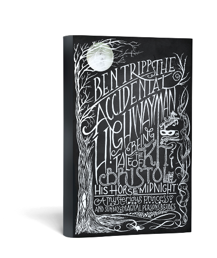
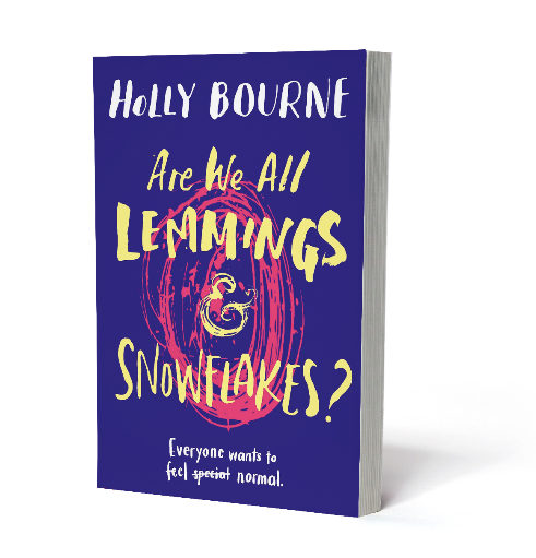
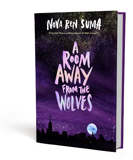
Thank you. I’m excited to be part of a new publication, and one based in in a country that’s not the one I live in! I’ve included some recent chalk work I did for a French client, as I love to work in different languages. I’ve also chosen a nice collection of book covers, as they’re great for demonstrating the breadth and diversity of the lettering work I do. And I do do a LOT of books!
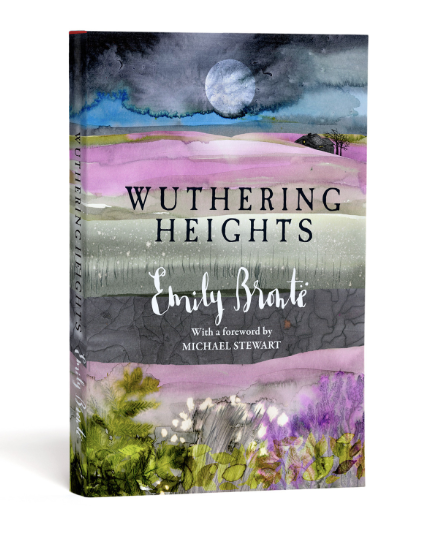
One of your most recent projects is illustrating the 200th anniversary edition of Wuthering Heights to coincide with the 200th birthday of Emily Brontë. The book is available now and your cover looks incredible, we’re excited to see all the illustrations within.
I understand that this was a story very close to your heart from a young age, and you’ve even exhibited at the Brontë Parsonage Museum. How did it feel to be asked to commemorate such a landmark edition and as a long-time reader, did you always have an idea of how you wanted to represent the characters and settings? Did the final result finish up to how you originally envisaged?
I felt a great sense of responsibility but also big excitement. I had to talk myself down from the ledge of thinking ‘this has to be the best work you’ve EVER done’ to a much more relaxed state of ‘let’s just let the ink flow, and see what happens organically’. I know the book so well, in the end all I needed to do was tune into it. The end result was better than I had hoped, but I could never have predicted that particular outcome! I like those jobs the best.
We understand you’ve recently celebrated some career milestones, with over 450 books illustrated (covers, interiors and both) as well as reaching over 25 years in illustration. You’ve certainly come a long way since winning ‘Best Handwriting in school’.
What would your advice be to your younger self?
Yes it’s flown. Seriously, 25 years have gone by in what feels like 5, and I know I still think like a new illustrator — anxious to promote, always feeling the competitiveness of the industry, never comfortable with resting and always thinking about what’s coming next.
My advice to my 23 year old self would be to try to make sure there’s always time for mucking about. I work so fast and furious for clients, particularly on work I get through my agent, that I sometimes forget that I’m not a machine I need time and space to develop. Often, development and experimentation happens ‘on the job’ — which is a good way of making it happen, but risky, and quite pressured. Investment in self is absolutely vital, and I feel the areas where it’s lacking of it as I get older; I know other illustrators feel the same. But I would let my 22-year-old self know that she was right to join the gym as soon as she left college!
(By the way I doubt my handwriting would win a prize now — it’s like The Picture of Dorian Grey; the more I’ve worked publicly as a lettering artist, the more my ‘real’ writing has deteriorated!)
Next year sees the release of activist Malala Yousafzai’s third book, which you’ve created the front cover for. You’ve previously worked with her on ‘Malala’s Magic Pencil’. That is amazing! How does it feel, knowing that the work you have created with a Nobel Prize laureate will be seen by millions of people around the world?
It feels nice, and although I treat it like a another job while I’m actually working on it — simply to make sure the same level of objectivity and efficiency is applied — I receive the finished books and get a warm glow across my face!
They could have chosen any lettering artist in the world, yet they chose me, so I feel very privileged. She is truly an excellent role model, and not just for women and girls.
You’ve illustrated world renowned philosopher and spiritual teacher Ram Dass’s new book — ‘Walking Each Other Home’ which is out now.Could you share a quote from him that particularly resonates with you?
As it happens my copies arrived this morning! And this quote popped out of the page at me as I was flicking through (it has a LOT of pages!):
“You are not dead yet. It’s not too late to open your depths by plunging into them, and drink in the life that reveals itself quietly there.”Good huh?
2019 is an exciting year for you with a top secret project released, involving a very famous film coming into book form for the first time!
How did you get involved with the project, and when will we know more information?
It came from a publisher I’ve worked with a lot in the past, but an art director I’d only done one book for previously. I think my combination of inky, layered textures, the darker stuff I naturally lean towards and the ability to create strong type centrepieces pointed flow-chart-style to me! I haven’t got a final publication date, but I think it’s early summer. I believe it’s hardback, and special finishes are currently being discussed!
You have built up a diverse and successful business, working across everything from a record label, to advertising, film production and of course, illustration.
Could you share some advice for young creatives looking to establish themselves commercially?
Gosh that is quite difficult. The landscape I graduated into was very different from the one I enjoy working in now. But I think there are commonalities.
- It won’t happen overnight, building a career takes investment and you need to be brave, taking risks, having a stab at things.
- It will always be hard work. Especially just as you think it might start to chill a bit — that’s when you need to sink your teeth in!
- Talk to people, a lot — in person, and pick up the phone. ‘Business’ is just another word for relationships, with money thrown in!
- Authenticity is key. You are only you; you can never be ‘them’, and their successis notyour failure.
- Do not take social media at face value — massive pinches of salt and a humorous dose of cynicism will keep you from thinking everything and everyone else is unattainably perfect! It can be your best friend and your worst enemy, so treat it accordingly.
- Look after your body and your mind. Start now. How you handle both will directly shape your 30, 50, 70 year old working self. There is no business without you.
Finally, could we ask about your pseudonym, Inkymole, how did that come about?
Rather undramatically! My surname is Coleman, and because I was short sighted at school with pretty thick bins*, that got turned into Colemole, which got shortened to Mole. The inky but came as a result of a lifetime spent with ink and paint on my fingers and just started to sort of get slung in front of it. Clients were calling me Inky on the phone, and when sarahcoleman.comwas already taken when it came to buying my first domain, inkymole.comwas free — so I bought that! Et voilà. Inkymole!
*British slang for glasses!