
We watched 'Still' last week, the documentary about Michael J. Fox’s life as a person with Parkinson’s Disease. We were shown the myriad clever, agonisingly secret techniques he developed to hide the effects of the disease for as long as he could. We watched the trembling left hand always given the task of holding something or gesticulating, and the way he exaggerated his already restless manner of moving through the day, in order to fold any twitches or unexpected movement into his famously energetic modus operandi.
It was funny, educational and extremely moving, and the moment we were shown his hands beginning to move I thought of this project.
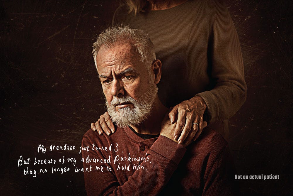
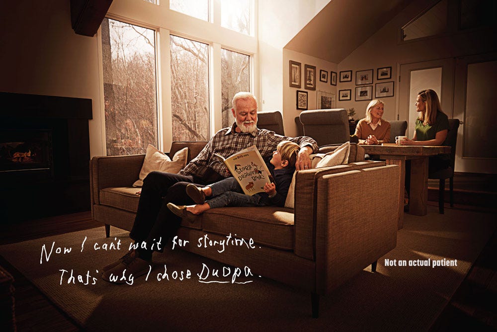
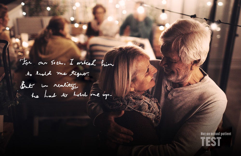
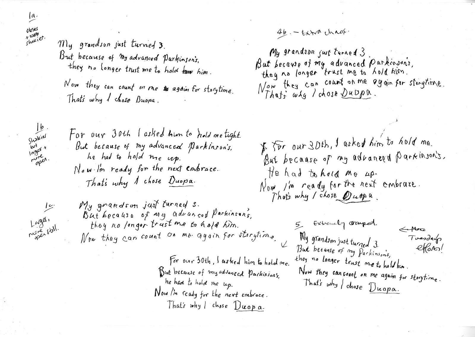
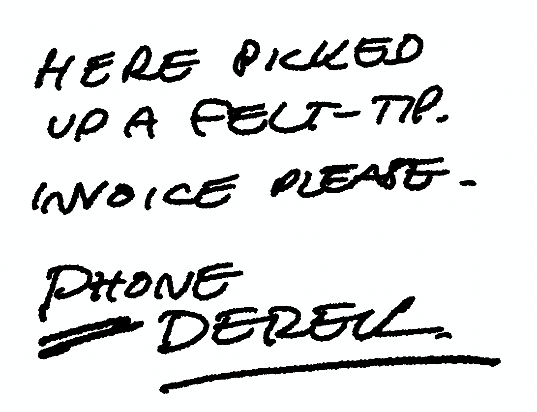
Commissioned in 2020 by Saatchi Wellness, it was designed to communicate the effect that Parkinson’s Disease has on motor control through the power of handwriting. My job was to develop a set of authentic handwriting styles for a set of fictitious patients, each with unique characteristics, that are shown both subjected to the effects of Parkinson’s, and after treatment by the drug Duopa.
Although it isn’t suggested that the treatment returns the patient to pre-Parkinsons handwriting, their motor control is shown to be sufficiently improved as to render their writing readable once more, communicating a sense of a return to empowerment and confidence. The stories of each individual are based around achieving modest, important tasks such as picking up a grandchild, or dancing with a partner.
The two shown here are from a larger set we created, with a complete font developed for use on behind-the-scenes assets. The research and development for this project was extensive and very moving at times, and I cried a few times as I channelled everything I’d learned through my fountain pen into the words of the imaginary, but also very real, patients.
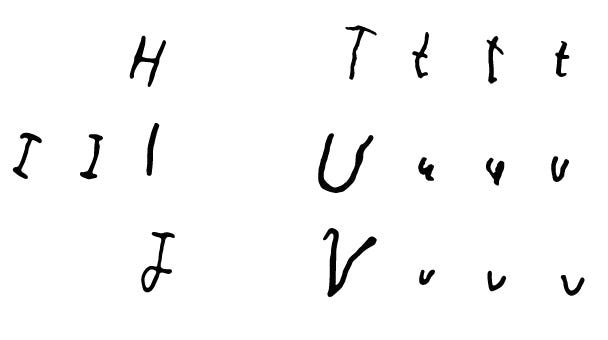
I do a lot of what might be called forensic lettering work — maybe that’s too exacting, perhaps ‘reproduction lettering’? — whereby I’m called on to recreate the handwriting of a famous person, or someone deceased (sometimes both) for advertising or TV, film or books. Some of won’t be seen publicly. I’ve also done a lot of work that involves developing handwriting for fictitious characters — in fact, I’m doing one right now, three different ‘voices’, three different ages and situations, with a different choice of writing implement for each.
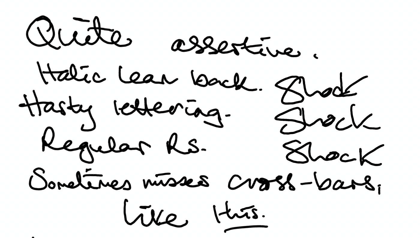
It’s harder than you think to override your own muscle memory and install new clicks and flicks of the wrist, different angles and pressure and descenders, a way to dot ‘i’s and cross Ts that’s someone else’s, and to keep it consistent — while tying in any historical factors too. In fact, it feels more like acting than design or lettering work, and it’s a million notebooks away from calligraphy. Once I’ve got the writing locked down, I can get into that costume and ‘be’ that person for as long as I need, even switching between them day to day. (There is, incidentally, always a voice that isn’t mine that accompanies the words I’m writing.)
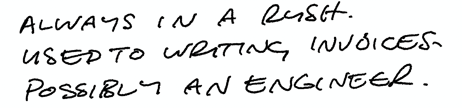
But I love the immersion and focus that comes with the task, and the attention to detail. It’s very different from the kind of lettering I might make for an editorial or a logo, where I throw my brush, nib or Apple Pencil across the page with energy and only the loosest idea of outcome.
If you would like to know more about this type of work, please get in touch. In fact — write me a letter; I’m far more likely to respond…and who knows, maybe I’ll do it in your own handwriting.
Images shared with the permission of Saatchi Wellness.
No comments:
Post a Comment