Tuesday, October 14, 2025

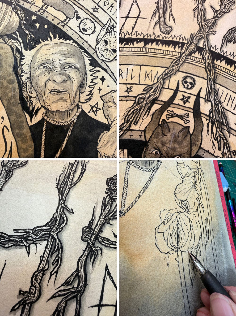
Look; she roams the night! 🦇 - my new poster for Benjamin Christensen’s revolutionary 1922 film about witches.

Friday 3rd is not 13th, but it’s a good enough day in October for my first post in ages. It’s been a busy and very fast summer, but more on that, and the failing-to-Substack guilt that’s been gnawing on my right hand the whole time, in a later post.

For now, here’s my new poster for the 1922 film ‘Häxan’, written and directed by Swedish filmmaker Benjamin Christensen — who also stars as Satan in the film.

Technically deeply impressive for its time, it’s a documentary-style exploration of how the characteristics and behaviours that led to women accused of being ‘witches’ in the past were potentially behavioural, hormonal, neurological or mental health issues, including now widely understood conditions such as insomnia (“she roams the night!!”) and depression (“look how the devil possesses her mood!”) It was revolutionary thinking at the time. Not only was it the most expensive Scandinavian silent film ever made to date, costing nearly two million Swedish kronor, it was eventually, and predictably, censored for what was at that time considered graphic depictions of torture, nudity, and sexual perversion, and anti-clericalism.

Press enter or click to view image in full sizePress enter or click to view image in full sizePress enter or click to view image in full size


Press enter or click to view image in full sizePress enter or click to view image in full size
Press enter or click to view image in full sizePress enter or click to view image in full sizePress enter or click to view image in full sizePress enter or click to view image in full size

The torture was purposefully explored in the film because of course, it is historically accurate. Whether young and beautiful or old and craggy, as a woman alive at a certain time in history, you could never assume you were safe (which directed the addition of the blossoms and the dying roses in my poster). The film shows women again and again placed in situations where their autonomy, already compromised by their social and family situations, plus the very period in time they found themselves existing, is stripped from them by men: men of faith, men of the law, and men of power.

The film however points its sulphuric lamplight in the direction of their fellow women. Devoid of scientific or rational explanations for whatever awful thing they’re experiencing, mothers, daughters, friends and colleagues accuse the more vulnerable women in their community of ‘witchcraft’. According to the rules, to accuse a witch is to recognise one, and therefore to be one, and to prove you aren’t one — well. We are all surely familiar with the options available there; to quote the deliciously political warning of the folkloric Radiohead song Burn The Witch, “if you float, you burn”.

Witches are not a new subject for me. I took a clammy dive into a modern reimagining of the Pendle Witches for my 2009 exhibition ‘They All Came Back’, asking precisely that question: if the Pendle Witches were alive today, how would that look? How would they do their accusing? How would they muster the deadly hysteria that resulted in 10 executions? Mother accused daughter; daughter accused mother, man accused dog. I got my friend, author Dr. Ed Garland, to write the voices of each Witch, and I made pictures, and dolls, to accompany those voices.

This piece proposed the witches’ most obvious route to channeling hate, accusation and bile — Facebook. I set the witches up, and got them talking. They’re all me, and I’ve sprinkled in “direct quotes” from the records of the time, but boy that conversation could have rolled on. It was delicious.

(and by the way. I didn’t know how to delete the profiles of the ‘witches’ I’d created for the purposes of this piece. So I left them there. And — I’m not making this up — when I finally logged back in years later, there’d been, shall we say, ‘activity’. Having lost the password long ago, I can’t get back in to check whether Alizon, Anne and Kath carried on baiting each other. I hope they did. I hope it’s a total maelstrom of utter spite and shitposting in there).


Created for illustration collective Hire an Illustrator’s new project ‘The Video Shop: A Blockbuster Experience’ curated by Darren Di Lieto, this was an invitation to reimagine one of 13 classic movie posters. I chose this film from a list of terribly appealing, Halloweeny options — Nosferatu, Little Shop of Horrors, Night of the Living Dead — but I went for this one because of its important role in introducing some prematurely modern ideas about women’s health. It felt uncomfortably relevant, and I’ve learned the hard way that discomfort is historically what produces my best work (a literal example, one of many, is to be found here). Naturally, my poster delights in the panto-esque Satan and his wobbly tongue, but I’ve flanked him with the ‘hysterical’ nun (if you don’t know, look up exactly where that word comes from!) and Maria The Weaver, the poor elderly lady who is tricked by a man of the cloth into confessing to witchcraft.

I remain doubtful about whether we have genuinely moved beyond baying mobs pointing fingers at other humans and shouting ‘witch’; all the way back in 2009, I was asking what is social media if not an omnipresent, all-welcome opportunity to do just that, should we choose it, either through fear or rage or panic (each being borne from the other)? But that’s a whole other blog. I am fully aware of the globally harrowing context in which I’m writing this, and it’s another reason why I grasped at illustrating a film which wasn’t just ‘fun horror’ and entertainment — though god (or the devil) knows we need escapism, even if horror-shaped, in a time of genuine, creeping dark.

Thanks to Darren for the opportunity to take part in such a ‘Sarah-perfect’ project.

You can, if you would like, buy a print of mine or any one of the other 12 pieces in this show:

https://press.hireillo.com/

Saturday, February 08, 2025

I’ll stop doing Christmas cards when they stop doing Christmas.

2024’s seasonal greeting was fully analogue, with inspiration from an 8 year old’s ink experiments.


Every year, from childhood to 2019, I’ve designed and produced something postable for Christmas. And when I say ‘postable’, I mean that in the traditional way — put it in a postbox! One day I’ll write a piece about some of these extravagant productions and the hours of work they entail, but they are legion. 


After all; I am an illustrator, an artist, a person who does lettering, loves print, and works with ink and pixels and paper all day/week/life long. You would be correct in saying there’s something of an expectation there.

They've ranged from a snow-white 7" record release on white vinyl complete with fully illustrated storybook and website, to a foil-embossed trio of hangable mandalas illustrating prose my my writer friend Ed, to a set of mini chocolate barshand-wrapped in my own Christmas wrapping paper (sold separately in my shop, 7 different designs), and individually hand-printed book marks.

These myriad creations are not necessarily on my website — I think of them differently from client work — and for many of them there isn’t a copy left, so if you had one, you were #Blessed, a sort of ‘you had to be there’ vibe.

The lockdown of 2020 meant that these very physical greetings were put on hiatus as people moved to home working, changed jobs or retired — or even left the industry altogether for something else. Who would be where? And for how long? How do you find out where all those people are and is it worth the postage spend when half might not arrive? My four-figure mailing list was suddenly in doubt, so an equally time-consuming animation was sent out instead — I still made some hand-printed greetings tags as well, unable to fully abandon the analogue.

The world had seemed to have lost a little of the joy in the tangible — or even become a little afraid of it, with all the sanitiser and hand-washing? — but I wasn’t too fretful at the time. It would, I was sure, be back.

Took me bloody ages but I loved it. There was text in the middle of this! Favourite bit: waving dolly.

Hand-printed tags to accompany the animation.

2021, 2022 and 2023 were a mildly fretful mix of ‘cards just for family and friends’ and an online creation for the ‘Big Mailing List’, but carrying over a thousand identical but individually-signed objects to our local post office seems to have become a thing of the past, the list requiring a significant amount of updating and research before risking the associated expenditure on postage. Instead my aim, at this point, is to have a postable list of perhaps a third of the size, of colleagues and clients I know are still working, or in my orbit in a mutually-appreciative way, and who would still welcome funny little creative indulgences in the post.


This 2023 article from Vice is mildly insightful.

Meanwhile, this year I was fully intent on some hand-made action. And I thought it would be nice/interesting/distracting to show the process of producing these actually quite simple (by comparison) cards.

I was entranced by a piece of artwork my eight-year-old niece made one day in September when I was looking after her, using some prototype inks from the UK ink company I work with. I was to put them through their paces; they didn’t exist yet, they didn’t have names, and I only had a tiny bottle of each (“ooh, don’t use too much of that”) but in she went, using too much of that, with a cotton bud and some gusto; dot dot dot.

The colours blended and overlapped in an exquisitely simple CMYK kind of way. I kept that piece on our studio wall for weeks. I knew it would be my Christmas greeting, but I decided I would figure out what the rest of it would look like nearer ‘the time’ (with the world being as it is, any outward-facing visual communication has benefitted from a certain ‘reading of the room’ before committing). Ideas were floated and rejected. I knew two things: it needed to use the newly-arrived batch of neon ink I’d bought for my obsolete Japanese Gocco printer courtesy of a friendly new supplier, and it needed to be simple.

Tests were carried out!

And sure enough, what the world needed towards the end of November was a big smiling bauble face, because I am ALSO eight years old and like drawing and sharing big smiley and preferably imperfect faces.

Some of the faces auditioned.

Smiley faces were drawn with ink and the wrong end of a paintbrush and auditioned. Those rejected were cut up to be deployed as gift tags on the family pressies. Then a rigidly symmetrical star was made in Illustator and tested, and laid over one another.

Boom. The infectious joy of a Christmas bauble backed by a neon star and an explosion of 6-coloured dots, overlapping and interacting with each other like CMYK Christmas lights.

I got the niece back in the studio to make as many dots as she could, but this time on pre-ordered pre-folded blanks. Since this was a solid collaboration, I also got her to draw her logo so it could be added to mine on the back of each card.

This she did.

The stars went down first on pre-scrored Hagaki-proportioned cards, the bauble colour laid over, then the bauble face in 3 separate screens:

And when G tired of dotting (she wasn’t being paid after all), Auntie Sarah finished the last ones off…


Drying on the racks.

And thus, a couple of hundred cards were made and sent.

Called ‘Print Gocco’ by their manufacturer Riso, whose name you will probably know in connection with other, larger and less analogue machines, my little printers will not last forever. They’re essentially made for children and their parts and supplies are obsolete, but luckily I have a supplier and have been buying up supplies for 15 years. While I have them in full working order, though, smelling the get-high printing inks and running my hands over the dried print, knowing that someone else at the other end will open an envelope and do the same thing, is a sensation I never get bored with. It’s one of the things that gives me joy in a very, very screen-based, fast-to-make world. I hope that it does the same for the recipients too, a hark back to the times when you waited for a return hand-written letter, knowing that the hands of the writer — of whom, it is assumed here, you were fond — had touched the very same paper.

If you would like to receive a hand-made thing every Christmas, you can let me know here.

And you can buy Gocco-printed cards in my shop, if you fancy some of that intoxicating print smell for yourself…or know someone who will!


Wednesday, September 25, 2024

To Steal A Mockingbird


I accidentally wrote my most engaged-with Thread a couple of days ago, when I posted that I’d found another little collection of infringements on Etsy and Redbubble:

(there was a picture of the nasty product with it which I don’t want to post. It was fugly.)
ugh.
more ugh.
In a scene from ‘Beautiful Creatures’, a film adaptation of Kami Garcia’s novel
Best thing to do, I always think, is to keep creating — which *I* can do, whereas they can’t — because presumably, if they could, they would. Even if you can’t or won’t get the pencils out and you’re determined to open an Etsy or Redbubble shop selling stuff with pictures on you can fire up Midjourney/Stable Diff/Firefly and chuck a few words in.


This is by no means a rare occurrence. I find them regularly, when I can be bothered to look, and if someone sees one and alerts me to it. But find them I do, and many of them — in the last handful of years alone, I have found around 70, and those are just the ones I’ve known about. I don’t even know if I have the stomach to look in the cesspits of hyper-shite, Temu and Wish, to see what might be festering away over there. (OK I just went and looked — filed one report, couldn’t see any more).


Etsy has a much-improved system for reporting sellers (Redbubble’s is more hoop-jumpy — I always feel like they’re rolling their eyes while I’m filling the form in) but I prefer in the first instance to contact the seller directly, tell (not ask) them to delete the listing and all listings which use that image, the take them to school on why using other people’s artwork is copyright violation etc. I did once secure the profits from the sales of a product that had sold in great quantities, with those sales numbers shown clearly in her shop; I didn’t enjoy how scared she sounded, but I couldn’t let it go either. I donated the money. I have also been asked to ‘prove’ I’m the creator of certain works —for which I’ll unleash the kraken. But rarely do I have to engage full combat mode; depending on their attitude and promptness of action, I usually leave it there, making sure I follow their shop first to keep an eye on any future ‘borrowings’.


Usually, people are all shades of awkward at being caught out, then apologise. I sometimes get The Bare Minimum, however:
But it was my update a bit later, following up on progress, that really got Threaders furious. People were mad about the original infringement — I get it, there are a lot of us artists on there professional and non-professional alike, and we all hate a picture thief — but this post had people roaring:


You see, aside from the puzzle that they’d used a sketchbook version of my cover which had never been made public — not beyond a lo-res jpeg in a classic old blog posted 15 years ago — my infringer had told me they’d asked the author for permission to use the artwork. And that author? Harper Lee.


Obviously, we could discuss all day why that’s funny/sad/infuriating/embarrassing for her — and some people were RAGING, and also baffled when I told them I felt a bit of sympathy for the infringer, the nuanced reasons for that proving harder to articulate than I’d imagined. And we can also unpack quickly that obviously, it’s the artist’s permission she should be asking, not the author’s, and that that artist is me. I get it.


But the huge engagement got me thinking. I created the cover for that book for Grand Central Publishing in 2009, in a quiet, nervous, ecstatic period of focussed excitement. That’s 15 years ago. The book was the 50th Anniversary mass-market edition — which is a big deal, because not only does it mean it gets gold foil on the front, it means it goes into every school, college, library, university and book shop. It couldn’t be a bigger print run.
And as such, it appeared in films, documentaries, essays, theses, dissertations, fan art, you name it. The novel itself is universally known, land loved, and part of the very texture of human culture and writing. As such, so is the artwork on the front. Although it’s mine, it stopped being ‘mine’ when the book first went out into the world, and became part of the canon of the handful of iconic covers that were created for this book in Harper’s lifetime.


So I began to seriously think for the first time that I really should let this go. I should stop wasting my precious time (feeling even more precious as I head into my 54th birthday in a few months) preventing people from using the image to generate a few quid and focussing on making new art. It makes me cross — it’s lazy and grotesquely entitled to use artwork someone else has made to make money for yourself, and there is a whole, loooooong piece I could write there — but it takes time and a certain kind type of diligent energy to hunt them down and report them; engaging with the sellers I find particuarly draining.
But as I said in my original Thread:


Best thing to do, I always think, is to keep creating — which *I* can do, whereas they can’t — because presumably, if they could, they would. Even if you can’t or won’t get the pencils out and you’re determined to open an Etsy or Redbubble shop selling stuff with pictures on you can fire up Midjourney/Stable Diff/Firefly and chuck a few words in.


For any other works that get infringed, it’s business as usual — if I spot you using my art, you better get ready because I Am Coming For You. But this one? It’s in the collective literary consciousness, and it’s inextricably and permanently connected to the book, in much the same way that people have ‘my Heathcliff’ or a favourite ‘version’ of a film or a character they love — they’re given over to the public when they’re created. most people I speak to have no notion whatsoever that this is someone’s ‘property’ — “it was just on the book/internet!”


And let’s face it, times are fucking hard. People are trying to generate extra cash wherever they can. I’m not saying life’s a sodding breeze for me either — I still have to earn money and pay bills; one life-changing cover (with a bog standard industry fee attached, I will add — this type of book project does not qualify for royalties) does not ensure financial comfort for life, despite comments I’ve received over time which suggest this is actually what some people believe.


I’d be interested in what others think. After 15 years should I retire the artillery on this one? After TKAM I went on to create several international editions, and the cover of Ms Lee’s ‘next’ novel, Go Set A Watchman. I gave talks about it, was featured in the papers and on the radio. My cover is in the Norman Rockwell Museum, and the original artwork was acquired by Harper Lee’s estate. I also have a precious hand-written note postmarked Monroeville, the content of which I shall never share publicly. And that, quite possibly, is enough.


If you love the cover image, you can for the first time acquire a signed, embossed and authenticated print of this work on 300gsm museum-quality paper, featuring artwork details never seen before.
It’s available from my Book Cover Print collection here.

Sunday, June 09, 2024

Haunting Digbeth, drenched in art

I was in Birmingham yesterday for one of the Design Festival talks I was especially interested in (by Territory Studio) and as it was a soothingly sunny, breezy day I went on a good long haunt of my old stomping ground, Digbeth.


When settlers first came to the area we now know as Brum it was Digbeth they started with, and you can feel that in the solidly industrious maze of chimneyed buildings, bond houses and factories clustered around each other. I was there briefly for one night in late April, but since I was there on a regular basis many years ago the ghoulish mask of gentrification has been slapped over much of the area, a process that’s really ramped up since work on HS2 began. Graf and street art, professional and non-pro alike, is being feverishly applied to every un-developed surface, as if the artists can feel in their bones that their time here is almost up.

On the way back to the car I visited the Custard Factory, central in our lives for a long time due to our historic involvement in music, pirate radio, DJing and events, and was unmoored by changes there — I initially couldn’t work out what felt wrong but then I saw it all: the lake in the middle was filled in, the gallery where I had one of my first shows (with Solo One) had been turned into a Laser Quest, and the little bar where we went to the infamous Selfish Cunt gig was now a Pieminister. And the Medicine Bar, where we’d danced (maniacally, to DJ Food and myriad others), DJ’d and handed out myriad flyers? Derelict and shuttered, its immense dragon sculpture replaced by a gaping white wall.

Time marches on and, to mutilate a favourite Dolly Parton quote, one day you wake up to realise it’s been marching all over your memories. But I was filled with appreciation at being there for this great, free creative event (I wanted to do a talk there but was too late to apply; that’ll have to wait for the next one) in a city I still get a buzz from, absolutely drenched in street art and organic graffiti on the walls of buildings designed and built for, and still echoing with, the business of graft — my comfort zone.

Even picked up a scuzzy pirate for the drive home. #castlevale #iykyk

Enjoy the pictures.


Beautiful buildings built for work:


A vintage Will Barras?


Medicine Bar: Before


Medicine Bar: Now

And here's us DJing in that very spot, looking back at the audience!


I was filled with an odd relief that there were still buildings like this to find. With paste-ups!


LinkWithin

Related Posts with Thumbnails