Showing posts with label pen and ink. Show all posts

Wednesday, February 07, 2024

Writing Their Story

I’ve just posted a new project in my folio, and although I’ve got over 20 years of pharmaceutical work hidden away in a password-protected archive for all manner of legal reasons, this one I was able to share. And I’m glad, because it was both a privilege and a responsibility to work on.

We watched 'Stilllast week, the documentary about Michael J. Fox’s life as a person with Parkinson’s Disease. We were shown the myriad clever, agonisingly secret techniques he developed to hide the effects of the disease for as long as he could. We watched the trembling left hand always given the task of holding something or gesticulating, and the way he exaggerated his already restless manner of moving through the day, in order to fold any twitches or unexpected movement into his famously energetic modus operandi.

It was funny, educational and extremely moving, and the moment we were shown his hands beginning to move I thought of this project.

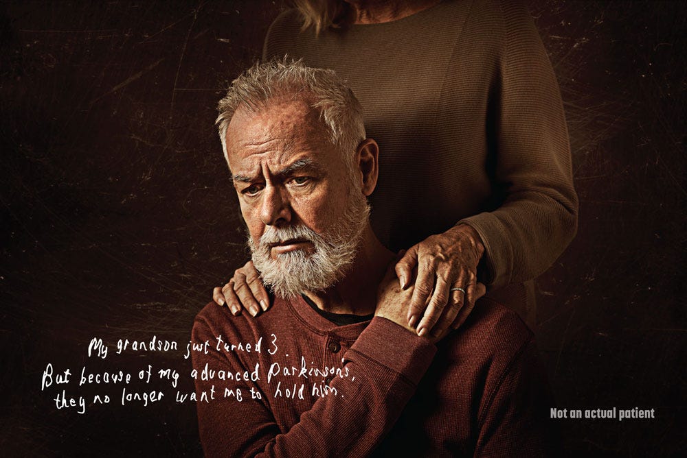
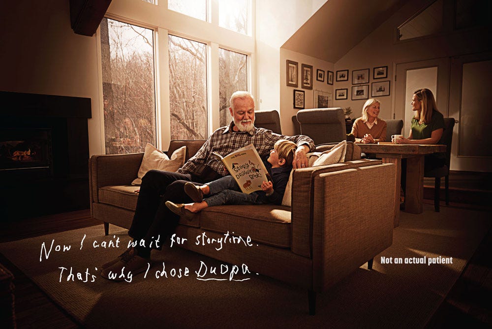
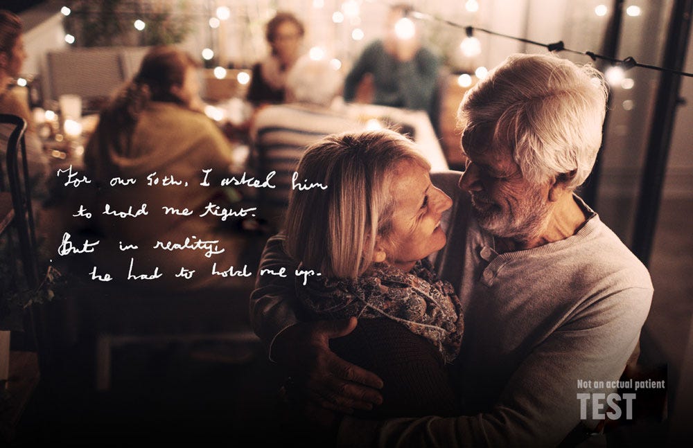
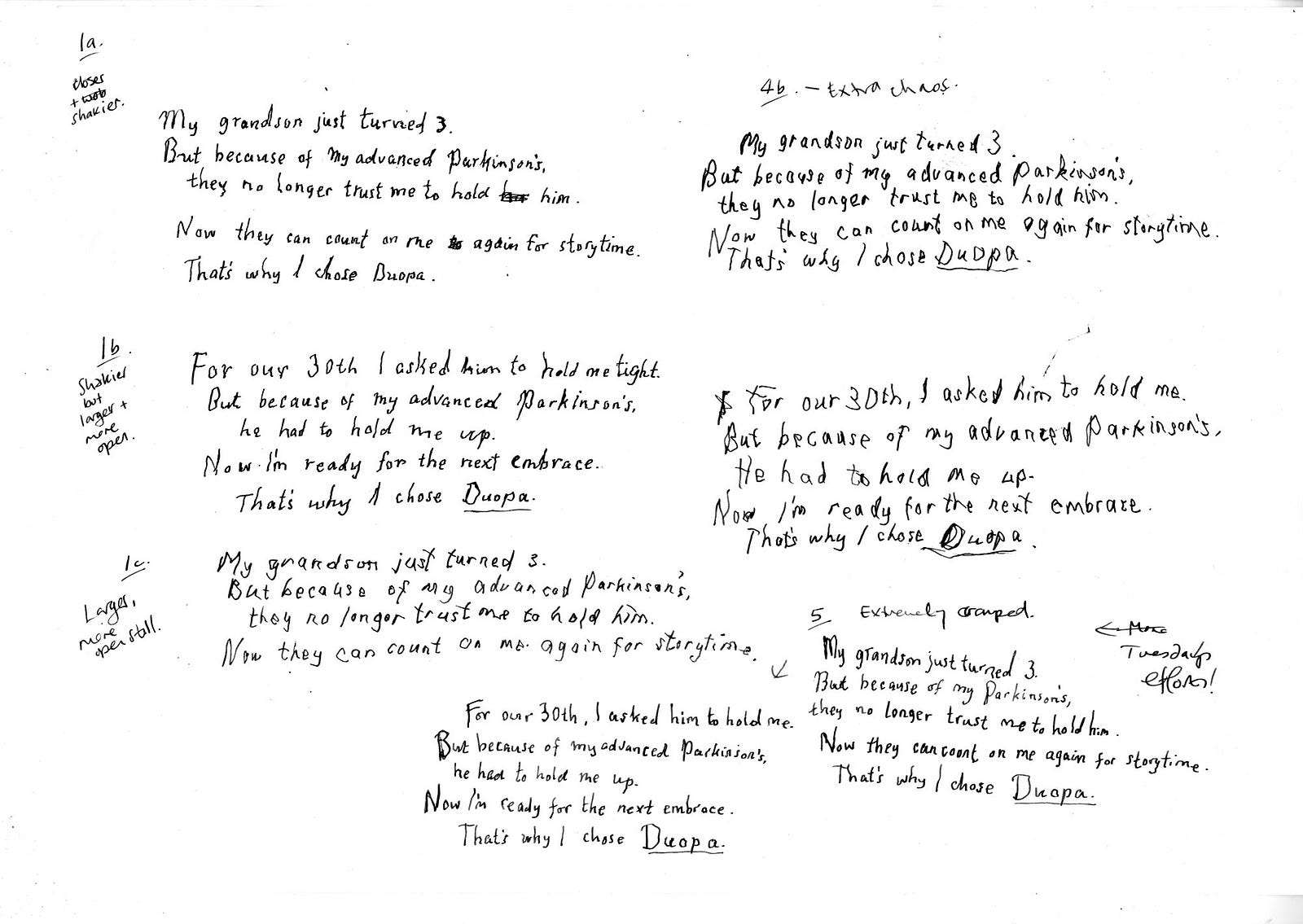
Commissioned in 2020 by Saatchi Wellness, it was designed to communicate the effect that Parkinson’s Disease has on motor control through the power of handwriting. My job was to develop a set of authentic handwriting styles for a set of fictitious patients, each with unique characteristics, that are shown both subjected to the effects of Parkinson’s, and after treatment by the drug Duopa.

Although it isn’t suggested that the treatment returns the patient to pre-Parkinsons handwriting, their motor control is shown to be sufficiently improved as to render their writing readable once more, communicating a sense of a return to empowerment and confidence. The stories of each individual are based around achieving modest, important tasks such as picking up a grandchild, or dancing with a partner.


From the Duopa project, working with Saatchi Wellness: the patient’s handwriting is challenged. It had to be hard to read, but not difficult, and accurately demonstrate the potential effects of the condition. You can see this image in use on the website.

The conclusion to the story is the patient’s handwriting showing the improvement in his condition; he’s able to hold and read a book.

The two shown here are from a larger set we created, with a complete font developed for use on behind-the-scenes assets. The research and development for this project was extensive and very moving at times, and I cried a few times as I channelled everything I’d learned through my fountain pen into the words of the imaginary, but also very real, patients.


Part of the developmental work for this project.


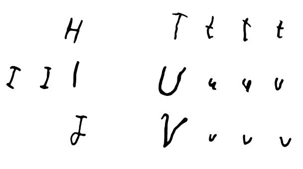
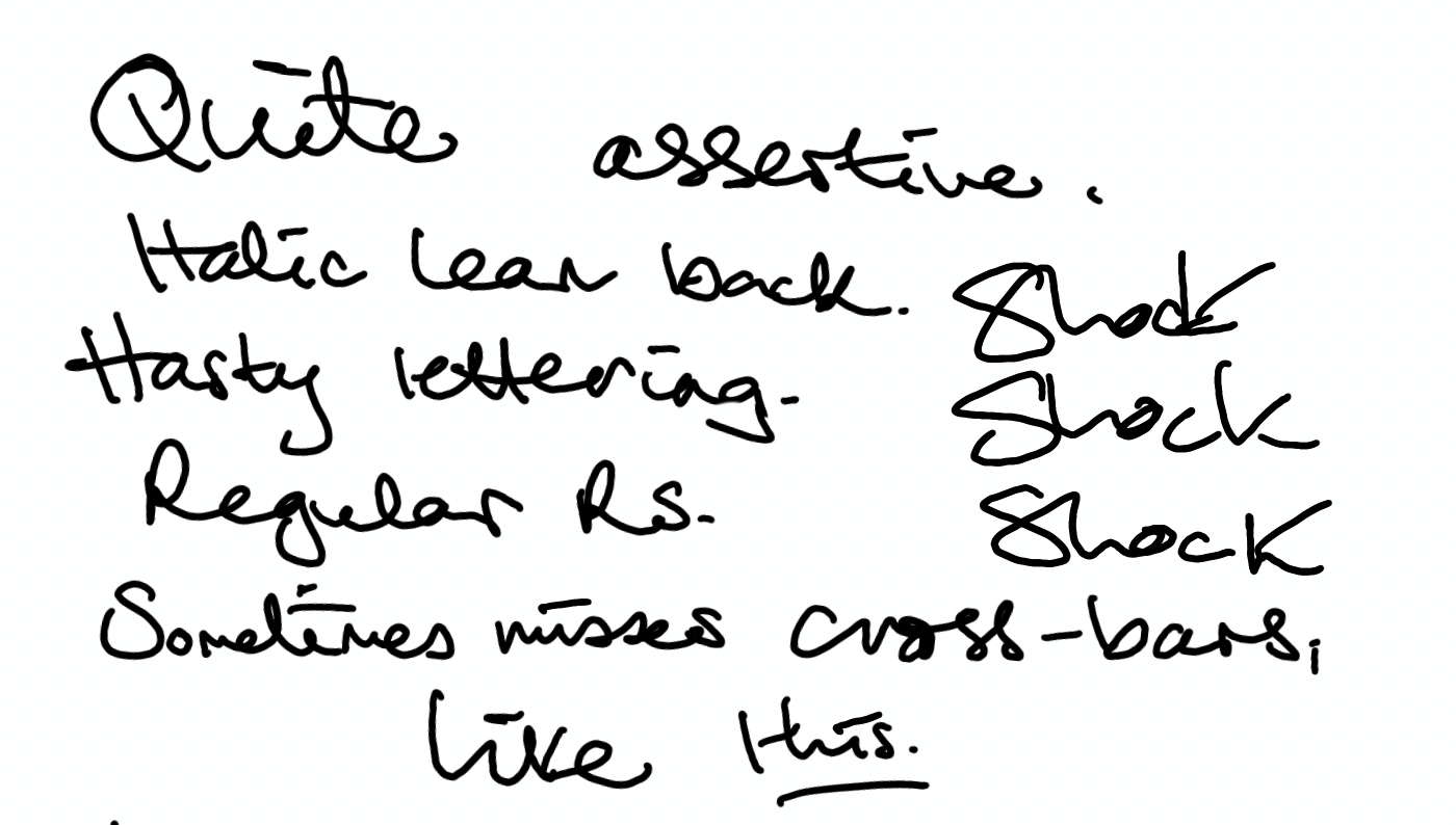
A small section of the font I created for the Duopa project, including the range of variations that are possible within the scope of the disease’s effect on the patient’s ability to write. This is manifested in the changing ‘T’s, ‘U’s and ‘V’s shown here.
Some of the many. many experimental pieces created for the Duopa project, showing notes and adjustments. Each of these handwriting styles must be thought of as ‘a voice’, rather than simply ‘this is how they write’.

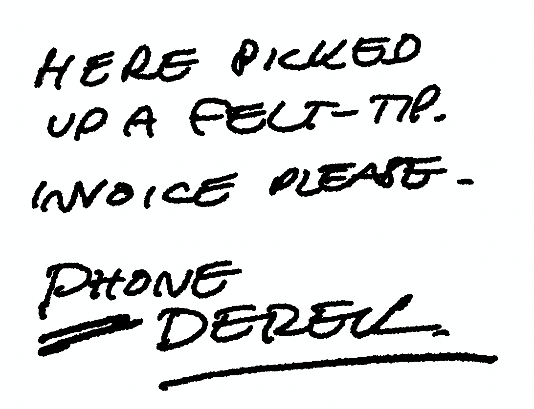
I do a lot of what might be called forensic lettering work — maybe that’s too exacting, perhaps ‘reproduction lettering’? — whereby I’m called on to recreate the handwriting of a famous person, or someone deceased (sometimes both) for advertising or TV, film or books. Some of won’t be seen publicly. I’ve also done a lot of work that involves developing handwriting for fictitious characters — in fact, I’m doing one right now, three different ‘voices’, three different ages and situations, with a different choice of writing implement for each.


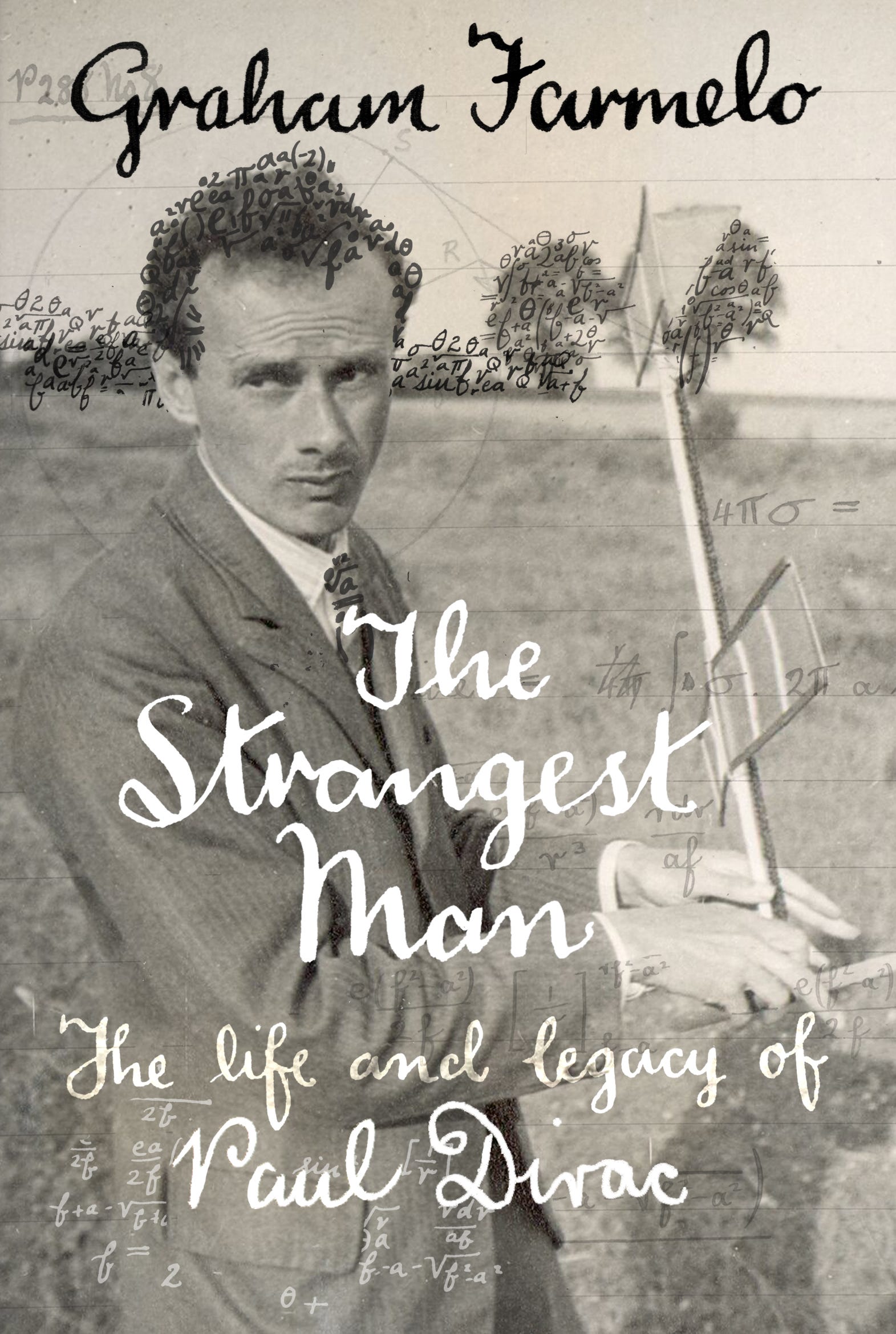
An example of the specialist lettering work I do. Here I’m recreating the handwriting of the physicist Paul Dirac, one of the founders of Quantum Theory, for use inside and outside the book, using just handful of the extant references available. The age and style of fountain pen used were of great importance too.

It’s harder than you think to override your own muscle memory and install new clicks and flicks of the wrist, different angles and pressure and descenders, a way to dot ‘i’s and cross Ts that’s someone else’s, and to keep it consistent — while tying in any historical factors too. In fact, it feels more like acting than design or lettering work, and it’s a million notebooks away from calligraphy. Once I’ve got the writing locked down, I can get into that costume and ‘be’ that person for as long as I need, even switching between them day to day. (There is, incidentally, always a voice that isn’t mine that accompanies the words I’m writing.)

But I love the immersion and focus that comes with the task, and the attention to detail. It’s very different from the kind of lettering I might make for an editorial or a logo, where I throw my brush, nib or Apple Pencil across the page with energy and only the loosest idea of outcome.

If you would like to know more about this type of work, please get in touch. In fact — write me a letter; I’m far more likely to respond…and who knows, maybe I’ll do it in your own handwriting.

Images shared with the permission of Saatchi Wellness.

https://www.duopahcp.com

Tuesday, May 10, 2022

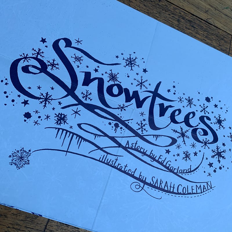
Snowtrees: A collaboration with Dr. Ed Garland


Our friend and long-term Inkymole collaborator Ed Garland is finally on Instagram, after moving away years ago and becoming Dr. Ed. This is good news.

After meeting up with him for a weekend recently, I’ve been thinking of all the projects we worked on together. Obviously I hope there will be more now that his gruelling study schedule has eased off, but I wanted to share a few as they emerged at a time when social media was still new, and were therefore only seen by the people who received a copy, attended an exhibition, or were part of the project.

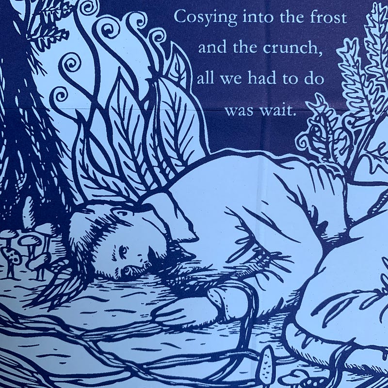
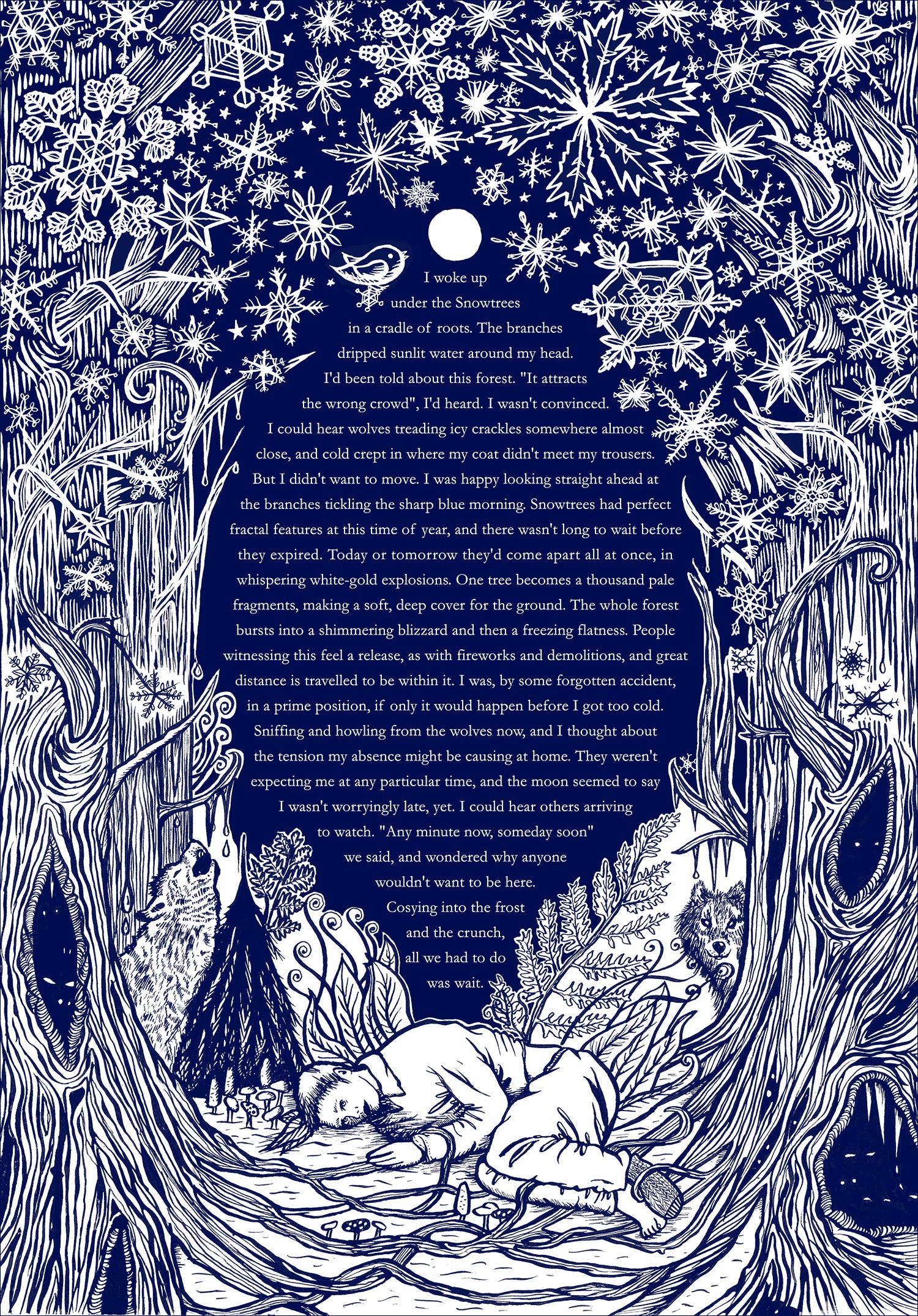
This is Snowtrees. We had just put up a big installation called ‘The Witches’ in the repurposed church building of our regular clients TBWA\Manchester, for which Ed had written the words, and we were in the van on the M6 driving home, knackered and full of chips. I checked my email. It was mid-October and, thinking ahead, I’d asked Ed to write a piece for our annual Christmas mailing, which would take a different form every year. I would illustrate whatever he wrote. His story was in, and I read it; crying, because it was so beautiful and it was exactly what I’d hoped for. Even a little more than that, in fact.

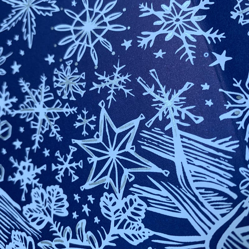
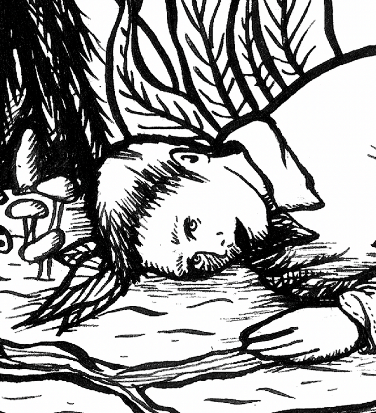
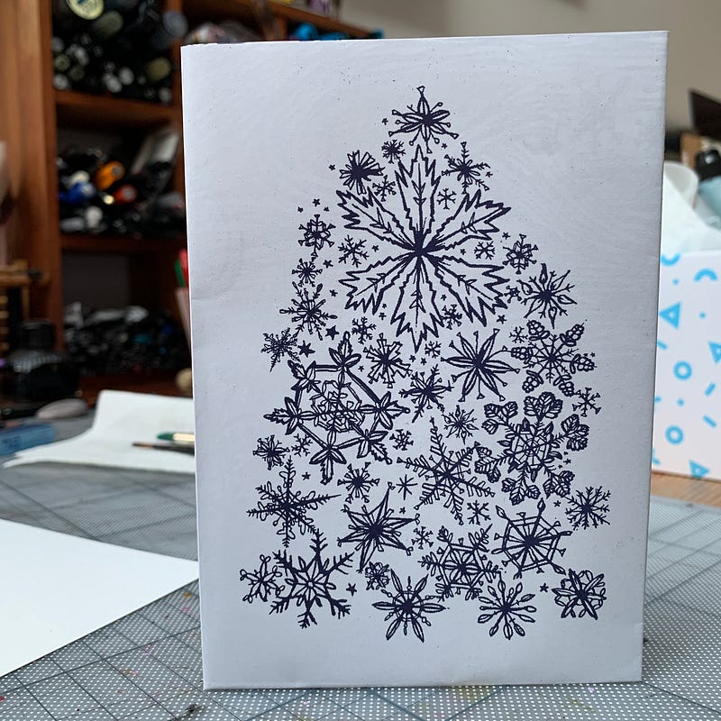
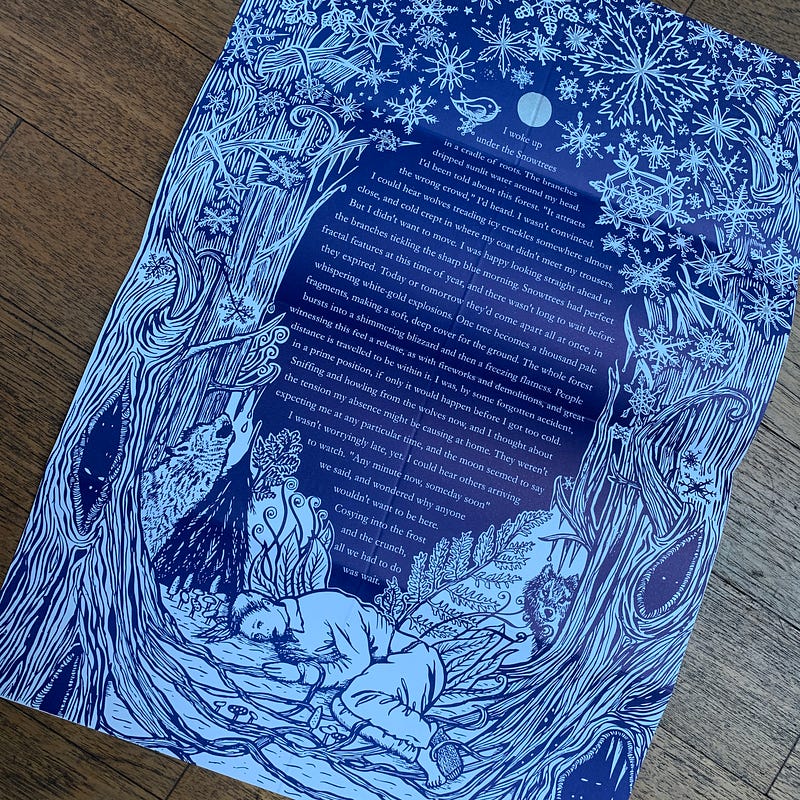
I made a black and white ink illustration to go with it, indulging my longing for eerie stories to illustrate and my love of all things creepy and atmospheric. (Whenever the opportunity arose for some personal or promotional work, this is often the direction it would take). We had a 1000 copies printed to A3 in navy blue ink, foldable to A6 (sorry Kelly, who did all the folding). They were addressed individually and sealed with a tiny label, and it stood like a Christmas card with a snowflake-tree on one side, inspired by a duotone 1950s fold-out birthday card we’d had on the studio wall for years.

And there it was. Ed will probably do the thing people often do when confronted with old work — shrugging off my praise, pointing out all the things that are ‘wrong’ with it, maybe even cringing a little— but I love this piece of writing, and more importantly, I love the creative response it triggered in me. Although I too can see things I would do differently now, I love the outcome.


I woke up under the Snowtrees in a cradle of roots. The branches dripped sunlit water around my head. I’d been told about this forest. “It attracts the wrong crowd”, I’d heard. I wasn’t convinced. I could hear wolves treading icy crackles somewhere almost close, and cold crept in where my coat didn’t meet my trousers. But I didn’t want to move. I was happy looking straight ahead at the branches tickling the sharp blue morning. Snowtrees had perfect fractal features at this time of year, and there wasn’t long to wait before they expired. Today or tomorrow they’d come apart all at once, in whispering white-gold explosions. 

One tree becomes a thousand pale fragments, making a soft, deep cover for the ground. The whole forest bursts into a shimmering blizzard and then a freezing flatness. People witnessing this feel a release, as with fireworks and demolitions, and great distance is travelled to be within it.  I was, by some forgotten accident, in a prime position, if only it would happen before I got too cold. Sniffing and howling from the wolves now, and I thought about the tension my absence might be causing at home. They weren’t expecting me at any particular time, and the sun seemed to say I wasn’t worryingly late, yet. I could hear others arriving to watch. 

“Any minute now, someday soon” we said, and wondered why anyone wouldn’t want to be here.


Friday, January 22, 2021

Why I don't do competitions.


~ New York Society of Illustrators Awards, 2008 (two prizes) ~

I'm at the tail end - seeing the 'light at the end of the tunnel' - of making a brand new website, starting totally from scratch and focussing on all the things that are currently missing from the current one. 

I've been meaning to do it for a couple of years, and much as I adore social media for sharing and enjoying each other's work, there's nothing like an online Mothership for telling the world who you are and what you like to make; a central place where I can put everything that's 'me'.
In the course of doing this, I chose to re-visit my FAQ section and where necessary (which as it turns out was 100% of all of it) write my thoughts afresh. After all, the types of questions I get asked have changed in nature, and mostly now come increasingly via Instagram messages and Twitter messages rather than via email, as they used to.

FAQs feel a little 'noughties', but they remain useful: it's still the case that most of the things I get asked are similar in nature and are thus given a similar answer. Though I'll endeavour to answer EVERY query I receive, as soon as I can, there's still an argument for having a 'first line of defence' which provides the answers to the most commonly-asked questions, so that the enquirer can check there first and if necessary, compose a more granular question to fire my way.

One of the answers that remained pretty much the same was this one. I expand on it here as it's something I've been meaning to elaborate on for a while. This is that 'elaborated' version.


------------------------------------------------------------------------------------------------------------------------

Q: I don’t see any awards or gongs on your website, why’s that?


A: I do have some, but they’re not on the site. I honestly don’t think they’re that important, or would influence whether a client thinks I’m suitable for a job. A client will look at the style of my work, the colours, maybe the medium; they'll look at my profile in terms of whether I've created work of this nature before, and if I haven't, they'll ask whether the work on show suggests I could take a run at the project they have in mind. Finally, we'll talk, and they'll assess my availability, process and timescales, and finally-finally decide whether I should do the job (or, it might be me that makes that decision).

Never in my working life of 27 years have I been asked by a client, or any of my agents, whether I've won competitions, or whether I have prizes or awards. Yes, there's a lot more to committing to a creative vocation, as it can be more than 'just' your profession, job or trade, and a client or agent asking this question is not the only set of circumstances in which competitions might be relevant to that vocation. In an educational setting, for example, doing well in awards might be part of a wider landscape of professional achievements being sought out, alongside qualifications and experience, especially where an institution has a policy of putting students into competitive settings.

But I don't feel they've ever played a part in my myriad clients' decisions to hire me for jobs, nor do I feel they should.

Of course, I'm not saying NO-ONE should enter competitions, or that they shouldn't exist. Not at all; that's up to the individual. But I know that from the very beginning - starting in the second year of university - the pressure was on to compete: with each other, and with total strangers, by entering competitions, and with ourselves. The latter I had no problem with - putting pressure and high expectations on myself is something I've carried about in my 'holster of burdens' all my life - but the first two, competing with my peers, friends and colleagues or people I'd never met - always felt a little off, and distracted from the main focus of being in the educational environment: to experiment, play, evolve, develop, and learn.

That's not to say our course wasn't abso-fucking-lutely hardcore. It was. 9-5, 5 days a week, with stuff to get done at weekends and every single holiday; 26 fully completed, handed-in projects in the first 11-week term alone; crits every week and a ball-breaking amount of written work to go alongside it all. The pressure from that was enough, without a tutor arriving with a pile of photocopied competition briefs ready to add their name to the winner's certificate as 'supervising member of staff'.

The weird thing is I had a love-hate relationship with competitions. I hated the pressure, and my friend and I would quite literally break into a run in the opposite direction from a tutor striding down the corridor with what was so obviously going to be another competiton for us to enter. But I also loved the challenge. I hated pitching myself against my colleagues, but I loved the thrill of everyone disappearing to their rooms every night and scheming on a solution, knowing we were all doing it at the same time and to the same deadline: what would Simon's work be like? How would Mel answer this one? Is Michelle going to go for gouache, or try something else?

And I won things. I entered competitions and I won them, or got runner up places, or some other kind of recognition because of them. And obviously, I loved that, too. 

But alongside those positive feelings was the uneasy awareness of an inflated sense of security, the success feeding the erroneous notion that I might have 'made it', before I'd barely begun. In fact, the 'success' I was having generally on the course and via competitions caused me to have the closest thing I think I've ever had to a little breakdown, coming home one Christmas and declaring that I was spent, all my ideas were gone, I'd done all my best work and how on earth was I going to be able to carry on from here?

It was silly of course and, as my Mum very quickly realised, I was just exhausted and a bit emotional at being home. TV, sleep, tinsel and good food quickly sorted out my terrible twenties angst.

But competitions entered later on, as a working professional, continued to make me anxious with a big dose of self-doubt if I didn’t get anywhere, and when I did do well, I could feel the outcome giving me that same inflated sense of security and maybe a little internal gung-ho. Perhaps, I thought, success in competitions meant I didn't need to try so hard, all the time, because a group of people I've never met have decided my work ticks a set of boxes, or it's been passed in front of the subjective opinions of five different people. And if I entered and got nowhere: the opposite: maybe I'm a fraud. Why am I even trying. Why do I bother. Am I actually a failure and everyone else can see this but me.

Note those were statements, not questions: all those evil, niggling little dialogues spoke up because I'd thrown my work into an unknown vat of work by a hundred or thousand other people, which didn't scratch the particular itch of whatever the judges were feeling on the day.


I continued to enter competitions, but over time I started to become totally ambivalent about them. Those tended to be ones I'd paid to enter - and that scenario made me uncomfortable, too. WHY was I ambivalent? If I didn't care about the outcome, why was I bothering to enter? I realised it was out of a sense of duty, and very much born from the notion that 'that's what professional illustrators do'. And we don't, not all of us, just some of us. Competition gongs are most robustly not a signpost that you're a working, professional, busy illustrator: they're just a sign you like entering competitions.

Coupling all those realisations with the fact that I was paying hard-earned quids to enter, knowing that in some cases thousands of people would be paying the not-terribly-modest entry fees (with winners paying additional fees to display work on top), and my decision came into focus: just don't bother. The time I would spend choosing work, formatting and uploading it and filling forms online could very much be spent doing something more productive - something with a definite, positive, guaranteed outcome, like a piece of work, or doing some admin, or cooking something tasty, or reading the book I'd allowed to get dusty through repeated late nights working, even if just for the hour it took to enter that comp. (And where were all the fees going?)

Even during my many fun hours spent being a competition judge, I would struggle to reach a decision and, channelling my early-career experiences as a lecturer, I wanted to write to every single entrant and tell them something positive about their work, along with a suggestion or two on how they might improve. But I had to pick a first, a second, a third. I loved the process of looking at all the wonderful work, and I'd do it again, but I felt mindful of all the entrants' reactions whether I were to award them or not. So I finally made the decision to stop entering competitions myself a few years ago. If I was happy with a piece of work, and my client was happy with it, then it ended there.

And that was that.

Some people love entering competitions every year, but not me. I get the round-robin emails of this competition opening and that deadline looming, and I don't feel tempted to yield. Years after deciding to ease back from them, I have chilled a little, and instead of a blanket ban have narrowed it down to one illustration competition I’m happy to enter now, which is the V&A Illustration Awards, run by one the UK’s oldest institutions. I don't make myself enter every year, my policy being only to enter something when I feel it would sit well in the setting of the organisation, and alongside company that that competition attracts. The process of surveying a year's work and identifying something to fit the brief is a useful and contemplative exercise, whether I win anything or not, and allows me an opportunity to ponder my trajectory, the historical world of illustration, and my place within it now, and in future. 

And of course, despite my decision-making, I totally reserve the right to enter anything I feel like, at a moment's notice - but only after I've run the full-body diagnostic of 'why' - what's compelling me to enter, and can those needs be met by an alternative course of action? I heck myself for signs that I might be being tempted by the dangled carrot of an ego boost, or a need for some professional reassurance, and think about what it is I’m really after.

Nice as competitions can feel, making a living as a freelance illustrator is competitive enough. It took me a while to realise I don't need a list of prizes to tell the world how much I've invested in the profession I love, and how much of my soul is already, in fact, shaped like a little yellow pencil.

  
A very, very old home-made website page! Back when I was a super-keen Dreamweaver.


Wednesday, October 23, 2019

It's Inktober all year round for me.


I found myself in the unusual and strangely wonderful position this week of being in suspended animation on every single job I'm working on. I suddenly realised I was either waiting on feedback, or for the go-ahead, and for the rest to be signed off as 'done'.

This very rarely happens. I'm usually juggling so many things there's never any actual 'gaps' - and thank goodness for that in an uncertain and unpredictable trade. But thankful offerings to the Freelance Gods aside, I've been rushing around completing as many overdue tasks as possible while I can (and believe me, there are STILL more to do - those things that are are on our lists that we just NEVER get to!)

I replaced the shower. I repaired the bath cradle. I planted the spring bulbs. I cleaned. I finished the archiving and helped clean the chimney. I brushed up a couple of website bits and bought some Christmas presents. Helped with the final cider pressing of the year, and designed and printed over 200 labels for last year's bottles. I made the candles for the winter season - 13 in total (*flavours below, if you're interested in that sort of thing). I wall-mounted the speakers that were fed up with sitting on the desk, and ordered fabric samples for the new bedroom curtain. Did a LOAD of financial stuff. Did some sewing modifications to my new gym Ts.

And I got really special nails done for the upcoming Hallowe'en party and trick-or-treating with my nephew next week.

What I ALSO did was get out all my fountain pens, take them apart, clean them, flush them through and fill them up with fresh ink, then found them a new place to live where they're all together in one spot, and slightly tilted so that the ink is always flowing the right way.

Sounds fairly routine, I know, but it was the most relaxing and indulgent thing I feel like I've done in ages that 'wasn't work but was work'. You see I have loads of pens, at last count over 700, but the fourteen fountain pens have a special place because they range from the wooden one (with matching biro) my Mum and Dad got me for my 18th birthday, to the Mont Blanc (with matching pencil) Dad let me have when he realised I would use it more than him. That one's done many book covers - in fact it drew a whole YA series in its entirety. Unlike my massive pile of fineliners or my jumbly heap of Poscas, every fountain pen has a story, and has found its way to me via a person or an event that's important to me.

As expected for a tiny ink-delivering machine based on technology that's in most cases decades old and probably hand-made, each one has its own 'voice'. Read on if you share my love of writing - and drawing! - implements; this is my collection.


This is the wooden one that was the 18th birthday present. It's never been out of used, but has no brand on it - the case is long gone. It has an iridium nib and uses cartridges - and has a sister ballpoint in exactly the same design, which lives in my bag - whichever current bag that might be. 


And just look at its exquisite nib!


Here's Dad's Mont Blanc, responsible for scribbling all those Lottie Biggs books, with its lovely golden nib. It uses a piston filling system. 


This Platignum cartridge fountain pen was cheaply made and mass produced, but I LOVE its sure-footed, nimble nib. I can really crack through acres of drawing and writing with this.


My tatty little burgundy Osmiroid 65 has a somewhat reckless golden nib that's really quite bendy, and it uses a lever system to refill.


These Platignum pens are literally bent - at some point the barrel has been subjected heat or pressure (or both) and developed a raunchy little kink. Still, they work perfectly.

The first is a nib-based pen with lever refill system.

The second was produced en masse for schools. You can replace the entire nib section, and it's filled via cartridge - cheap, convenient and less messy for educational use, while still being a couple of decades away from commonplace ballpoint and gel pens in schools. See below the tinful of replacement nibs I have for this pen and its bro 'Platignum School Pen', which also has an unruly curve! The tin of nibs and cartridges was a gift from may friend Boyd, aka Solo One, who knew from the moment his eyes met Diana's that they'd be safer and more useful in my hands than his own.


My bladder-filled Shaeffer has gold findings and a very delicate nib, which creates precise and very definition lines. Some nibs feel a little like they're going to run away from you at any moment, or feel unsure of their direction, especially if they're very flexible: this one doesn't. 
A great one for signing contracts, as it seems to really like metallic and shimmer inks.

I also love squidging the bladder, for no reason other than it feels amusing.


My olive green Esterbrook 9314M is a recent acquisition, and I made an attempt to fill it with its own colour - not quite a match, but a glittery warm green anyway. This pen has a fine calligraphic nib and a squeeze-bar refill system. It's a very satisfying write.
It was a gift from The Pen Museum in Birmingham, with whom I was working to identify some pen parts recently. 


This really heavy Shaeffer was also one of Dad's - a pen lover himself, he recently let me have it because he felt sorry for me having so few pens.
Its nib is dramatic and pointy, its barrel and lid a brushed steel - I would say aluminium sum, but it's just so weighty. And it too employs a squeeze-bar refill system.
One to choose when there's a gravitas to whatever it is you're signing, redacting or drawing.


Another paternal addition to the collection - this cheery 80s Parker is an easy choice when reaching for a fountain pen. Its relative newness means the ink flows without any mardiness, and it has a smooth, brushed metal hand grip and balled nib end - a beauty. Just flows.
This one likes cartridges.


The heaviest of them all is this massive welterweight Shaeffer. I like to have the top on the end of every pen I write with, for balance and weight (*controversial*)  - but this one is just too heavy to do that with. Employs a piston filling system.
It's virtually brand new at about 10 years old, and has a rather ornate nib - you can see how little wear this nib has seen compared to my others.

This, and the next pen, were gifts from Shaeffer during a project I took part in called 'The Library Of Lost Books'.

And all-metal, it's usually really cold to the touch!


Also relatively new, arriving about the same time, is this plastic Shaeffer calligraphy pen with clear barrel. The nibs are interchangeable and it comes with 4 options - width, angle etc. - and coloured neck sleeve.
Ink is delivered via cartridges.


This little Messenger is a stone-cold favourite, even though I feel bad saying I've got favourites.
It likes the shimmer inks, behaves impeccably and is all-metal - meaning it's another cold one!
With its fine, almost-flat nib it's reliable and eager, and it's the narrowest of the fountain pens - meaning it's delicate and cigarette-like in the hand. It's got a piston filling system.


Finally, my ladylike Parker Slimfold - a pretty embossed pattern in its top collar, and that classic golden arrow - actually gold plated - to clip it into your shirt or notebook. It possesses a lovely rounded end, like a submarine, and fine, golden, small nib. Considering the fineness of this nib, its line is surprisingly wide.
This one too enjoys a shimmer or metallic ink (not all do!) Ink is delivered via modified 'U' aerometric filler.


Here they all are, lids on and off:


and in their new, lightly-angled pen tray, fresh cartridges and a wildly exciting stash of inks ready to refill them whenever they should need it!


*Those candle flavours in full:
Bakewell Tart
Chocolate Fudge Cake
Pumpkin
Lemongrass & Ginger
Espresso Martini





Sunday, November 20, 2016

Lost & Found: I


Found when recently tidying the office: work that used to be part of a display of rejects, experiments, ideas, killed jobs and lost projects.

Posting one at a time!

D&AD Pencil for 'ReTweets of Love' Campaign

I've only just learned that the series of 7 pieces I did for Diet Coke via Droga5 won a Wood Pencil in the D&AD awards, for 'Art Direction for 'Poster Advertising'. Er yeah, they forgot to tell me that!

Here is the award story in full, and a reminder of the pieces. (Unfortunately the illustrators involved are not credited.)

The only one that didn't make it to a final was the jewellery - I designed 4 pendants in lettering for one of the Tweets, and 3D printing company Shapeways were going to make it a reality, right until the last minute when they pulled this design out of the collection, I think due to the concerns of technicals and legibility.

Those pendants are shown here for the first time though, with me modelling practice size experiments!


LinkWithin

Related Posts with Thumbnails