Showing posts with label illustration. Show all posts

Monday, January 26, 2026

Austin: The Poet, in 22°C.

I spent last week in Austin and on my last day there, with a few hours to go before my flight home, I did the walk from deepest downtown over the bridge all the way down South Congress to the legendary Allen’s BootsJo’s Coffee and Güero's Tacos. I wanted to visit all three, in the sunshine which we had been warned all week was about to be replaced by a humdinger of an ice storm.


There was a lot to love about Austin; the art, the food, the bats, the grackles with their mad eyes, the architecture, the weirdness, but mostly the people. I’d been told all my life about Southern Hospitality; by my Mum and Dad especially, who were adventurous travellers ‘til only a few years ago, and particularly loved exploring the quieter towns and side-streets of the States. I’d never been to Texas, but we’ve recently been gorging on a few Westerns, reminded of how much we love a good TV gun battle, an outraged saloon bar woman with 60s hair and a bit of Clint side-eye. So yes, when asked, I had to go.

I talked to people almost non-stop, in the lift, in the shops, on the street, in the bar, in the Uber. EVERYONE chatted, in the most welcoming and friendly way - and usually before they heard the British accent, which can often amusingly be the trigger for a friendly and curious chat. I can’t remember the last time I felt to welcomed by a bunch of people I’ve never met before in my life. Every face and voice different.


One such chap was Adam. Parked outside Allen’s Boots with his little black and gold typewriter on a tiny table and wearing a hat with jewel-coloured eyes underneath, he asked if I’d like a poem writing for me. Yes, I said; yes, I certainly would. He asked for a topic to get him started. Hmmm. What to request? I pondered. I’d spent most of my walk reflecting on how, within the same ten minute space, I’d become newly fixated on the Waymo driverless cars I’d seen all over the city (Austin being among the first to implement them), desperate to ride in one, all eye-widening invention, haunted tech and firmly reaching back to us from A Joyful Imaginary Future, while simultaneously sobered by a conversation I’d had with a Planned Parenthood lady on the street with whom I’d discussed the ongoing impact of the rollback of Roe vs Wade in her state, and the work her organisation was doing to push back on that. There you go, I said to the poet; forwards, and backwards, all in one walk and thought bubble. That’s your topic.

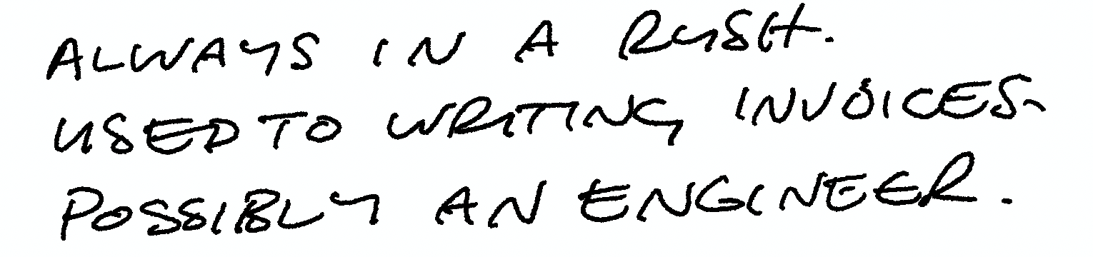
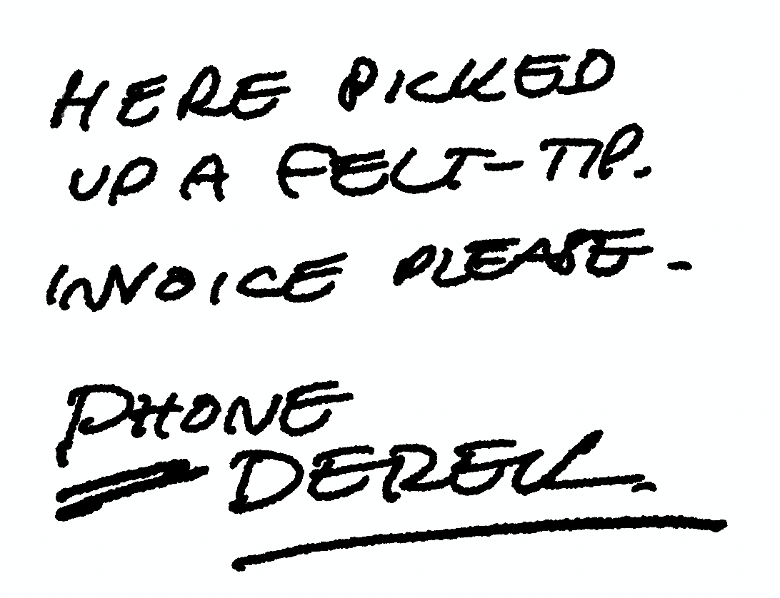
Here is the poem he wrote. I think he did very well.


I paid him for his creation, of course, and we chatted for another ten minutes or so before I went into the boot shop and browsed the beautiful hand-made boots and hats I would never buy and couldn’t afford even if I wanted to. But I could try them on, so I did, and felt like a kid for a bit, taking a goosey selfie in the changing room, and thinking that this is what travel is anyway, isn’t it? You try a place on, see how it feels, and you take it off again, taking a little piece of every place with you and absorbing it into your being. 


Clutching my poem, I headed into Jo’s Coffee and stared at their famous wall as I waited for my Cortado. And despite all of the reasons why I might not have, all the reasons I was warned against going, and never at a more urgent time to be reminded of the joy of meeting humans outside your own little sphere of existence, I felt it in that moment. I really did.


Wednesday, February 07, 2024

Writing Their Story

I’ve just posted a new project in my folio, and although I’ve got over 20 years of pharmaceutical work hidden away in a password-protected archive for all manner of legal reasons, this one I was able to share. And I’m glad, because it was both a privilege and a responsibility to work on.

We watched 'Stilllast week, the documentary about Michael J. Fox’s life as a person with Parkinson’s Disease. We were shown the myriad clever, agonisingly secret techniques he developed to hide the effects of the disease for as long as he could. We watched the trembling left hand always given the task of holding something or gesticulating, and the way he exaggerated his already restless manner of moving through the day, in order to fold any twitches or unexpected movement into his famously energetic modus operandi.

It was funny, educational and extremely moving, and the moment we were shown his hands beginning to move I thought of this project.

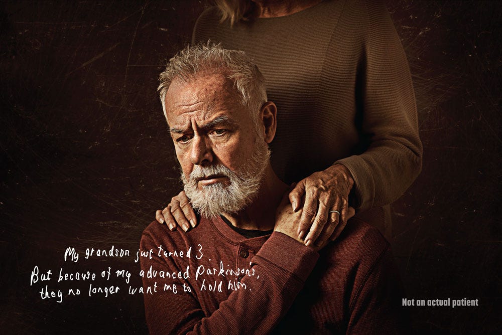
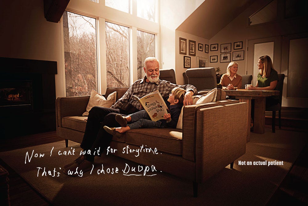
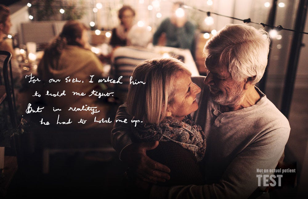
Commissioned in 2020 by Saatchi Wellness, it was designed to communicate the effect that Parkinson’s Disease has on motor control through the power of handwriting. My job was to develop a set of authentic handwriting styles for a set of fictitious patients, each with unique characteristics, that are shown both subjected to the effects of Parkinson’s, and after treatment by the drug Duopa.

Although it isn’t suggested that the treatment returns the patient to pre-Parkinsons handwriting, their motor control is shown to be sufficiently improved as to render their writing readable once more, communicating a sense of a return to empowerment and confidence. The stories of each individual are based around achieving modest, important tasks such as picking up a grandchild, or dancing with a partner.


From the Duopa project, working with Saatchi Wellness: the patient’s handwriting is challenged. It had to be hard to read, but not difficult, and accurately demonstrate the potential effects of the condition. You can see this image in use on the website.

The conclusion to the story is the patient’s handwriting showing the improvement in his condition; he’s able to hold and read a book.

The two shown here are from a larger set we created, with a complete font developed for use on behind-the-scenes assets. The research and development for this project was extensive and very moving at times, and I cried a few times as I channelled everything I’d learned through my fountain pen into the words of the imaginary, but also very real, patients.


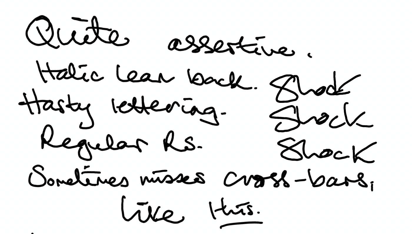
Part of the developmental work for this project.


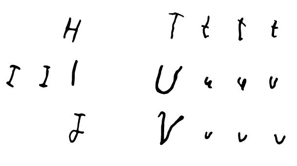
A small section of the font I created for the Duopa project, including the range of variations that are possible within the scope of the disease’s effect on the patient’s ability to write. This is manifested in the changing ‘T’s, ‘U’s and ‘V’s shown here.
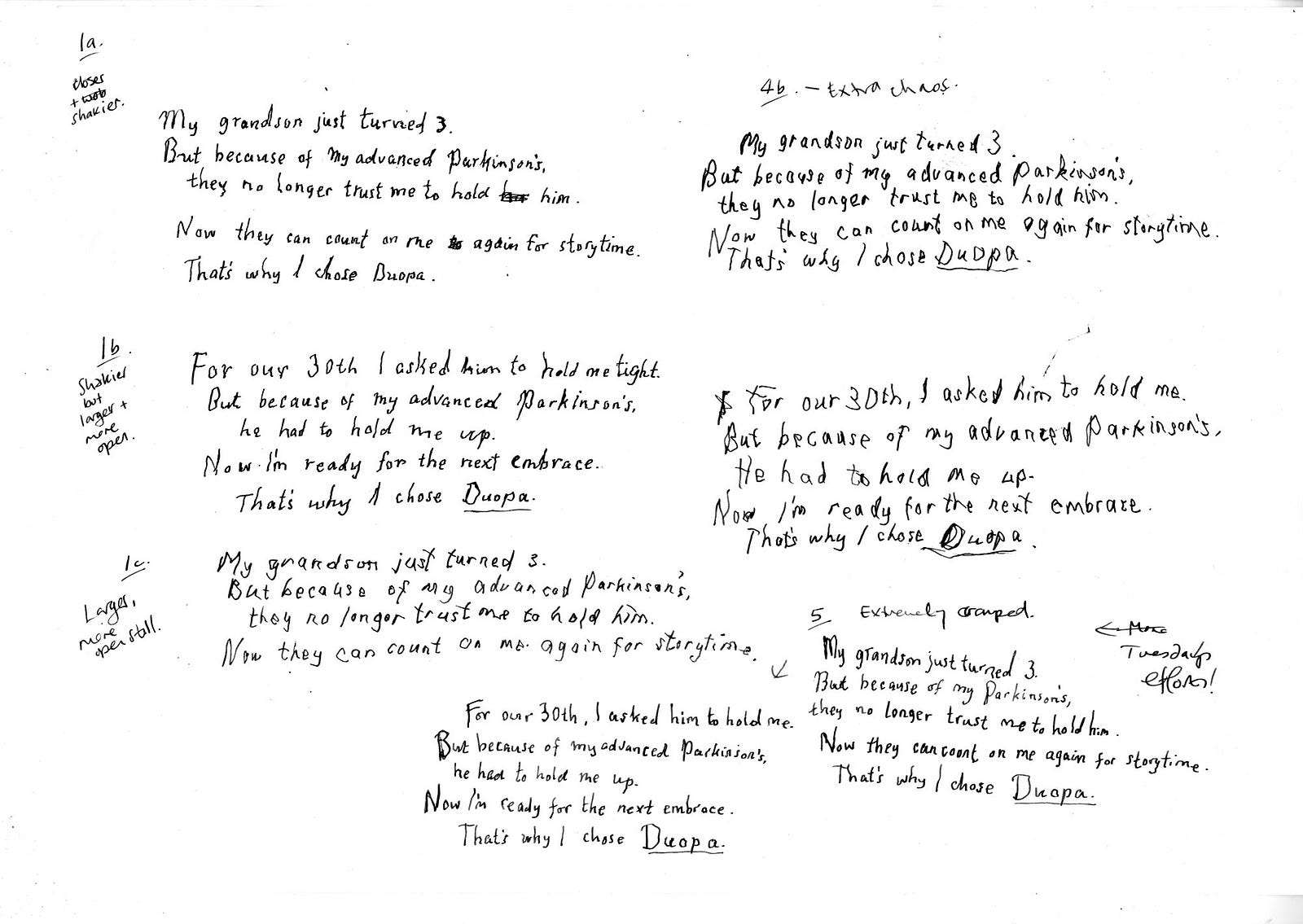
Some of the many. many experimental pieces created for the Duopa project, showing notes and adjustments. Each of these handwriting styles must be thought of as ‘a voice’, rather than simply ‘this is how they write’.

I do a lot of what might be called forensic lettering work — maybe that’s too exacting, perhaps ‘reproduction lettering’? — whereby I’m called on to recreate the handwriting of a famous person, or someone deceased (sometimes both) for advertising or TV, film or books. Some of won’t be seen publicly. I’ve also done a lot of work that involves developing handwriting for fictitious characters — in fact, I’m doing one right now, three different ‘voices’, three different ages and situations, with a different choice of writing implement for each.


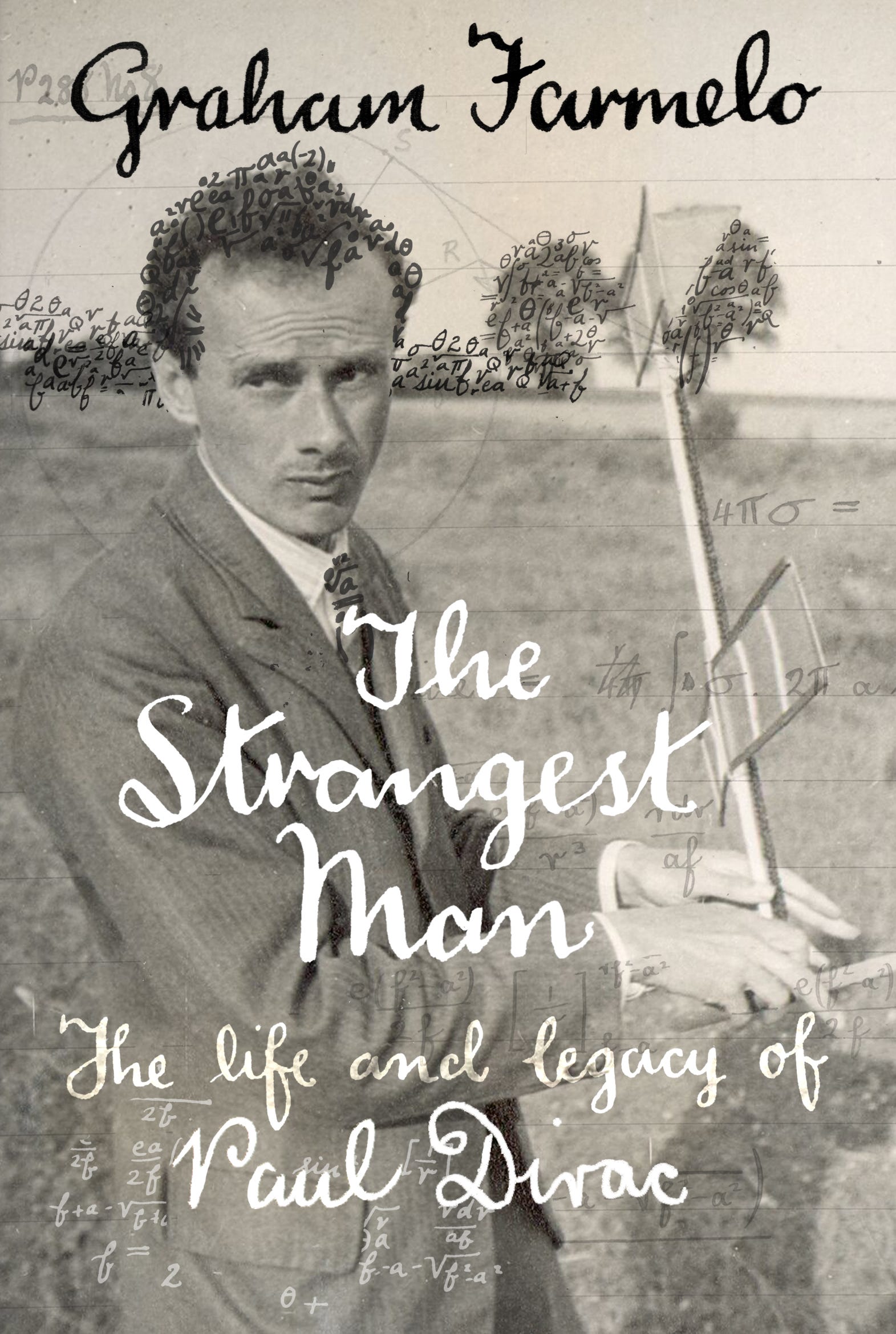
An example of the specialist lettering work I do. Here I’m recreating the handwriting of the physicist Paul Dirac, one of the founders of Quantum Theory, for use inside and outside the book, using just handful of the extant references available. The age and style of fountain pen used were of great importance too.

It’s harder than you think to override your own muscle memory and install new clicks and flicks of the wrist, different angles and pressure and descenders, a way to dot ‘i’s and cross Ts that’s someone else’s, and to keep it consistent — while tying in any historical factors too. In fact, it feels more like acting than design or lettering work, and it’s a million notebooks away from calligraphy. Once I’ve got the writing locked down, I can get into that costume and ‘be’ that person for as long as I need, even switching between them day to day. (There is, incidentally, always a voice that isn’t mine that accompanies the words I’m writing.)

But I love the immersion and focus that comes with the task, and the attention to detail. It’s very different from the kind of lettering I might make for an editorial or a logo, where I throw my brush, nib or Apple Pencil across the page with energy and only the loosest idea of outcome.

If you would like to know more about this type of work, please get in touch. In fact — write me a letter; I’m far more likely to respond…and who knows, maybe I’ll do it in your own handwriting.

Images shared with the permission of Saatchi Wellness.

https://www.duopahcp.com

Thursday, November 30, 2023

A Logo for Maine.


My new logo for the US state of Maine has begun to roll out in the last few weeks, and it's a thrill to see it.

It began in early January 2023 with an email from creative Jordan and VP Neal at Miles Partnership, asking if I'd like to have a stab at updating the logo for the state of Maine. 

Now all I know about Maine can be summed up in three points: 1. Our friend, the poet Andrea Gibson was born there. 2. It's huge and beautiful, and 3. Stephen King!!! 

I said yes and within a couple of weeks was hashing out some proposals. The Miles team had made my job easier by carrying out acres of research with the inhabitants of the state itself. They'd got a stack of feedback on what they liked about the original logo, what they didn't; what living in Maine meant to them, what they thought of when they pictured their home state, and hundreds more answers to in-depth and nuanced, thoughtful questions.

The existing Maine logo looked like this:

The core feedback was that the logo felt "outdated, bland and uninspiring, particularly among Maine visitors". When asked what the new logo should be, the answer that came back most often was "bold" - but with the near-unanimous caveat that it should nod to the traditional nature of Maine.

The findings came to me in an extremely thorough 45-page document which formed the backbone of my thinking. 'Organic, craft, charm, outdoors, nature, wood, trees, breathtaking, rustic, authenticity and sustainability' were other pivotal words which came out of the research.

And that was plenty for me to go on! I had the final logo in mind almost immediately, but presented lots of different looks to the team. After all, sometimes it's just as useful for the client to see what they DON'T want as it is for them to see what they do. All but a couple were analogue, made with ink, crayons, pens and pencil on paper, I was keen to communicate movement with solidness and history; contemporary energy with tradition. 

A still from one of the WIP videos I made while working on the logo.

While wax crayon, used to make a resist version.

Here are a few of those initial suggestions - there were a LOT. I do this because, at this stage, the client could spot ANYTHING in an idea which triggers the final outcome - so I tend to leave very little out; I guess you could call this a brainstorming of sorts:


Preferred options were 'put to research', and after a few weeks a trio was isolated for further tinkering. And by tinkering, I mean the start of the fine-tuning process - without knowing which the final choice might be. This is things like examining the weight of letters, kerning, trying different options on 'e's and capitals, whether on a single line or a little bumpier, like this exploration:


Often at this point the client's curious to see how my very analogue work will look when transformed into vector art (presuming we're working with art that wasn't created digitally to begin with).

This isn't a 'click the button' or 'apply that filter' step - rather, I do this via a series of processes which sensitively and carefully change the format of the piece (from pixel to vector) without changing its nature, preserving its human warmth, detail and idiosyncrasy. Without blowing any of my hand-sketched  trumpets, it's often why people come to me for logos; in a sea of Canva-generated/off-the-shelf/plastic-looking logos they want something very obviously crafted by human hands, but which functions in every format, at every size, and performs in any technical, screen or print environment. I've been doing that a long time, and it's surprising how that need has remained consistent.

Here you can see a close-up of a very carefully vectorised version of this inky option:


This option from the second round of ideas was chosen to get through the third round. Made with simple, freely-drawn capitals in ink on paper, it worked as well in colour as it did greyscale and vector:

And as a partner suggestion to this I made a version created separately with ink and pencil to hint at cut wood, wood and trees being things that emerged as strongly connected to Maine and eliciting affectionate responses in their research group. Here's the raw art before any refinements:


Watch some of the process here:


At this point, I got The Tingles - when you know underneath you've cracked it, and you desperately want the client to agree with you...but you daren't hope too hard, because your experience tells you it can go completely in another direction! But those Tingles came when I played with these layered and coloured versions. Suddenly, I could see this on all the signs, the site, the products, the T shirts...


The team liked it. But there was one more thing. I was aware from the start that when I said the word 'Maine' in my mind, it was actually 'Maine.' - with the full stop. I couldn't stop seeing it this way. I felt it communicated a confidence and pride in this single-syllable name, and suggested that the state was everything you could need - the full stop made it both a name and a statement. 

"Where you from?" 

"Maine."

And so it was added to the next round. Would they go for this punctuatively unusual choice?


The answer was YES. And so, over the course of six months, our logo was born, and final artwork was prepared in myriad formats and al the colours of the new Maine branding guidelines. In its final iteration, the logo is currently working its way over the next few months onto hundreds of products, signs, printed materials and online platforms, but you can see it right away on the visitMaine website, and on these satisfying examples.

To my delight, as well as embracing my 'thing' for the full stop, they're using both the flat-colour version and the textured version together, deploying them in different environments, and that in itself is unusual. I applaud their boldness!

If you live in Maine and you see it about, please take a snapshot and send it to me! "Out in the wild" has become a cliché, but only because the thrill of seeing one's work out doing the job it was created for never gets boring. 

Not for me, anyway.

Thank you to the brilliant team at Miles Partnership in Denver for bringing me on to do this prestigious project, especially VP Neal and Jordan, and thanks to my agency BAreps for their patient, professional cheerleading!


LinkWithin

Related Posts with Thumbnails