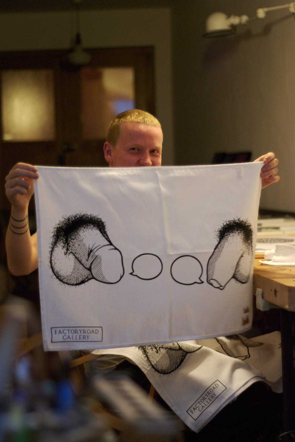
Exactly ten years ago we opened our shop, Factoryroad.
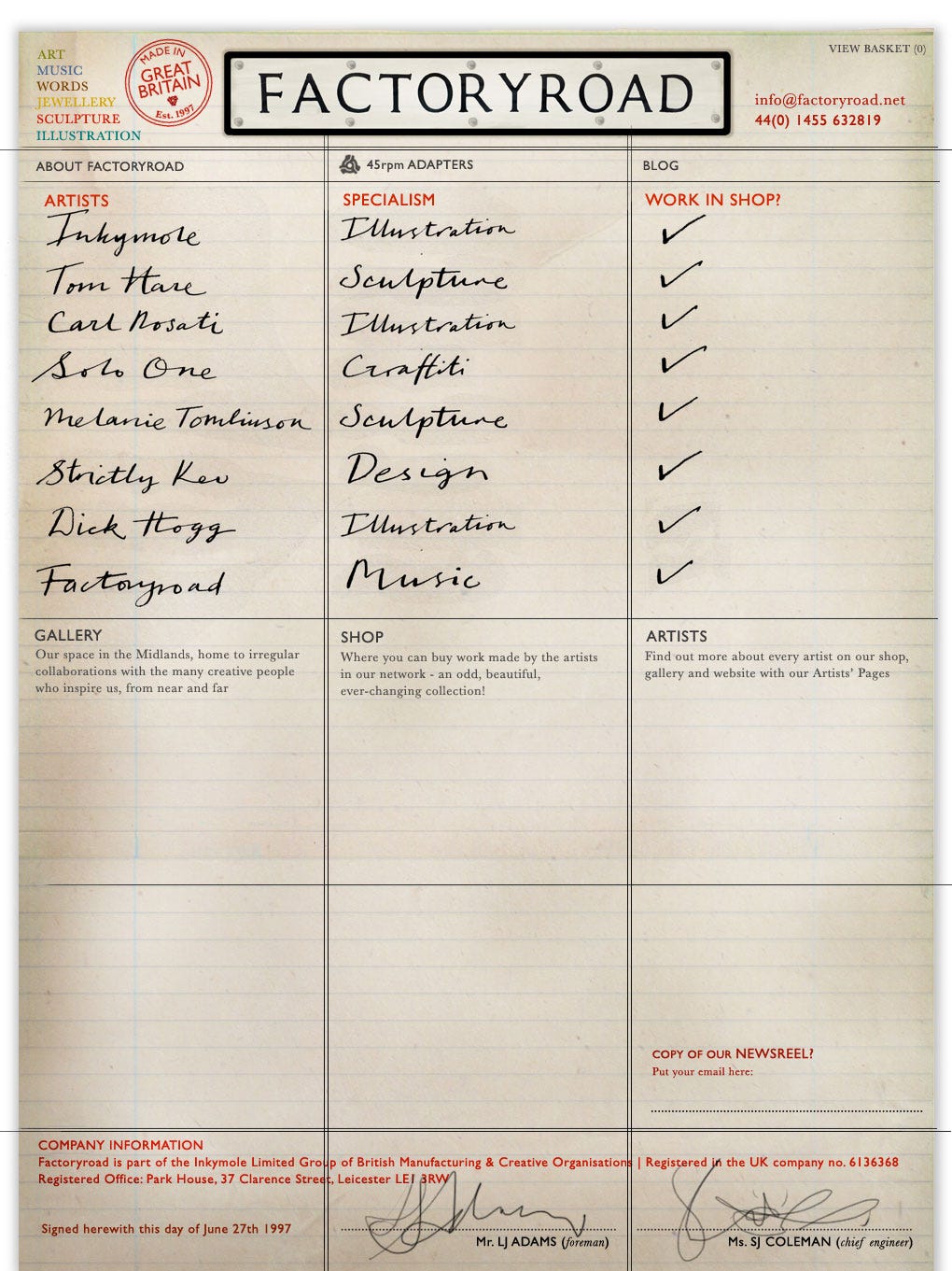
Possibly ahead of its time, it was named for the street we live and work on — known, as the name suggests, for its rows of factories, humming away all day and sometimes into the night with a half day on Friday. Channelling the industrious, round-the-clock nature of working, the building we still live and work in — Factoryroad’s base — was built by one of the factory owners for himself, with the foreman’s house built next door, and we still look out from our studio every day at the Victorian factory behind us (now flats, of course).
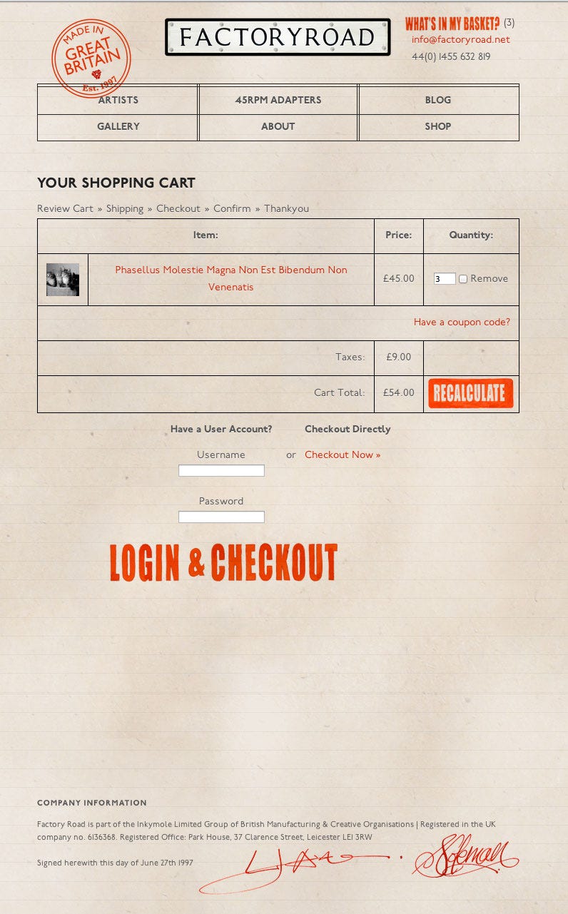
I’m thinking about the Factoryroad Shop today not only because I’ve just noticed it’s ten years since its launch, but because had its roots in the collaborative, spontaneous, risk-taking way of working that we’ve always fostered, and which we’ve struggled to get back to after a hammering by the isolation and hesitancy of the pandemic. It’s coming back, but our shop represented an energetic pulling-together of friends and colleagues who all made and designed lovely things, and whose work we wanted to sell alongside our own in one place — the site itself was commissioned from an ex-student and creative colleague, Nathan at Smile, then a new company.
From robustly working-class backgrounds, and living with a strong sense of purposeful industriousness, both of us channelled usefulness and productivity in all that we did. You can see it in the design of the site, based on a found invoice from a real factory, hand-drawn rubber stamps included. For us Commerce + Art was never, and still isn’t, a dirty combination, and we embraced the idea of giving a leg-up to our creative mates who made beautiful things.
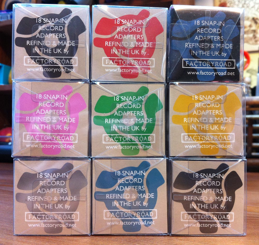
Factoryroad itself as an entity had existed since the late 90s, making T shirts, 45rpm record adapters, doing record distribution and and making records under our label Blunt Force Trauma — it even had a Tumblr!
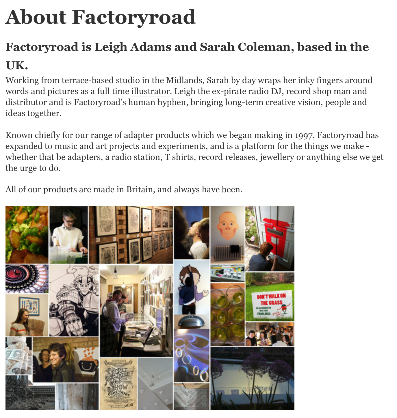
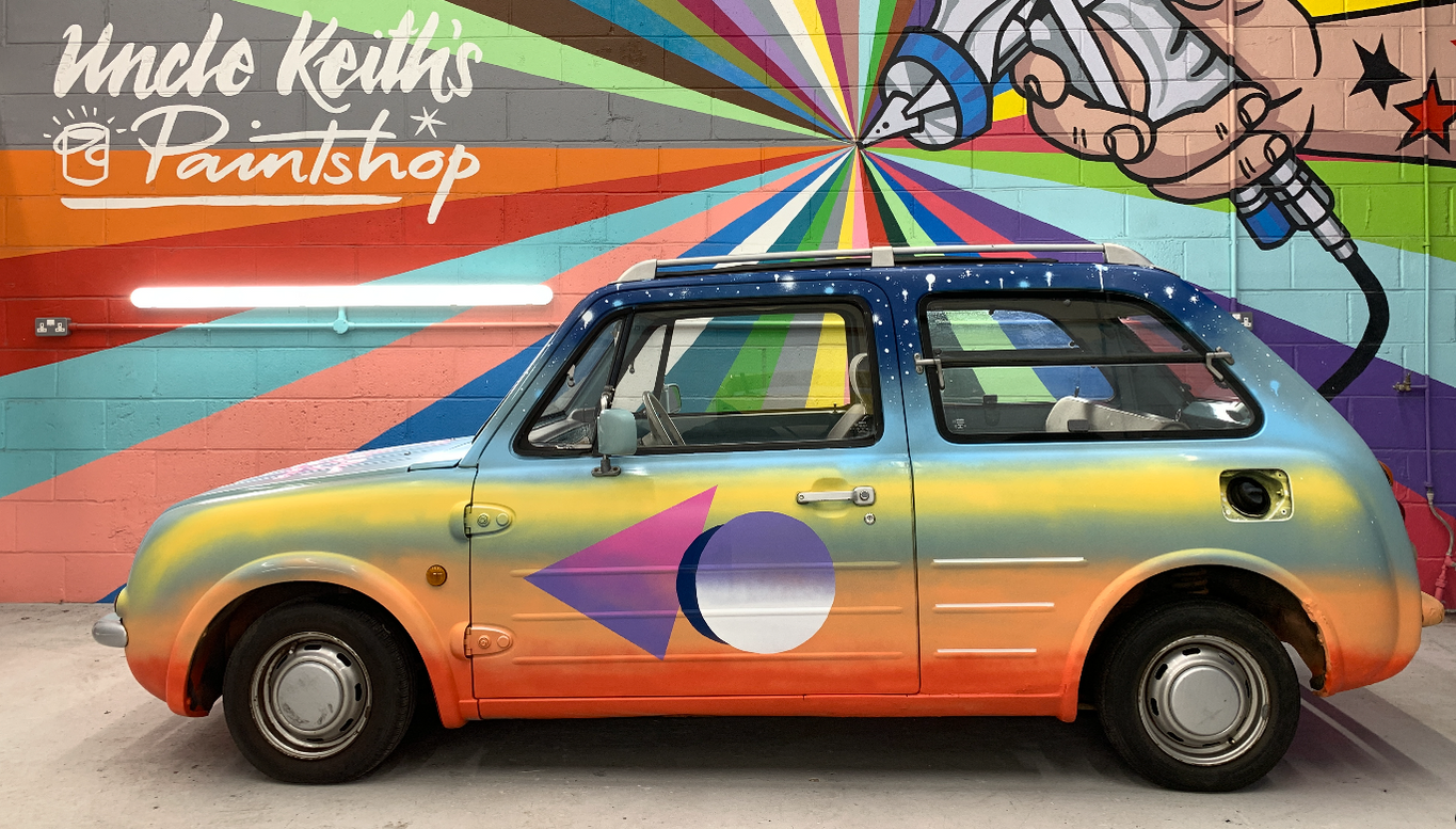
A natural follow-up to a lifetime together putting on music, social and creative events in clubs, empty and unorthodox spaces, we’d done promotion the long-hand way — going out, driving miles to see people in person, make friends and connections, taking pressies and enthusiasm. To network, you had to travel, and travel we did, in our series of odd little cars.
And the thing about FR is that we did it all, everything, without funding. No arts council money, no grants, no awards. Not that we didn’t try a few times — we were just never eligible, or the hoops to jump through were creatively restricting, or we didn’t move in the right circles. So we gave up on that fairly quickly. More correctly, we funded everything ourselves, sometimes putting the household in a precarious position. We didn’t come from money and neither of us had any - only what we earned at the time from freelance illustration, a little part time lecturing and Leigh’s job at the time in a series of record shops — which he proactively decided to leave behind in 2007 — and we were paying a mortgage and studio rent. So we took what with hindsight were huge risks, gambling sometimes thousands on ambitious projects that we never sure would pay us back. But they did pay us back — always in ways we couldn’t predict, and always slowly, but surely.
Nowadays, I see the ease with which Crowdfunding or Kickstarting is deployed — and good for you, if you can do a nice job of that; there’s something terribly appealing about being answerable to a hundred strangers who’ve given you money. I’ve funded plenty of those projects myself, but we never felt comfortable risking anyone’s money but our own!
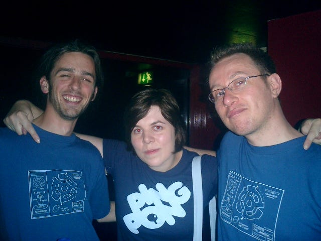
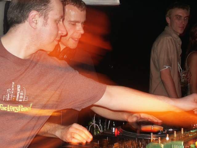
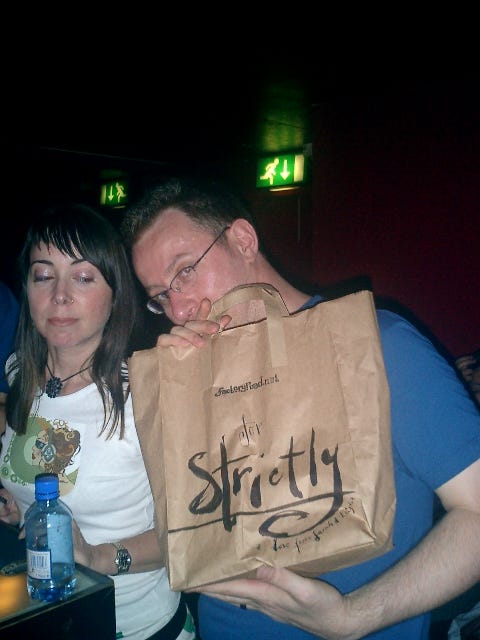
To this day, our manifesto remains:
“Our projects are usually created and executed together, and are usually things we want to try out, do for the sake of doing, or experiment with. They’re neither designed to make money (though they sometimes do), nor to satisfy any brief but our own. They’re also, sometimes, collaborative, and are almost always for the entertainment and engagement of other people.”
You can still read this at the top of my Special Projects page, which attempts to gather as many of these together as possible, though there are too many to list (and many, though it seems improbable, are ‘pre-internet’, with no traces online to link to).
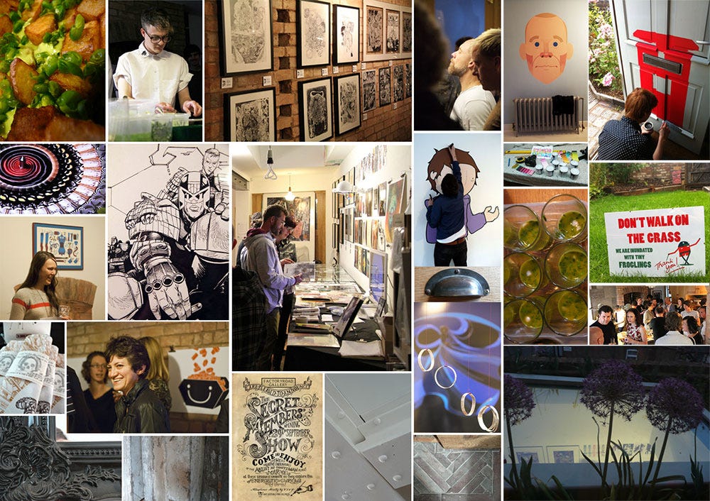
As well as a shop, Factoryroad was also a gallery that held myriad events in its space, and was supported by a network of creative friends from a mile away to 5000 miles away — they attended in person, contributed work to shows, and spread the word. Every event was a huge undertaking, and you can read about some of those shows and events here.
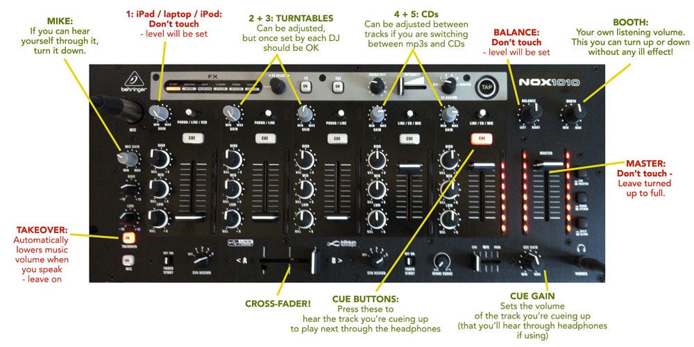
We even ran a radio station from there, Altar Ego — itself an incredibly challenging project, even for two ex-pirate radio people, which we weren’t sure we could pull off till we’d, erm, pulled it off…several times.
“Go ahead and chew everything that you’ve just bitten off, Sarah”.
Doubling up as our working studio space, the gallery space itself eventually became too disruptive and energy-consuming amid the mad amount of client work and other commitments happening at the time, so we pressed pause on it. (We just do things now without disassembling the entire studio for a week.)
The Factoryroad shop was a commitment to our friends and colleagues to provide a platform to sell their work, which most didn’t have at the time. We built it to offer a selling space to some of the people we’d worked with the most, at a point in time when it was far less easy to jump online and set up a payment system and a shop. But it was also a time when was Instagram wasn’t as massive, Etsy wasn’t the big thing it is now, accounting and book-keeping was still a little on the time-consuming side, cheques could still be written, and the avenues for selling were fewer.
Even just ten years ago, promoting, in other words, was harder, but we had the audience and mailing list to make it work.
Some of the artists involved eventually moved away from their creative practice, or lost interest in selling products, and our shop, though beautiful, wasn’t live for long. It might have existed for longer had it been set up today where, a mere ten years later, selling your art online is not just an nice added extra, it’s pretty much mandatory for any artist.
In the end Factoryroad evolved into four separate shops — the busy one I run now, a Discogs shop for records, a smaller shop just for our 45rpm adapters, and a new one for our other business, Inkymole’s Motors, designing and selling automotive accessories and parts. But I look back at all the FR stuff today — stuff it’s impossible to do justice to in one brief article — with fondess and gratitude that we crammed them in, and took those risks, feeling the roots of it all underpinning everything we still do, and tuning into the gentle tapping of my foot as I feel the same urge to ‘get cracking’ again — but with the added perspective, experience and wisdom of someone a few years further along.
For the curious, here’s some of Factoryroad’s collaborators, who either took part in projects or shows, were the star of a show or film or collaborated in some other way — music, film, art, sound or video recording, food, admin. Most are still creatively active, though not necessarily in the same at form.
In no particular order:
Melanie Tomlinson (metal sculptor, jeweller)
Strictly Kev / DJ Food (designer, recording artist, DJ)
Henry Flint (2000AD comic artist, illustrator)
Buddy Wakefield (spoken word poet, author, performer)
Dick Hogg (prints and artwork)
Peter Horridge (illustrator, designer, typographer)
Aaron Lloyd Barr (was illustrator, then agent, now co-owner of ATRBUTE)
Max Ellis (illustrator and photographer)
Anthony St James (photographer)
Ed Garland (author and musician)
Sage Francis (rapper, hip-hop artist, label owner, musician)
Buddy Peace (hugely prolific musician and producer)
B.Dolan (musician, producer, rapper, activist)
Gareth Edwards (screenwriter, film director)
Louisa St Pierre (illustration agent)
Jed Smith (chef)
Alisha Miller (public artist)
Jonathan Levine (gallery owner)
Andrea Gibson (spoken word poet, author)
Anne Coleman (textile artist)
April Ball (designer)
Beth Robinson’s Strange Dolls (dollmaker and artist)
Caroline Allen (sculptor, artist)
Drew Jerrison (author, now senior marketer in publishing)
Florence EMA Blanchard (artist)
Andrew Bannecker (illustrator)
Nomoco (illustrator)
Stan Chow (illustrator, DJ)
Joe Rogers (artist)
Alan Titmash aka Jonathan Pelham (musician, now art director)
Graham Robson (illustrator, now a senior artist at Games Workshop)
The Cloud Commission (prints and original artwork)
Solo One (original artwork and stickers)
Dick Hogg (prints and artwork)
Tom Hare (woven sculptures and vessels)
Jacquie O’Neill (illustrator)
Jill Calder (illustrator)
Kelly Merrell (doodler)
Lisa Hayes (jewellery)
Rebecca Lupton (photographer)
Shirley Gibson (designer)
Nigel Axon (architect)
Sarah J Coleman (illustration, prints, stationery)
Factoryroad itself (music ephemera, T shirts, 45rpm adapters)
Linkless But Nonetheless Participating People:
Lisa Hayes (jewellery)
Tracy Walker (artist)
Brook Valentine Menown (assistant)
Lily Blythe (assistant)
Rebecca Lewis (artist management)
Bob Neely (music)
