Showing posts with label cover design. Show all posts

Wednesday, January 09, 2019

The Book With No Name


At the time of starting work on this cover, the book didn't even have a name!

Sometimes that can be an asset, sometimes it makes things difficult. But I'd worked on Tonya Bolden's previous novel, Crossing Ebenezer Creek, so I knew something of what to expect. Inventing Victoria, as it was eventually titled, is another book in a long series of Young Adult Fiction books I've been working on with race, poverty, class and black social history as one or more of its themes. 

The series, which has happened quite organically, started with To Kill A Mockingbird and has since included its prequel Go Set A Watchman, and includes Sharon M. Draper's 'Stella By Starlight', 'Crossing Ebenezer Creek' by the author of Inventing Victoria, Alice Hoffman's 'Nightbird', 'It All Comes Down To This' by Karen English, Linda Williams Jackson's 'Midnight Without A Moon' and 'Sky Full Of Stars', Dana L. Davis' 'Seven Days Of Stone' (since re-titled 'Tiffany Sly Lives Here Now'), Lauren Wolk's 'Wolf Hollow', and I'm currently working on a new one which isn't published till 2020! 


Some of the covers have required both harrowing research (including, fore example, Emmett Till, lynchings, slavery, the American Civil War and the two World Wars) and a sensitive approach to incorporating those histories. Why I've attracted such a large collection of works on this theme may have something to do with the Mockingbird start, and the art directors I've worked with have talked about an ability to create a lot of atmosphere on a cover - other than that, I'm not sure why these books have come specifically to me - but I know that I've really loved doing them all, and learning some history on the way. 


Essie is a young girl in 1880s Savannah, USA. From The School Library Journal, who sum it up better than I could:

"Fourteen-year-old Essie Mirth is ashamed of her prostitute mother, Praline, and the house of repute on Minis Street in 1880s Savannah (Forest City). She has a protector in storytelling caretaker Ma Clara, and earns a housekeeping position at Abby Bowfield's boarding house, where she makes her only friend, Binah, and meets a mysterious boarder named Dorcas Vashon. She is taken under Dorcas's wing, leaves her humble beginnings behind, and reinvents herself in Baltimore as Victoria Vashon, the niece of Dorcas. 

She receives strict education and etiquette training from Agnes Hardwick; soon welcomed by the black middle class and black aristocracy in Washington, DC. The teen struggles with her newfound socialite status. and is disturbed by the obnoxious, class-conscious and colour-struck attitudes of the other society ladies. Courted by insurance entrepreneur Wyatt Riddle, she is faced with a blast from the past whose presence threatens her new life. Bolden makes this YA novel promising and enjoyable with a combined weaving of history and fiction. It is poetic, breathtaking, descriptive and fast-paced."

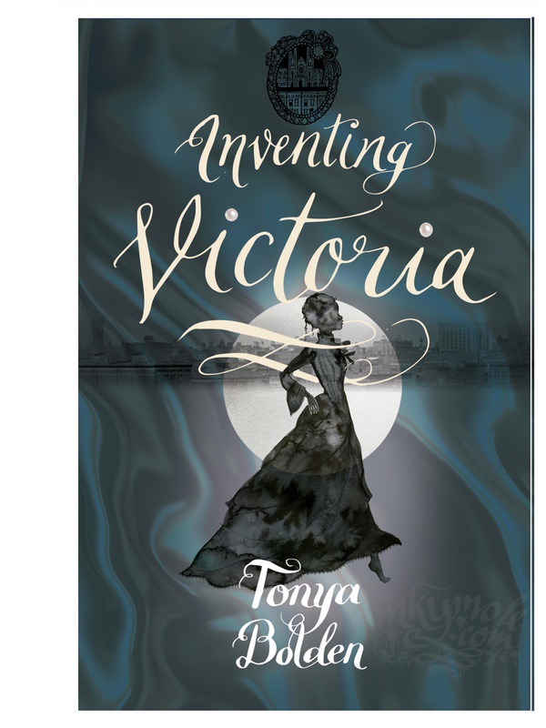
Research for this book was, in fact, lovely: satin party gowns in jewel-like colours, period jewellery, hairstyles of the 1880s, beautiful young black women, historical Washington and antique lace. While the book remained untitled there were SO many versions - but I worked with the elements of transformation; the dress, the hair, the profile which needed to suggest pride turned haughtiness, and wealth.

See the different ink-drawn elements below and the many suggested covers I created for the book both before and after it was given a title. 


For the final, antique lace integrating a horse-drawn carriage, china tea cups and flowers was created to frame our storyteller, with a loosely-drawn cityscape anchoring the cover beneath a summer moon:


Essie/Victoria herself was drawn in coloured inks on paper, but was smoothed over a little where the ink was rather too 'organic'. Getting her skin tone *just* right was important - she had to match exactly the author's own Essie/Victoria, he one who lives in her imagination, not mine. See also the evolution of the hand-drawn title lettering on the final to get the legibility 'spot on'.


Thank you to Donna Mark at Bloomsbury for asking me to create this cover for them!


Wednesday, October 10, 2018

The Turnaway Girls

Published this week, the new novel by Hayley Chewins is a beautiful, rather stirring book about what happens when you try to silence girls' voices.

South African-based author Hayley set her novel in the fictional Blightsend, where singing is not allowed, so the girls (led by 12-year-old Delphernia) sing in secret. Outside, The Masters - men - make music. Indoors, the women and girls turn that music into gold - a process they called 'shimmering'. The bleak landscape of Blightsend (great name!) and the curling, far-reaching sounds of the girls' golden voices needed capturing for this cover, so a woven network of musical staves was created as a centrepiece in which Delphernia herself stands, arms to the moon and flanked by her 'marble' birds.

There were relatively few roughs got this cover - for me, anyway, since I usually send quite a few - which made the job of narrowing down easier. Working with art director Pam at Candlewick Press, we quickly established the bits we liked via a series of looser-than-usual thumbnails, with notes. This has proved a great way of getting all the ideas out quickly, without committing too many hours to a version which might not prove to be 'the one':


Once we'd dissected these ideas, I worked up a shortlist in more detail. At the core of this cover was to be the music, the birds, Delphernia herself, and the foreboding landscape. The music was realised through a tree-like structure made of staves, golden leaves pinging from each 'branch (we did not yet now we would be treated to gold foil!)


The winner was chosen, and thus began the process of working up the separate components. Though I sometimes create artwork 'in one take' - as a single piece of completed artwork - which I love - this is is my most common way of putting a cover together, due to the probability of having to make adjustments and micro-movements as we progress the cover, and the need to tweak background colours throughout, for optimised reproduction.

Watch the time-lapse of this bit happening! (go FULL SCREEN to enjoy)


All of the original artwork - now in the proud hands of the author Hayley - was created in acrylic-based drawing inks on thick cartridge for the most part; the stony buildings of Blightsend were probably my favourite bit to do though, on fat, knotty watercolour board. 
I got to completely make up a fictional landscape and gnarly sea! Spiky it is then...


My vast inky sky, made of five shades of blue ink on A2 paper, were added to anchor the details, with a collaged ink-wash-moon...


And, compiled in Photoshop over many hours and with countless (labelled) layers of all the ink work, is the completed cover - the US edition, and the very ethereal UK version due out in January.

Thank you to Candlewick press for inviting me to do this cover...and going all-out on the gold foiled cover! I hope Hayley is already writing a sequel...


Saturday, July 28, 2018

Exactly A Quarter Of A Century Later...Part Two.


A few months later, art director Louise sent me an email containing one line:

"I'm enclosing a brief that I think will make you very happy."

She wasn't wrong.


Finally the opportunity to illustrate the cover of this book that had been such a part of my DNA since the age of 11 was here, and I was excited. A special 200th Anniversary Edition of Wuthering Heights in hardback, to mark two hundred years since Emily Brontë's birth, was indeed a brief that made me very happy.

I expected to feel intimidated and a bit daunted by the responsibility, as I had with To Kill A Mockingbird and Go Set A Watchman, but in fact, I just remember feeling calm and mega-keen. I didn't have long to do it - I prescribe a sharp deadline to cure all procrastination ills - and all of the material was still there, stuffed away inside my head, after all; I just needed to draw on it.

Rather than plough through the piles of work I'd done for my degree, when I produced a stage version of WH set in the modern day, I decided to approach it afresh, as the reader I am now, and at the age I am now. There were to be no clichés on MY watch - no wailing Heathcliff, no bodices or moody/sexy Catherine. Instead, the landscape to the story - the moors, heather, sky, graveyard, stone buildings and the flora and fauna, not to mention the weather - is really the most important character in it, since it dictates and controls the livelihoods, personalities and actions of everyone living in it, so I let that be my guide.

And after all - every fan of this book has his or her 'own' Catherine and Heathcliff, so it was not for me to try to portray these people, who are different every time.

So actually, in an opposing path to the one taken in the creation of 'Ill Will' (in the last blog), one of the very first ideas I put together ended up being the final, pretty much un-messed with.

There were developments along the way, which looked like this - the first two inspired by cooooooooold snowy Japanese landscapes, together with my memories of the Ryuichi Sakamoto's soundtrack to Peter Kosminsky's 1992 version:

(OK, I thought maybe I might let myself explore a ghost or two.)


I thought the house needed to be in the picture, and this house is very much based on the shape of Top Withens - which is not the 'real' WH as there is no 'real' one, but its location was correct.


I confess to loving the lettering on this one, and praying that they'd go for it.


One of the very first ideas was this one, using strips of hand-inked work representing the different textures found on the moors - heather, grass, gorse, stone, threatening sky, clouds, gravestones, the moon. I'd have been extremely happy if they'd gone for this one, too - especially with that bold lettering!


In the end, it was the movement and colour of this one-take piece, combined with a little paper collage, that was the winner. The lettering was replaced with a font so that the background became the main focus, and away it went.

I could not believe it was done, and so quickly.


Printed on cotton wrapped around the meatiest of hardbacks, it's an incredibly satisfying book to hold:


And that, dear reader, is how it went.

A bucket list job, completed in just a couple of weeks. What's next, I wonder?

Buy your copy here 


Thank you to Louise at Harpercollins UK for asking me to do this project.

(If you'd asked anyone else, there'd be a curse upon you forever. But you already knew that.)
x


LinkWithin

Related Posts with Thumbnails