There was so much to see at the weekend that it took me two days; Bank Holiday Monday I was a husk.
Leicester’s Bring The Paint festival is organised biennially by Izzy Hoskins and Anthony Overend of Graffwerk (2026 for the next one then) and their paint shop GraffHQ. It’s a phenomenal achievement that shows what can be done when a community pulls together; an abandoned mill that’s’s become a hub of artistic energy and collaboration.
Clusters of artworks are to be found throughout the city so you can visit Leicester and gorge on it all year round. But some are not forever, so make it a summer trip if you can, park up and be sure to scoff down something from Bitsy’s Emporium before you start out via the canal towpath, which itself is alive with colour and humour.
The whole thing revitalised my slightly jaded, tired artist’s mind and reminded me how fortunate I am to live in the area, and to have so many generous and creative people that I call friends — it reminded where I’ve always felt the most comfortable, my whole professional life having never felt like I properly fitted into any one of of the creative cliques or circles — always loitering a bit on the edges of several, where they overlap. Social media’s exhausting, the commercial landscape is exhausting, and Bring The Paint was like a large cup of strong tea with a fat nutritious meal, followed by a hearty nap.
but for a full list you need to pick up one of the chartreuse-coloured maps they made for the event.
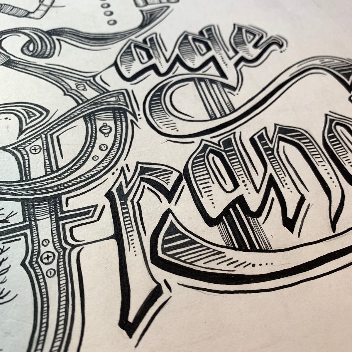
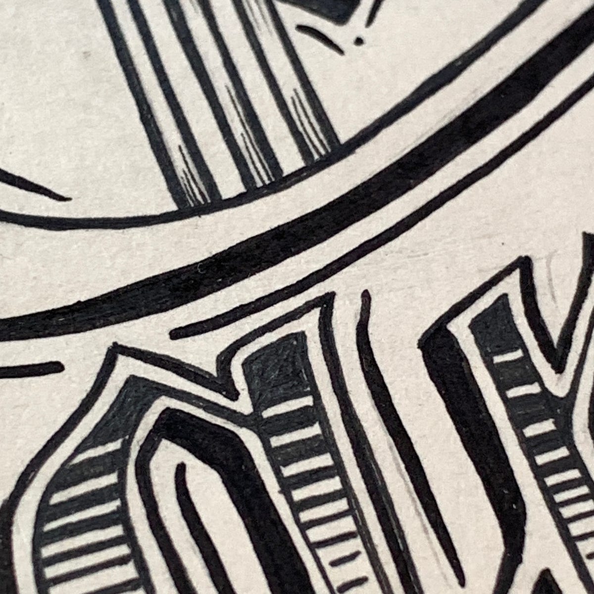
(My own contribution to the first ever Bring The Paint, in 2017, is at the bottom - I managed to get a little space right by the canal and HQ and I had about a day to plan what I was going to be doing!)
Large and fulsome photo dump to follow, because enough words.
About a quick and surprising exchange that’s got the AI-coloured sections of my brain whirring afresh.
A common scenario is this: a client asks me to do a project, referencing some work of mine that they love, except that one of the pieces they refer to wasn’t done by me. I always explain politely and get them to check their sources and double-check that they actually want *me*, not whoever did that work. And it’s fine — it happens.
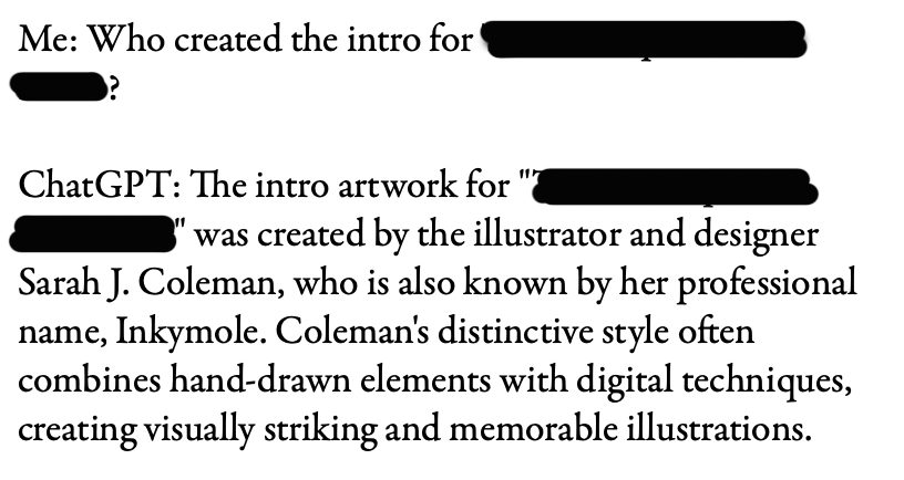
This week, it was different. I let the client know the reference - which I’ll call Project X - was nice, but not mine. I said I could see why they thought I did it; but what made them think I did?
Here was their answer:
Client: Who created the intro for “Project X”?
ChatGPT: The intro artwork for “Project X” was created by the illustrator and designer Sarah J. Coleman, who is also known by her professional name, Inkymole. Coleman’s distinctive style often combines hand-drawn elements with digital techniques, creating visually striking and memorable illustrations.
Oh.
Now, I’d love it if I had actually done Project X. I didn’t. But what piqued my interest immediately was that we know about the reductive, destructive power of AI on artist’s reputations and folios, obliterating credits, ownership and attribution — but it has never occurred to me that it could do the opposite.
I don’t have any negative vibes toward the client, by the way. They’re a busy person and they were looking for answers — they laughed and admitted they ought to have fact-checked the answer before emailing me. Agreed. I know they’ll use this as a teachable moment.
(And at this point it looks like I am doing the job they wrote to me about — this exchange hasn’t any negative bearing on that).
It didn’t take long for me to realise that if ChatGPT can say I drew something I didn’t, what else can ChatGPT say people did, when they…didn’t? < brow furrows / chin-stroking commences and a whole load of new worrying unfurls >
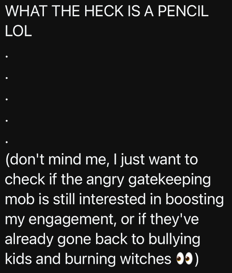
In the same week, I saw a Thread accusing [non-AI] artists of gatekeeping (yawn — I will simply direct you to my colleague Kyle Webster’s article for that), bullying children and burning witches in an amusingly teen-rage trollstream that attempted to defend what appears to be the poster’s love of making AI art (which in itself does not need defending). They do this by name-calling and yelling, in a loud series of furious threads based on, at best, an ‘intentionally modified’ grasp of the fundamentals of copyright and public domain. So I know that the rage of the prompters that I wrote about is still there, and making its way into the historically peaceful space of Threads (they seemed to be just having a really good time generating engagement, which might be all it’s really about — attention):
(someone replied calling them an ‘Aren’tist’, which just made people CHUCKLE’.)
I wrote a three-part piece about AI early last year as a way of organising and processing my thoughts and knowledge about AI, and to sort of put a stake in the ground at that point in time. I never had the intention of continuing the series, as I already knew that things were happening too fast and too often to keep up. As people sent me article after article in response, and I went off to deliver a talk on the subject, I quickly realised that unless I ditched my full time work to become an AI reporter, I couldn’t hope to stay on top of developments, so vowed to keep reading and observing without commentary instead. In fact someone emailed me for my thoughts on AI for an article the other day, and OK, I was ill at the time, but it was just way too broad a question — I had to pass on it, directing them to the thousands of articles already out there.
But this little ChatGPT incident needed recording. I don’t have ChatGPT but know people who do, so I plan on a little experimentation. The time I want to dedicate to writing about AI might be very extremely limited, but my curiosity isn’t.
Let me know if something like this has happened to you — I’m all ears!
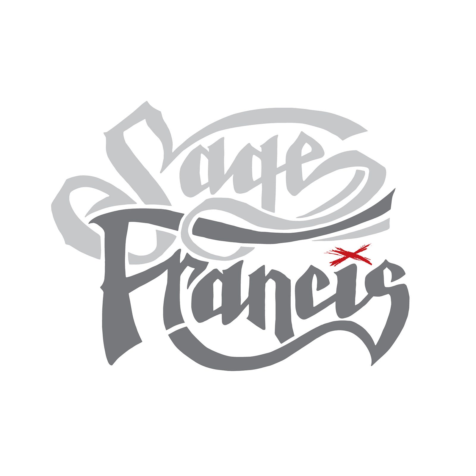
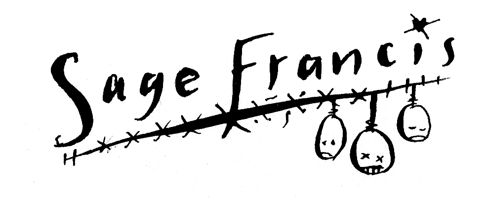
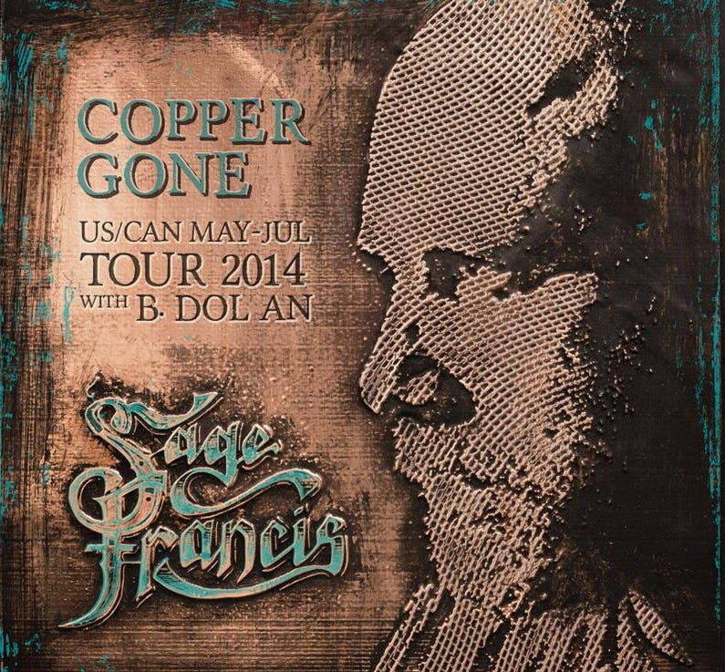
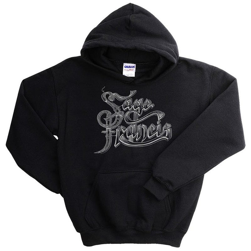
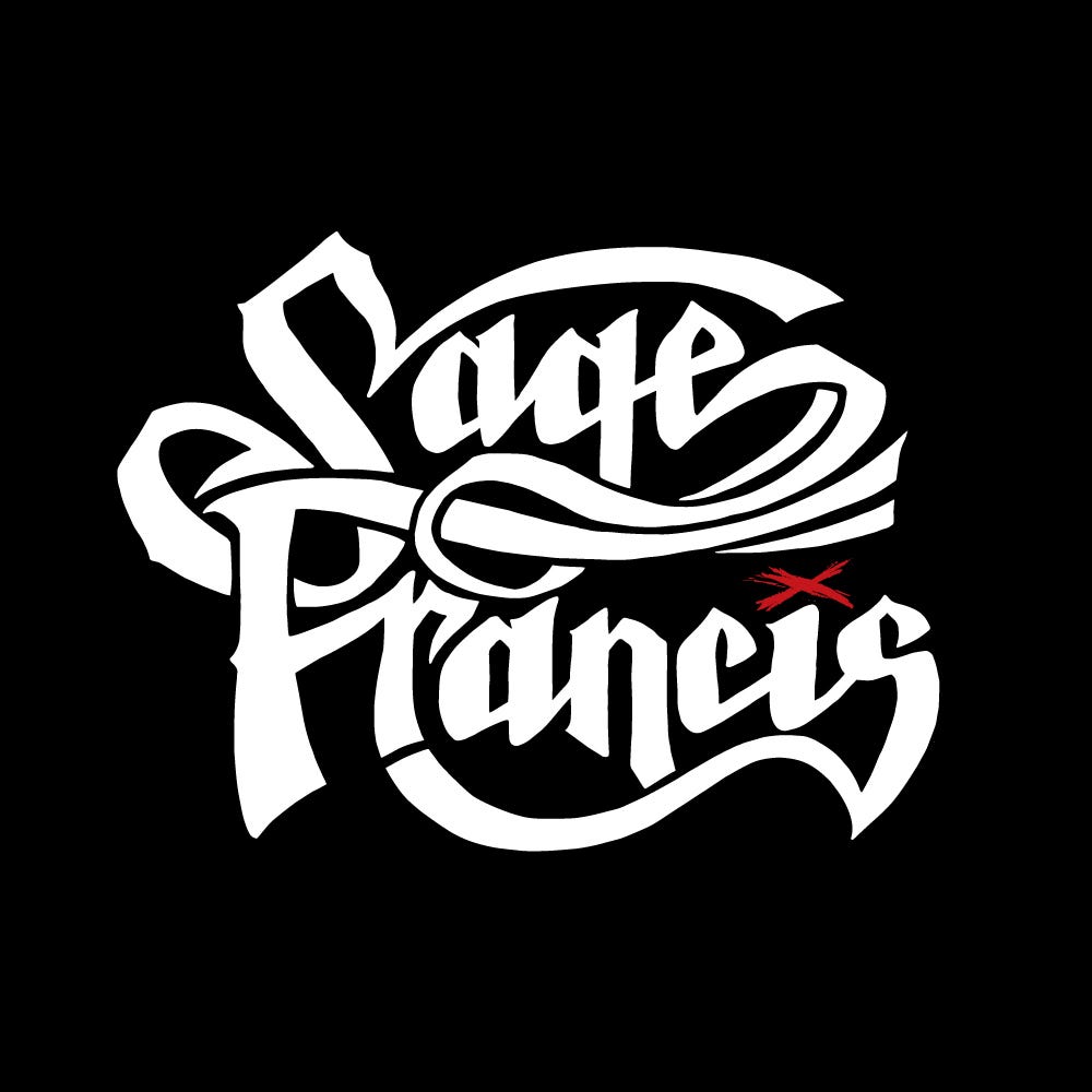
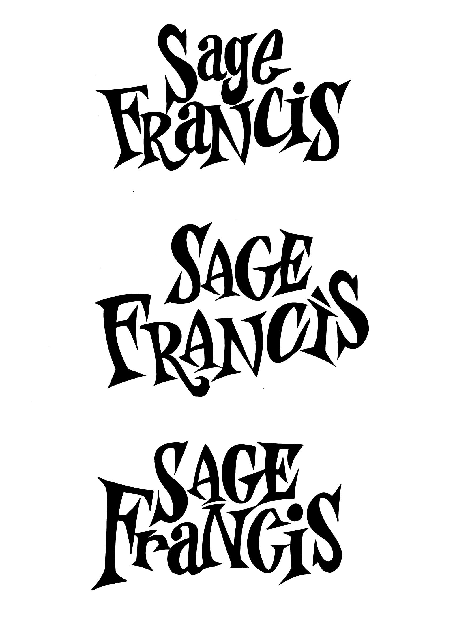
Artist, record label boss and rapper Sage Francis has just unveiled his new logo, over 20 years since I first fell in love with his records, 18 years since I did the biggest art project of my life on his work, 16 years since I did a piece of art that wasn’t meant to be a logo but became one, 17 years since I did his first proper ‘new logo’, and ten years since I designed him another ‘new logo’. Like the artist himself, this is a logo — and a relationship — that doesn't stay still!
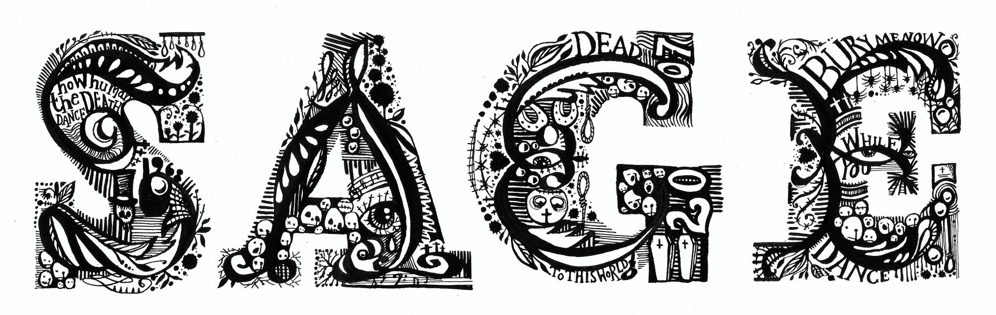
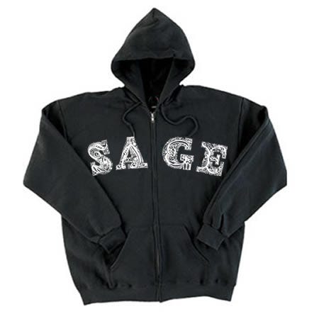
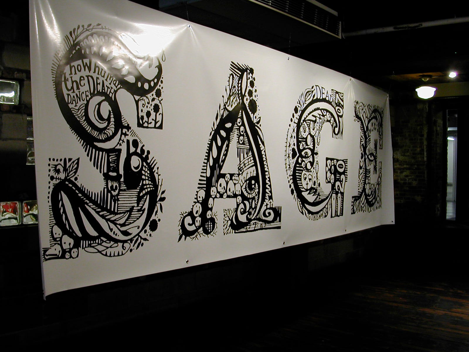
We never sat down to do a logo, to brainstorm or sign an NDA or moodboard or A/B test or anything else. It’s been a fully organic journey. The first one was actually a piece specially created for the 2007 Manhattan outing of our big Sage-inspired show, If A Girl Writes Off The World (a pre-Adobe Dreamweaver-built site will open up. I built it myself and it’s so poignantly 2007). It was picked up and put onto some of the hoodies in Sage’s Strange Famous merch range — best-sellers at that. Detailed and writhing, it was made with a very fine Nikko-G nib and black ink. The original is actually very small, and framed in our hallway.
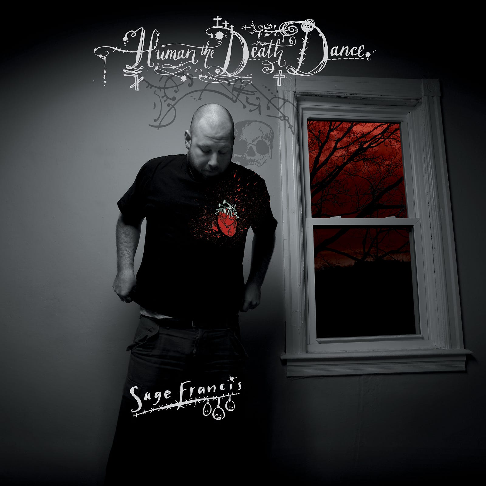
The second was kind of accidental as it was made for the cover of Sage’s 2007 album Human The Death Dance. It just kind of…started to get used on things, posters, ads, posts and merch. In the way that a logo does, I suppose. Made with an inkpen and nib, it featured sad faces and a minimal slope, just designed to peer over the shoulder of the man himself, next to a watermark-like Death. With hindsight, it was flimsy and odd, but then again…unlike a lot of my formal client commisssions, I hadn’t ‘sat down to design a logo’.
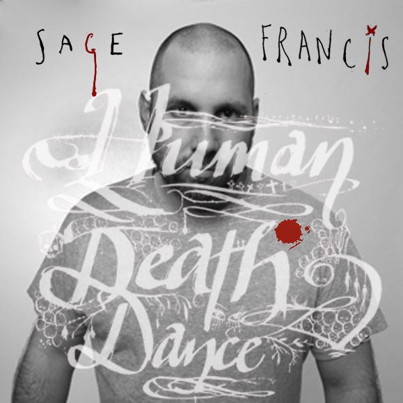
The album cover. Which was almost……this one instead.
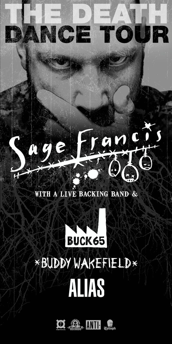
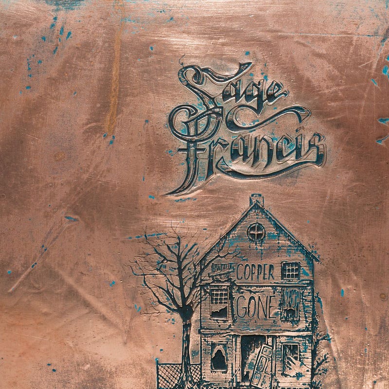
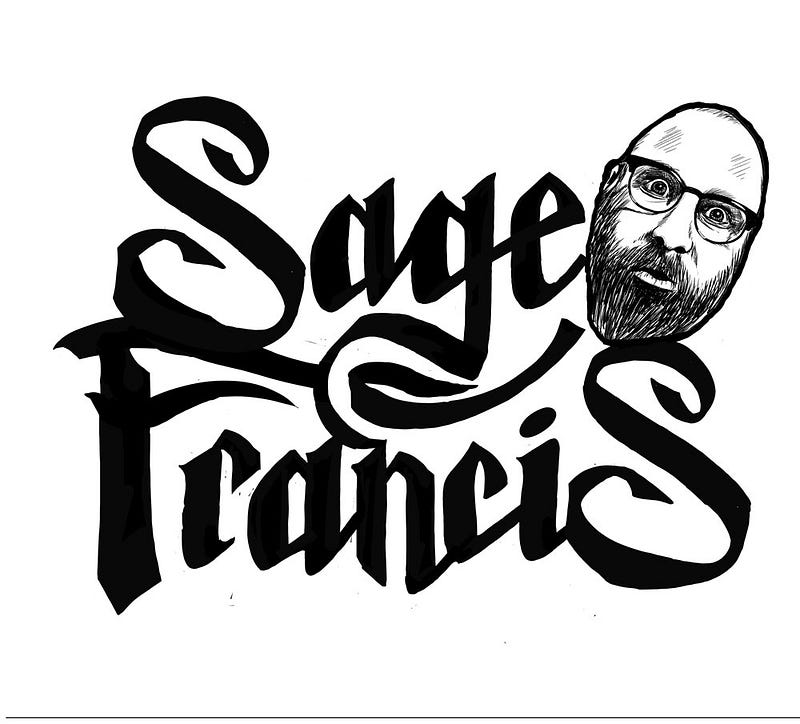
The one that came after that was also for an album, 2014’s Copper Gone. It formed part of a single piece of ink-on-paper art but once again lived a life of its own, and served as Sage’s identity for the ten years prior the current one. I almost can’t believe myself the huge spans of time I’m casually throwing around here, by the way — but those are the dates, and this is the longevity of it all.
Again if I’d known at the time that this would be deployed in the way it was, there are things I’d have changed — but would it have improved anything? Not sure. Really not sure, but at some point someone filled it in and made it solid — which wasn’t a cool move, and around that time I began thinking, I really need to do that properly, or scrap it and do the whole thing again.
Eventually I did. I can’t remember whether I just did it and sent it to Sage with a note saying ‘this really needed doing’, or whether he asked — it doesn’t matter — but the outcome is this one. This time I *did* sit down to ‘make a logo’ from the roots put down by the Copper Gone iteration, but clean and clear. I faffed and tweaked and moved vector points and smoothed out bezier curves then undid it all, and repeat, eventually creating so many versions I think we actually really should have done some A/B testing. But there it is.
There are still things I’d change, even now, and it may or may not serve for another ten years. But I like the organic and slightly clumsy way all of these were done. They sort of ‘happened’, which is very different from the art-directed, purposeful, accountable way I do my other work.
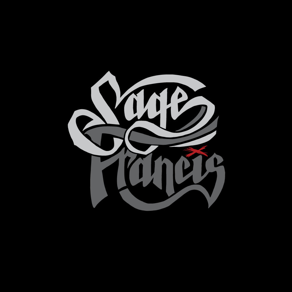
The final. I think. Not sure. I like it. Sage likes it. But do I like one of the other versions more? We can always use one of those…can’t we…I think. We fly in the face of your Logo Rules, sir!
When Sage posted it to the fans, most people just loved it and started slapping money on the counter for the T shirt. Someone said ‘Francis’ reads as a completely different word. Someone else said having seen it they’re now expecting a country album (which I applauded).
I still look at it and see a curve I would change, bits I’d move, and I stare at it till I’m logo-blind. But honestly, I wouldn’t have it any other way.
Thanks Sagey for the wholesomely organic way we do things, every time.